This post is written to celebrate the 1 Year Anniversary of Agenda and tells the story about how Agenda came about: where the idea came from, how it evolved, and finally became the award-winning app it is today. Along the way it also shows how you can use Agenda to always be able to answer: What’s up Next?
What’s up next?
In January 2016 that question was on my mind for two reasons. First, the three years before I had worked in a more corporate environment when Papers, the research literature organization tool I had written, was acquired by what’s now SpringerNature, a large scientific publisher. It had been an amazing 10 year ride in which things went from just an idea, to hobby project, to life as an indie developer, a distributed team of 6 on 4 different continents, and ultimately to 25 people in an office in London. Nevertheless, I felt it was time to start something new, and be more hands-on and creative again; I started asking myself the question: What’s up next?
Second, while leading the Papers team I had started developing a methodology to keep track of my daily tasks, the meetings I attended, and to collect the ideas for all the projects I was involved in. I called it the “Next Box” method, and given it had become such a central piece of staying on top of things for me, I figured others might find it useful too. It could become an app that would always allow you to answer the question “What’s up next?”.
A never-ending To-do list
I think everyone has been there. In an attempt to keep track of all the things you need to do, you end up with dozens of post-its, write yourself emails that end up cluttering your inbox, or create a simple TextEdit document where you paste anything you don’t want to forget.
Back in the days that’s exactly how I kept track of things for the scientific Mac apps 4Peaks and EnzymeX that I had started writing while doing a PhD in cell biology. The methodology was simply to type or copy-paste anything in that was important enough not to forget, from ideas for features, to web links, code examples, and crash reports from users. If it was very important or urgent, I would add it near the top of the document, and if it could wait, more to the bottom. As you can imagine the result was rather unwieldy after a while:
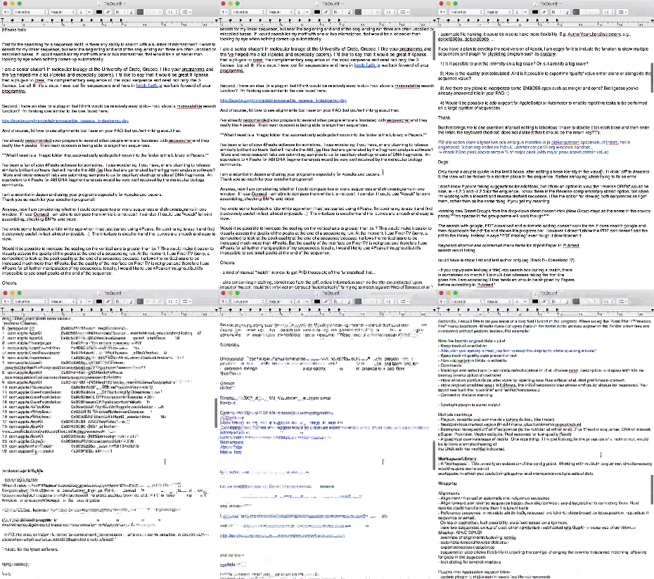
…the comfort of knowing you have written it down somewhere. An example of the infamously large TextEdit document I used to keep track of what was up next for 4Peaks.
Yet the TextEdit approach had its advantages:
-
at least the info was in there somewhere, and with a bit of searching I could usually find it back;
-
the fact that is was just a TextEdit document meant I could paste anything in, from text to images, without any restrictions or imposed structure, making it very flexible;
-
the somewhat arbitrary “important things at the top” rule, did lead to a reasonably OK way to prioritise things;
-
it allowed me to get things off my mind, the comfort of knowing you have written it down somewhere is one of the most important reasons to use a tool like Agenda, or even Mail or TextEdit if you must.
Not just one To-do list
Of course once you go this route you soon end up with many of these files, in my case one for each app I had developed, plus one for stuff at home, one for interesting developer links, and a bunch for brilliant app ideas that never materialised (and in hindsight weren’t that brilliant anyway ![]() ). The result was that I now had a whole bunch of these documents open, adding to the mess.
). The result was that I now had a whole bunch of these documents open, adding to the mess.
That was until somebody pointed me to Simplenote, which is basically the same setup, but instead of having separate TextEdit documents I would now have a single window with a sidebar to switch between my various projects. I quickly copied over the text and used Simplenote until that January in 2016:
…the comfort of knowing you can find it all in one place. Moving to Simplenote brings all text documents into a single window, with a sidebar to easily switch between projects.
There is always a next time
After the acquisition of Papers my life started to revolve less and less around programming and more and more around managing people and meetings. I started using Simplenote to collect the things I needed to discuss with people in an upcoming meeting. Usually just a few bullet points at the top of the document, placed under a heading called “Next Time”. As I almost always had Simplenote open on my Mac anyway, it became super easy to quickly capture ideas or discussion topics that would come to mind during the day, which meant I always had my talking points ready at the start of any meeting. I always knew what was on the agenda…
This was not the case for some other people, or better, for most people I would have meetings with. I frequently had to sit through endless meetings just because there was no defined agenda, and regularly had 1-on-1’s where we ended up having a small talk for an hour, only to be confronted with big issues raised in an email a few hours later.
I know, often our days are hectic and busy, we are running from one meeting into another without any time to think about what we should actually discuss. We decide to improvise and adhoc try hard to remember what needs to be discussed. But we all know what it is to walk out of a meeting or hangup the Skype call, only to realise a minute later that we forgot to discuss perhaps the most important topic. Well, that started to happen a lot less now that I had a place to quickly capture any topic that needed to be discussed the next time we would meet. And those endless meetings? Even when coming straight from a previous meeting, now that I always had an agenda it worked miracles for keeping them short and to the point.
What was even more interesting, after the actual meeting I would simply rename the Next Time heading to the date of the meeting, type a few returns to move it down, and insert a new Next Time heading at the top of the document, thereby creating one section or “box” per meeting. By doing so I was not only ready to collect the items to discuss in the next meeting (“the Next box”), but I was also automatically creating a history of everything we had discussed in the previous meeting, and the one before that one, etc, etc.

…the comfort of knowing what you discussed and decided last time. The agenda for the next meeting becomes a record of the past one.
Super-powers
This methodology quickly turned out to be a winner. Certainly in Skype calls it must have sometimes scared other people in the meeting how quickly I was able to pull up facts on what we decided then-and-there, and who we agreed would do so-and-so. Even more powerful was the combination with Gmail: knowing the date to search for thanks to my notes made it trivial to look up documents, presentations, attachments etc. So easy that I started getting questions from other people whether I could send them again file X that person Y had sent a while back. Sometimes they would ask me for the files they sent me ![]() .
.
As mentioned, I noticed most people didn’t use any method like this, despite how simple it was. I started advising the people I saw struggling to do the same as I did and told them: “Just keep a TextEdit document open where during the week you capture the things you want to discuss with me. And when we have our 1-on-1 we can simply go over that list”. When it seemed to work for them as well, I started to slowly think of turning this methodology into an app. At the minimum I would have one customer: myself.
Partner-in-crime
However, before I started programming I wanted to ask long time friend and fellow mac developer @drewmccormack what he thought of the idea. Once or twice a year we would meet up when I got back to The Netherlands (where I’m from and where Drew is living). While his very first reaction was “another note taking app?! There are thousands of those already!”, he seemed to like the idea for this date-focused note taking app in the end. I decided to ask if he was interested in jumping into this new adventure together, and luckily he did.
Fast forward twelve months of development and we started to get close to a first alpha version of the Mac version of Agenda, the name we decided to give to this new app. Up until this point we had decided to stick very close to the ideas I described above, and it is not hard to see the parallels between the above example and the below screen recording of an early development version:
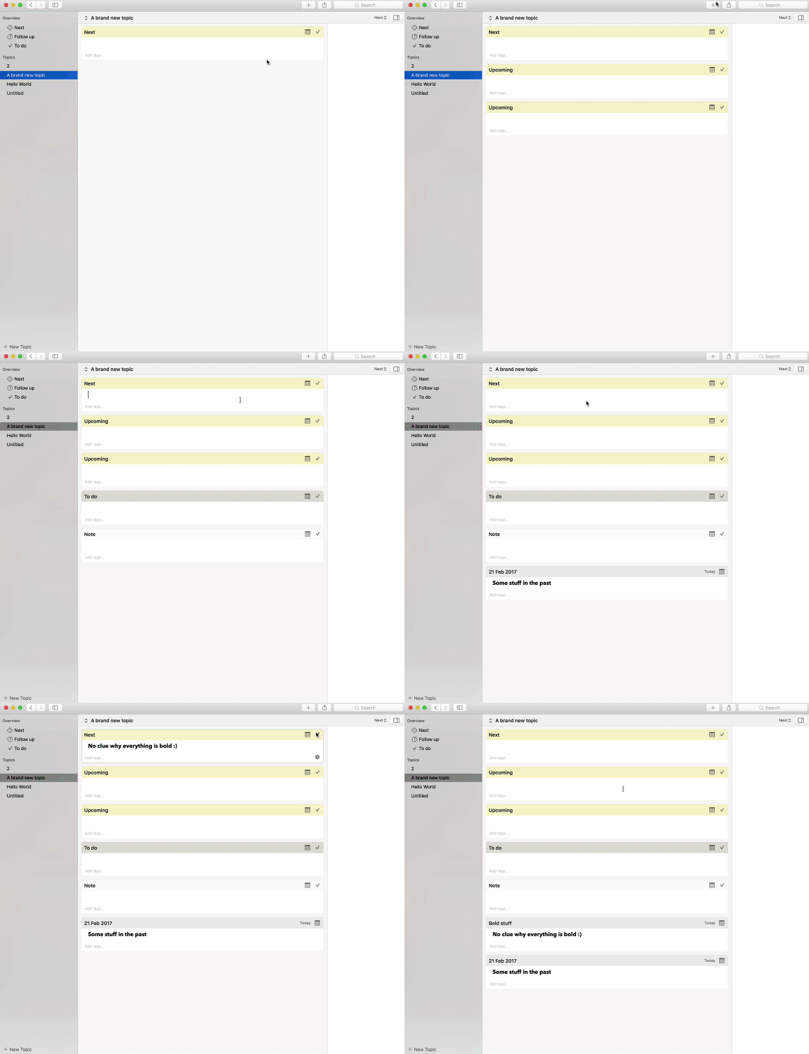
Screen recording of an early development version of Agenda, introducing a formal Next Box in yellow. More yellow notes could be created upcoming events, while notes of meetings and events in the past would sort to the bottom and show in grey once marked as done.
Back to earth
With the help of close friend and designer @wrinklypea we worked towards something that we could call a real app, and when finally the day had come to send a first alpha version to a few close friends and fellow-developers, we were super excited.
But not for long alas.
We received some very good feedback from a number of testers. However, when we say “very good”, it refers to the quality of the feedback; what was said about the app itself was actually quite bad. The testers did not understand the methodology, nor what all those boxes were supposed to mean, what determined their sort order, etc. After a year of work, that was a bitter pill to take to say the least…
Screenshot of the alpha version we sent to a trusted few who made it clear to us that we did not yet have an award winning app on our hands.
The big turnaround
It was obvious we needed to change things, and quickly came to the conclusion that the app should just be a lot simpler. Instead of creating an app that enforces my exact way of working, we figured you should be able to use it as a note-taking app even if you do not intend to use any of its date-focused features. Of course, you could then still use it to build the type of Next Box workflow on top, like I had also done in Simplenote. And speaking of boxes, we also realised that somewhere in the development process we had gone from something that we called a “next box” to something that also really looked like a box. We realised that we needed to go back to something that felt much more like the original TextEdit and Simplenote origins of the idea.
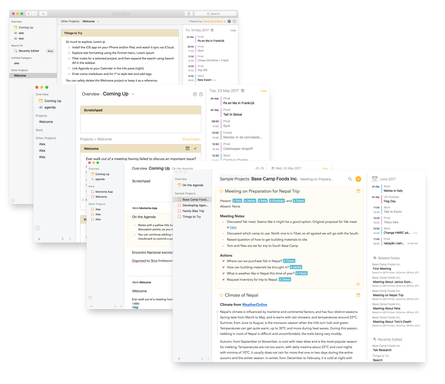
What followed remains one of the most remarkable parts of the Agenda story to date. In a matter of days we completely changed the look of the app, and three weeks later we sent a new version to the testers, who now reacted much much more positively. It was the point at which we started to believe the Agenda project could go somewhere and that it might actually become a viable product.
The transition from the first alpha (codename: disastrous-feedback) to the second attempt, which already looks very close to the Agenda 1.0 released a few months later. The three screenshots in the back were taken over the span of only three days, with the front most screenshot of the second alpha following two weeks later.
Dotting the i
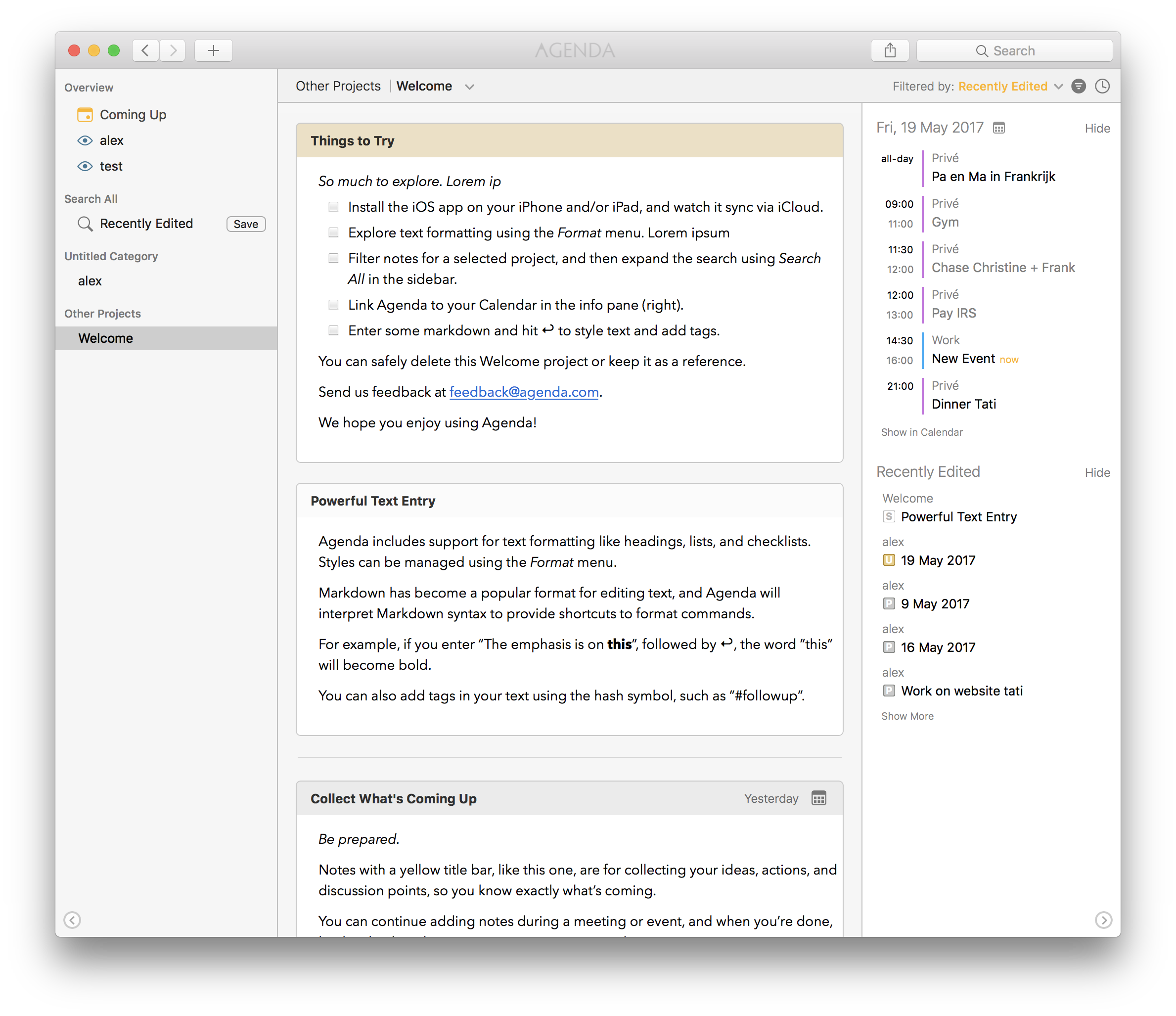
By that time Agenda 1.0 was famously 80% done, with 80% still to go. It is a joke we often use internally, but there is a truth to it. Even with most functionality in place, finishing the app, polishing it, fixing the bugs, working out an innovative and fair business model for both ourselves and our users, building a product website, setting up a community forum, and everything else still took another 6 months. Luckily we had great help from some really awesome beta testers, and on January 22, 2018 finally the day had come to reveal Agenda to the big public:
A new dawn for note taking, Agenda 1.0 for macOS launched on January 22, 2018, followed by the iOS version a few months later.
A never-ending story
Remember that joke about the second 80%? We have another such saying internally:
The real work only starts when it’s out.
And so it went. Once people started using Agenda they inevitably found things we had missed during beta testing, used it for things we could not have thought about, hit issues we thought were impossible to hit, and most of all, they told us they loved to see more. One thing stood out in particular, they wanted an iOS version of Agenda, and they wanted it fast! Luckily with the macOS version out of the way, the iOS version was already 80% done… ![]()
This was all a good thing though, it meant users liked Agenda and we could not have dreamt to have a better reaction.
In the past year Agenda was downloaded over one million times (!), it won the 2018 Apple Design Awards and was selected as Best new app of 2018 by MacStories.net. We are perhaps just as proud however that this community has grown to more than twenty thousand users, who share interesting stories and their workflows, create iOS shortcuts for other users, and give valuable feedback on what they would like to see improved or added to Agenda.
Speaking of which, this first birthday is hopefully one of many. We have a ton of things we would like to do to make Agenda so much better. We cannot wait to get it to you.
Thank you all for your wonderful support!
Alex & Drew




 here’s for many more, stay indie


