Brilliant to hear, there’s something really nice about it isn’t it, had the same experience translating the app to Dutch. Regarding the issues:
Press and hold the + button > Manage Templates… > Down arrow on the left of the title:
The description for the option “Current Time/Hora atual” cuts after 3 lines
Can we make the description shorter? For example, by stopping after there word “tempo”?
- + button in the bottom left corner:
Like before, the description for “New Project/Novo projeto” cuts after 3 lines
Same here, we could change it to " …notas de reunions, eventos, ou …", or we could make the last part short: “ou organizar a tua vida.” Leaving it up to you
- Sync notes > Dropdown with sync options:
Like before, the description for “iCloud” cuts after 3 lines
Same here, what about “Usa o mesmo iCloud…”
- The preview note sample is not showing anything, only the placeholder string (maybe it’s supposed to be like that in the beta but I thought I should mention it)
Weird that should have been translated indeed, I can see it in the translation now, will check.
- Calendar
- The option “Shown Calendars/Calendários mostrados” has a divider overlaping the text, which is caused by the “line break” (maybe edit out the “shown/mostrados” text as a solution ou perhaps change the wording? Like, “Show Calendars:/Mostrar calendários:” so it can fit? We’d have to edit the reminder’s lists label as well to keep consistency)
Yes, that’s probably best indeed: “Show From:” or “Shown From:” perhaps. Also note that Listas has a capital L that it probably shouldn’t have.
- Account
- The text “Logged in as/Sessão iniciada como” cuts reaching the “Log out/Terminar sessão” button
Thanks, will check if this can be improved
- When logged out, the links “Privacy Policy/Política de Privacidade” and “Don’t have an account?/Não tens uma conta?” overlap"
PT is really long, especially the Initiar and Terminar Sessão buttons, not sure if we can just use Initiar and Terminar instead? Also, if needed perhaps just use “Privacidade” for the privacy policy, and “Não tens conta?” with “uma” perhaps?
- Many of the options direct to the Agenda Community homepage, not to the specific pages it should
Can you show examples?
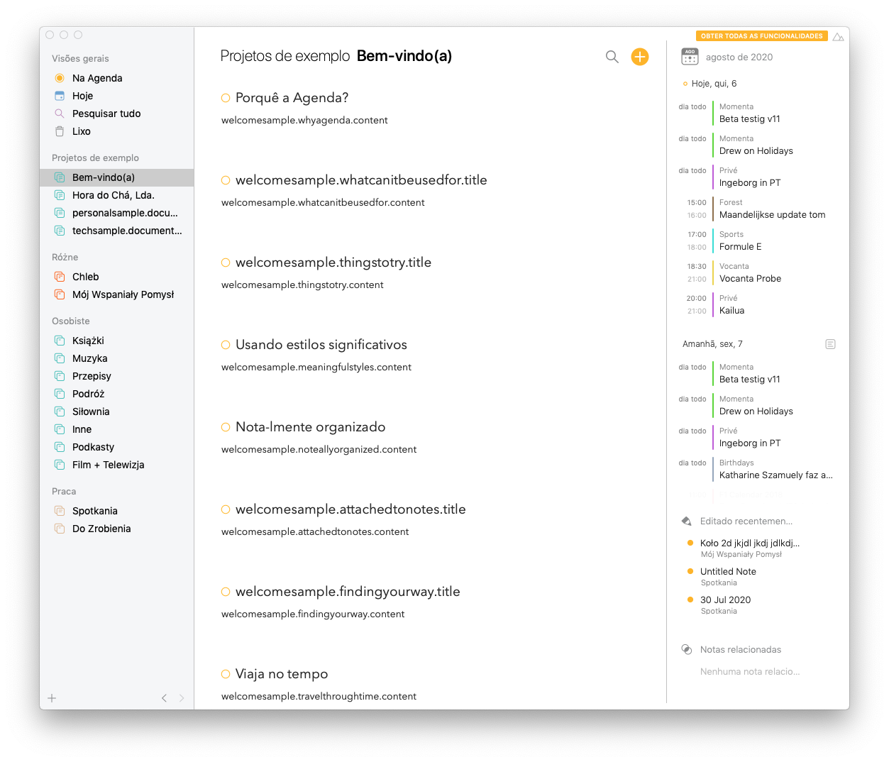
- In the “About Agenda” section, the names of the translators do not appear, only the placeholder string (maybe it’s supposed to be like that in the beta but I thought I should mention it)
Strange, I can see the translation in OneSky (although it only has your name with a comma, did the others contribute? I will ensure it will be in the next.
- The title cuts by only a letter
Ok, will check if I can fix that
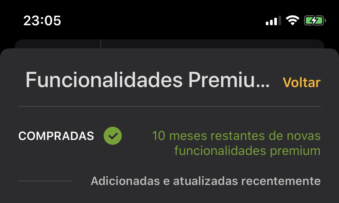
- When a user has the premium features, the paragraph after the “PURCHASED/COMPRADA” checkmark cuts off
Perhaps we should then remove the word Novas otherwise shorten it.
Side note
In the Preferences (both General and Account tabs), I found the premium features section kinda “sinked in”, feels like the “Show Features/Mostrar funcionalidades” button is too close to the bottom tab bar (this is just me with my designer perfectionism talking, so it’s more of an observation than anything)
Thanks, and I see what you mean, but we don’t have much vertical space to play with alas.
- I didn’t find any typos but now that I’ve had the time to explore and see the language first-hand, I feel like some of the strings should be revised given the context they’re in. What I mean is, when translating I didn’t have the notion/overall picture of the placement of the strings, but seeing them in action now, I know exactly what they really mean and what I should translate them to.
Sure and makes total sense, you can just keep tweaking things as we go and the changes should go in in the following build.
Again, glad to see you so excited, thanks for the great work and can’t wait to see it go live!


