Linking notes to dates is fantastic, but it’s not enough if Agenda doesn't look better

I hate to write this post. I want to be positive, but the fact is that I have stopped using Agenda and I thought that at least I’d tell you why.

I loooove the idea of linking notes to dates and/or calendar events. My notes not being sorted correctly is my main gripe with all other note taking apps (Bear, Ulysses, Notes, Evernote etc.)

However, I find that Agenda looks too messy to be any fun to use. I love writing in Bear or Ulysses, where the UI is minimal and all the focus is on my text. It’s easy to tell that layout isn’t important to Agenda. There are icons and text everywhere, cluttering the screen. Or take a simple example - the bullet lists - they’re not even bullets, but dashes. And the padding before and after the dash looks so sloppy. No one has put any work at all into this.

I jumped into Agenda. Purchased the premium version and migrated my notes over, taking time to connect most of them to the right dates and all. I loved using ”On the agenda”, but over time, I found it harder and harder to work in Agenda, because of it’s messy layout. So I started writing in Bear and then copy the notes over to Agenda. Then, as time went on, I didnät take the time to copy my notes over to Agenda and now I realised that I haven’t used Agenda this year at all, while I’m using Bear several times per day.

Today, I had a look at the features that are being implemented right now and saw that layout isnt there, so I guess I’ll start migrating my notes back into Bear.

I still like that basic idea of Agenda, though, so I’ll be keeping an eye on what is happening with Agenda. The features you are working on now are not at all interesting to me. For me, the things I’m interested in are:

  1. Layout
  2. Stability
  3. Better results when copying or pasting text to or from Agenda

So. You created a good app. Keep working on it! I just wanted to explain why I’m taking a break.

10 Likes

I’m still using Agenda and still love it. But, on layout, I would add the suggestion that "line spacing” changes apply only to paragraph break (when the user hits enter). Currently, the line spaces is the same for work wrap and for paragraph spacing. So, using white space to visually look for different items in a dashed list cannot be done. This is a real blocker.

2 Likes

Thanks for your honest and thoughtful feedback. A lot of what you describe comes down to personal taste I think, and as you have noticed, we indeed have no big plans to change the layout and UI in general. The exception is that we do plan to improve the layout on small screens like on the iPhone and also allow for titles to span for more than one line.

Personally we believe that it’s better that there are different tools out there that attract to different tastes and ways of working than that all of us developers try to converge our UI’s to very similar apps. Ultimately you should look for the one that works best for you. Again, I do appreciate you took the time to tell us your thoughts.

2 Likes

So, using white space to visually look for different items in a dashed list cannot be done. This is a real blocker.

You can if you use soft-returns: using alt/option- or control-returns you can create new lines of white space without starting a new list item.

An alternative is also to change the line spacing (premium feature) all the way to zero, this will give you a system more similar to say TextEdit where every a double return can be used to insert a space between paragraphs.

I’m with you all the way on it being great that there are several tools that look and work differently. And most of my argument is personal taste. No doubt.

…but soft returns won’t create a new bullet point in a bullet point list, will they? Turning line spacing down to 0 would solve what I think @smckeown is trying to say

Yes, that’s correct.

I tend to agree with this feedback.

I’ve been using agenda for a while as a premium subscriber. I’ve put all my notes in it across both personal and professional.

I do think some of these small design issues can become more difficult to ignore over time. I would highly encourage you to change the bullet appearance. It feels very odd and unfamiliar and just makes lists in agenda not feel natural or native. This might seem like a small thing but I think it’s actually bigger than you realize.

I have some additional comments about the organizational approach but I’ll leave that for another day.

thanks.

5 Likes

I also have to agree with the feedback of the original poster. I do feel the GUI of Agenda can be improved a lot, in terms of decluttering, putting features in a more logical location, and making sure more macOS/iOS (HIG) conventions are adopted.

For instance, in the iOS app, I hate the left and right slider and would much rather have dedicated buttons to switch views.

The omission of a text edit toolbar in mac is a strange one as well. And the solution to click the hidden circle in front of each line feels strange.

There are indeed several issues with the bullet lists.

All in all, putting more toughts and efforts into the GUI would pay off.

3 Likes

I love the sliding sidebars – it makes it super easy for me to open and close them as needed.

Different strokes for different folks.

9 Likes

I also agree with this feedback.

I have also been using agenda for a while as a premium subscriber and after compiling a long bullet-pointed list that I needed to copy and paste into iMessage I found that the formatting went horribly awry and was unrecognisable and unusable. I can understand that layout is a personal preference, but copying and pasting is a basic function that should be relatively seamless between different apps. At it stands I feel forced to use a different app for any content that I expect to share via other apps.

I would have to agree that your opinion is definitely a personal preference issue. I really value minimalism in my workspace, but the features that Alex and Drew have implemented are definitely valuable enough to me that the UI strikes an appropriate balance above all other solutions that I’ve tried.

To me, Apple’s notes and reminders apps would be the next best solution, but they are missing the ability to properly link their notes with reminders, and I actually find Agenda’s organization tools much more effective for me. The former being the most important drawback for me.

1 Like

I think this is the gist of most of this discussion to be honest, it’s pretty much impossible to make something that fits everybody, or at least not without then making it also bleh to everybody. So we prefer to make it click really well with many at the cost of not being a great fit to some.

Having said that, the bullet vs dash discussion has been raised in various other discussions already, and as we have mentioned, it’s something we’ll offer a preference setting for at some point. It’s just that we haven’t gotten to it yet, and that other things have simply a higher priority at the moment (like localising the app to other languages and offering a sharing extension).

I’m really sorry - I tried to find my workflow with agenda. I would love to link notes to dates and even with reminders.
But won‘t become really happy with the UI - to much distraction, cug button at the bottom and other things. And there are bugs in search. Don‘t invest more time in agenda, sorry.
regards
Roger

I’m not sure that it’s personal preference. There are basic formatting tools missing basic. Agenda is terrible at communicating with other apps wether it’s for copy pasting or sharing data. Notes have to be able to be sent wherever and easily, it’s not the case now.

Overall the app has great tools that makes it unique and stick around for a while but I have to agree to most “personal preference” highlighted here.

As mentioned in a few places, a sharing extension is next up on the list.

1 Like

I concur with the idea that most of what is being said in this thread is purely a matter of taste. I very much love virtually everything about Agenda. Yes, from time to time there are things that might be improved on, but I’ve had Agenda almost from the very beginning of its inception. I have tried hundreds of different apps in the last several years. And my observation is that i have never seen any developer so responsive to their customer’s viewpoints and requests, and so ready to make changes that are actually needed, and not just changes that only a few users out of many hundreds would like.

So here are a few of my comments on thoughts raised in this thread:

I also love the sliding bars, and vastly prefer it over having a button to switch views. The sliding bars have the huge advantage of not losing the current view, but rather having both. It’s not unlike the advantage that a real printed book, magazine, or brochure has, in that one can quickly scan a page or pages, chapters, or sections, while easily holding your place at your original spot, easily flipping back and forth without losing your place. Most electronic device apps though, have the “button” style so we have to switch views, losing our original view or views, making it much more difficult to easily and quickly change back and forth to a previous view or views.

As for the dashes, or bullets, or other styles, I mostly use the checklist style myself. Yes, maybe you’d prefer a different style, and perhaps our preference will be added, or not if only a few want it. Different strokes for different folks, as they say.

I for one vastly prefer the style used in Agenda, and it is only one of the many reasons that I’ve completely switched any list, to do, work into Agenda since it first came out. Maybe for only straight writing, or some other needs, other apps might serve well. But for the focus that Agenda has, and the purpose it serves, I’ll go completely with Agenda and its style.

3 Likes

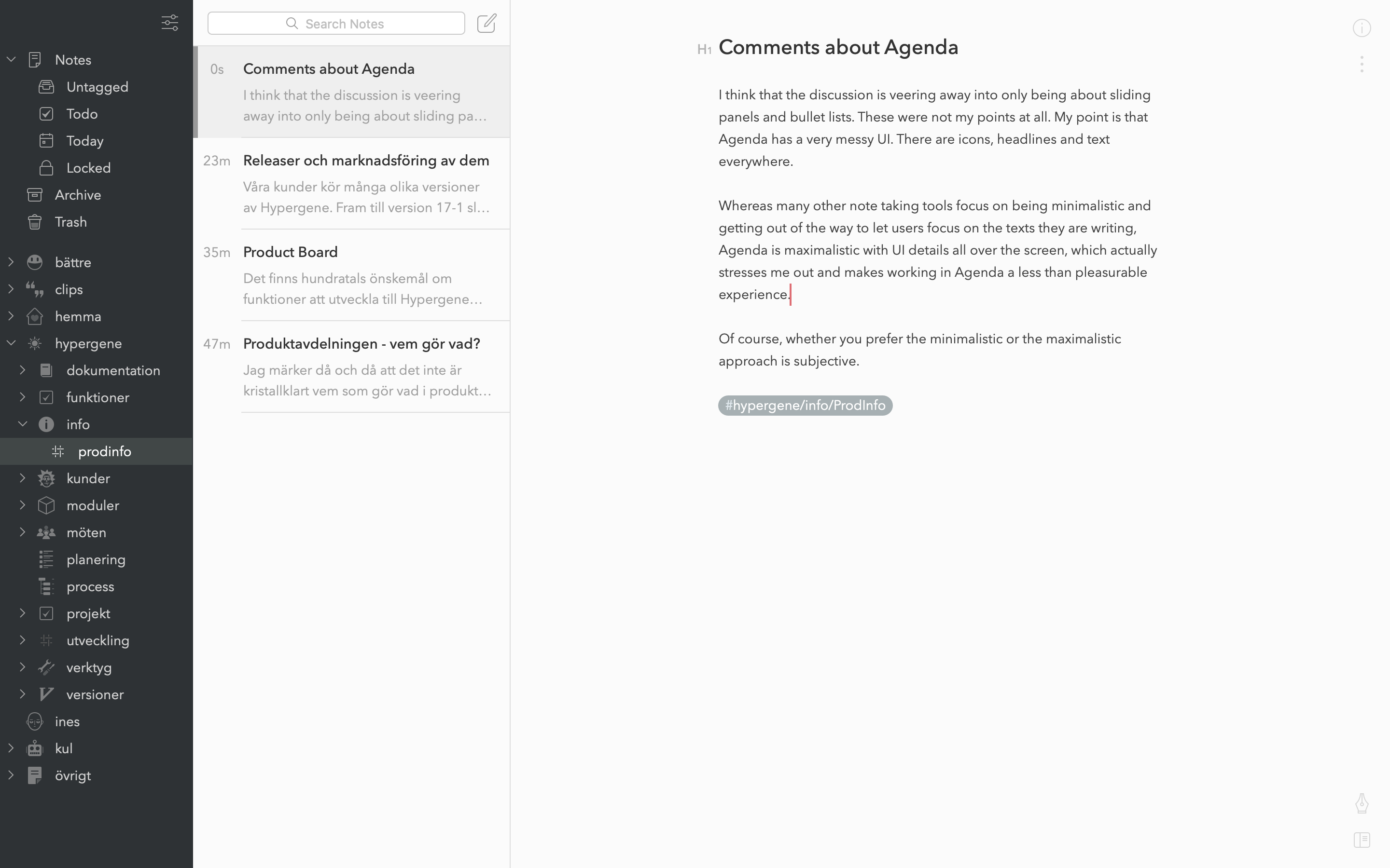
I think that the discussion is veering away into only being about sliding panels and bullet lists. These were not my points at all. My point is that Agenda has a very messy UI. There are icons, headlines, colors and text everywhere.

Whereas many other note taking tools focus on being minimalistic and getting out of the way to let users focus on the texts they are writing, Agenda is maximalistic with UI details all over the screen, which actually stresses me out and makes working in Agenda a less than pleasurable experience.

This is what Agenda looks like:

The area where I write my text has a background color. Every corner of the area has icons or text. Below the writing area are other texts. At the left and right as well as at the top are even more text and icons. Texts have several different weights and sizes and icons have many colors.

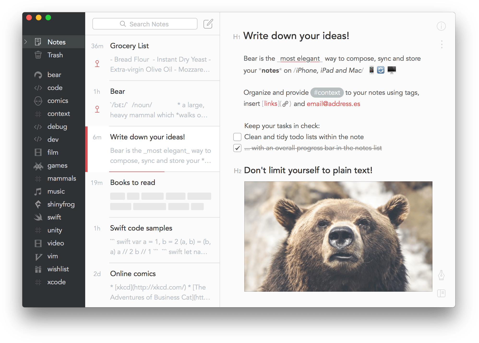
…and this is what Bear looks like:

This is as messy as it is possible to make Bear. With one single keypress, I can make everything but my text disappear.

Of course, whether you prefer the minimalistic or the maximalistic approach is subjective. I just wanted to make sure we’re talking about the same thing.

Sounds like you want to switch the accent color to graphite like you’ve done in bear, which by default also comes with bright (red) accent colours and icons…

I find this a lot messier personally, and not at all very different from what Agenda does:

Even more, if you deselect the note and hide the inspector on the right (which Bear doesn’t have), you actually come very close IMO. Plus the low contrast of a lot of grey text in Bear is also not everyone will appreciate I think (again showing that a lot of these things are subjective).

Yes, it’s not yet possible to activate a so-called focus mode, but we have mentioned in elsewhere already that this is something we hope to add later in the year.

3 Likes