Now available: Agenda 13.1 with enhanced Today overview and performance improvements

Giving Agenda a second boost

Last month we launched Agenda 13.0 with the new Open Quickly premium feature, improved Keyboard Navigation, Split & Merge, and much much more. As with all major updates – where the focus is on adding new and exciting features – there’s always some clean up to do and some bugs to fix. And although not jam-packed with big features, it always feels good to take some time to get this extra bit of polish out. This is exactly what Agenda 13.1 is about, now available from agenda.com and the App Stores.

Beyond Today

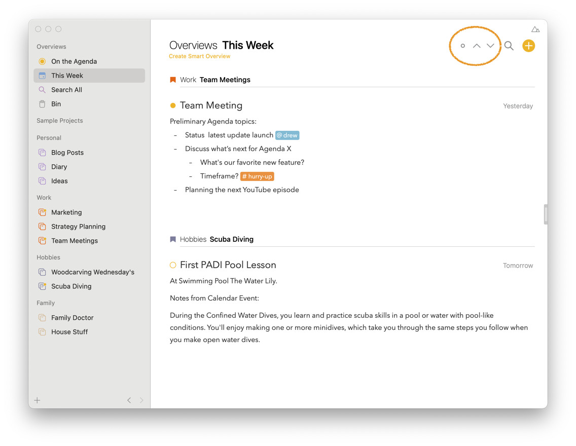
Despite being focused on performance improvements (those with larger libraries should notice a tremendous speed up!) and bug fixes, we did manage to squeeze a few nice new features. Most important of which is that the Today overview has now become a lot more powerful: it now allows you to “step” through your calendar in the future to next, or the past to previous days. You can even use the calendar to select day ranges like the current week and step through time by weeks at a time.

Nothing Left Unchecked

As we explained in our recent YouTube video, the underlying thought in Agenda is that your notes are not static but evolve over time. This is why in Agenda 13 we added the option to split your notes, extract selected text to a new note, or merge notes for example (as shown in practice in this video).
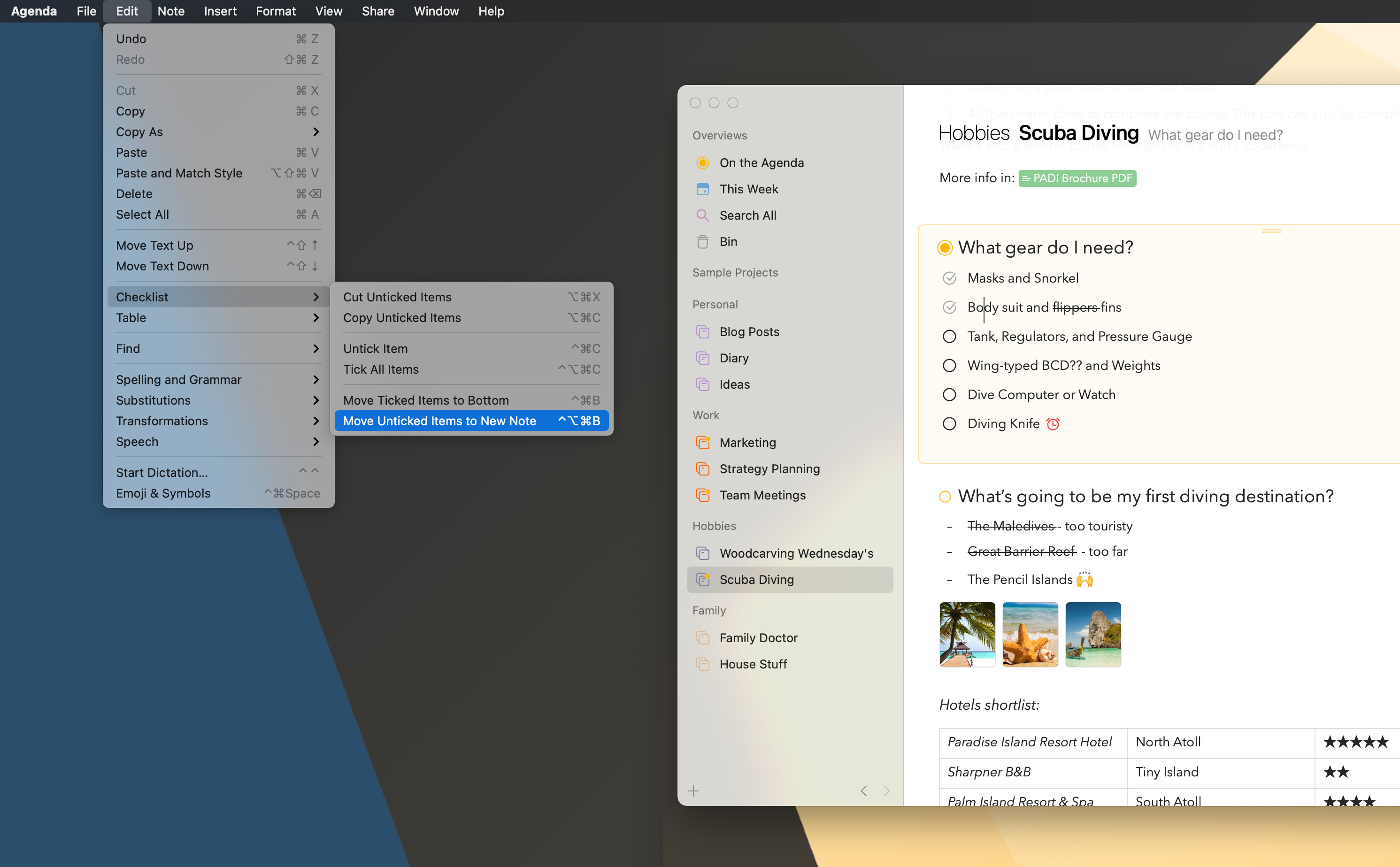
In Agenda 13.1, we add to this the option to move unchecked items in a checklist to a new note with a single click. Undiscussed agenda items after a meeting? Things to buy that were out of stock? Or work that didn’t get finished this time around? With one click you move them to new note so you’re sure you don’t forget them at the next chance.

Bonus Content

And there is more. We added some other niceties like support for week numbers, table edit actions in the contextual menu, improvements to x-callback-url support, and whole range of other improvements and fixes

We think together these improvements make Agenda 13 shine even more. We hope you like it and we’d love to hear what you think!

Alex & Drew

Ps. The complete release notes of Agenda 13.1 can be found here

Pps. If you have missed everything introduced in Agenda 13, here’s a recap on our YouTube channel:
7 Likes

I love the ability to step through days on the Today view, but I cannot for the life of me figure out how to return back to “Today” on the iPhone without manually tapping through the arrows. On the Mac app there is a dot that lets me jump back, but I can’t find a similar function on the iOS app. Am I missing something here, or has this not been implemented yet?

On iPhone there’s unfortunately very limited space which means we can’t show the “centre” button. We’ll think about a way to make it easier to jump back. In the mean time one workaround is to:

  1. tap the search loupe icon left of the up/down control in the header
  2. tap the calendar on the right of the searchfield
  3. select Today

This should reset it as well.

I like very much the new features! How can you set the This Week view? I can see tomorrow, yesterday and so on but not this week… :slight_smile:

You can do this by clicking the search loupe icon, then use the calendar to select This week or any date range you like.

1 Like

Thanks! This new feature looks fantastic and makes really a great difference when you are working… :+1: Is there any shortcut to use with the keyboard to act on it?
Good point, there isn’t yet, but would make sense indeed.

1 Like

Just recently returned to Agenda so I apologize if I missed a few things. However it seems that we are still not able to easily return to “Today” overview on the iPhone? Is there a gesture or way of doing it?

Thank you in advance for your help. :slight_smile:

Do you mean today in the calendar events? If so, a small circle appears when you scroll away from today, and that circle brings you back.

If you mean something, let us know.

@drewmccormack It’s not in the calendar events but in the Today overview. (Which now you can go to other dates) Please consider putting something there. Thank you!

On the Mac, when I click away, a circle appears which takes me back to Today. I guess it is missing on iOS. Is that what you are seeing?

@drewmccormack Yes indeed it is for iOS

Thanks. It seems we didn’t have space for it on the smaller screen. Will think about solutions. Thanks for bringing it up!

Yes I agree and in someway I find agenda much better on Mac than on iOS and I believe that could be improved.

The following may sound nitpicky and probably not agenda first priority but I would really like to say some feedbacks that could improve the users experience.

First, the long press heading to arrange the notes seems great and only great when the note is fairly small, because of the narrow screen on iPhone, even a few hundred words note that I don’t see reason to split it will not function well on that feature. Video to explain

Second, I’m honestly think there are a lot more native features that could be put into agenda iOS that wasn’t used, similar like how some said space wasn’t used well. In Notes app, bear notes app, craft, draft, and so on, they all have a simple force press or long click thing to proceed some actions for the note, such as delete it, copy it, share it, etc.

This wasn’t implemented in agenda, instead a cogwheel at the bottom was used for these actions. In some cases (actually very often), the note is longer than my screen, but the wheel is at the bottom. Meaning when I clearly know that I want to share this file, I need to always scroll to the very bottom, at this moment, the well thought timeline becomes clutter, and affects me cleanly see where the note ends and so on. I know it is possible to click the agenda dot and press other actions and so on, but it seems very inconvenient to press at least four buttons to be able to share a note when other very polished apps need a press and a click.

Another one is about the force press function, when agenda has a arrow on the project which when I press shows a timeline feature (with all the notes showing down), it actually should be convenient due to the timeline feature, however, in my actual usecase I find that apple notes works way smoother. Why is that? The scroll down


as shown above acts like the folder view of apple notes functionally but has the benefit of not needing to leave the note view to the folder view, however it doesn’t have any function like the other notes apps (not here to compare but simply saying that function is quite general). In notes I simply force press and easy action. In agenda the only thing I can do is to press and go to that note. Even worse is that if I want to share it, I again have to scroll to the bottom. Let’s think a scenario, I know a note in my welcome project named yak, and I want to share it, I have to locate it via the timeline and then scroll to bottom and then share it. If a force click or long press is implemented, I simply locate the title of it in the timeline, long press, and then share, what a breeze, I can do the similar in notes or bears or drafts but agenda has the benefit of the timeline. It is supposed to be convenient not blocking my way!!

Below is a video about the second and third feedback.

I totally understand a lot of users are not that nit picky than I am and this is a rant. Agenda is a good and well thought app, but I just would like to aware that the user experience on the iPhone is quite important and just the touch of few life quality implements is enough to ruin or to strengthen a well implemented thought or workflow, which is why the app design affects so much on productivity, at least the happiness to use the app. Hopefully some could be implemented or a better idea could be thought of? I understand developers about adding a lot of functionality but I would argue when it comes to the phone, I want smoothness when I’m capturing and sharing on the go, not ultimate functionality as I would do so on the Mac. As the platform has different use cases, phone for on the go, Mac for more serious work with keyboard typing, and shortcuts, and so on. Just my thought, not sure if it would be appreciated, should I put this in feedback session or something? I’m not sure how the forum works. Sorry for disturbance!

Thanks for the feedback! We’ll take it along and see what we can do.

1 Like