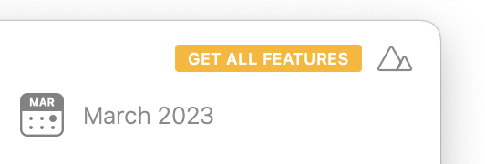
Is there a way to remove “Get all features” from the top right corner of the app? I paid for all of the features I’ve needed, I’m good, no reason to distract my attention with that badge every time I open the app…
and, wait… when did Agenda switched to the subscription model? ![]()
Great release. Now I’m free to keep a separate Agenda window open for each project at work I’m responsible for keeping track of. Massively helpful!
Also @alexander.potemkin they haven’t changed anything, just set an option to auto-renew the yearly purchase of premium features. You still can cancel at any given point and keep what you bought — unlike so many software rental “subscription” apps.
1 Like
@d_chadwick , thanks! It’s came unnoticed…
1 Like
I don’t think that would even make sense for 2 reasons:
- It’s a reminder there may be new features added that you may have missed;
- It’s an incentive to support development, and although I listed this as #2 it’s actually #1.
2 Likes
Well…
-
The original promise was: “buy what you need; don’t - what you don’t”. It was never meant to be “but we will chase you in a way, that you will buy from us”.
-
I didn’t expect and I didn’t have up till now an advertising banner on the tool I paid for according to the original promise. If the promise has changed - please, let me know!
I can see there are plenty of people who are happy about the changes, but I’m not one of them. I’m really sensitive to the change of contract/promise and if that’s the case, I will spend my time setting up Obsidian in a way I wish and adapt it for my workflow everywhere, not only at work matters.
@mekentosj , probably you can comment on my request? Is it a bug and there will be any chance this advertising banner will removed, like it was possible to remove it earlier - once I read the new features and understood I don’t need it for the time being? Or it’s a feature and it will stay there until I pay to have it removed?
It’s not a bug, the Get All Features banner will be shown if you’re not a current paying user.
We don’t feel we break the promise/contract; if you stop paying you get to keep everything you have and can keep using everything you have, that was the promise. We didn’t say, “we will never remind you that it would be nice/good to support our ongoing support and work”. Just like we still will show the Premium batch next to those features you don’t have.
In all honesty, it used to work like this before as well (always show the batch if you stopped paying), and we then got swayed to remove it because of the argument you make, that it fits the model where it’s “free” to step out of supporting the product. But we then realised that we might have gone too far and were basically shooting ourselves in the foot, especially when even good friends of ours were telling they were using Agenda every day, loved the app, were even happy to pay for it, but didn’t because essentially they were never reminded to do so. They basically asked for the changes we made, like either making the payment auto-renewing or even better offering a lifetime option. So we did, in order to ensure the future of Agenda.
With Agenda’s model we have tried to find a balance, one where you as a user aren’t held hostage with the threat to lose all your premium features if you stop paying, and at the same time allow us as developer to generate enough income from the app to make a living and not be forced to abandon the app because we can’t make the ends meet. As said, we realised we might have gone too far with the first that it would risk the latter, and therefore we made these changes in Agenda 17. We feel it’s still a much fairer deal than pretty much all other subscription apps out there, but this is ultimately up to you (and other app makers) to decide for their own.
8 Likes
Your app payment model is obviously way more fair than 99% of the other apps and now you even have a lifetime option. Whoever says the opposite is not being honest: it’s this simple. I would love to see what other app, specially, what other note-taking app comes even close.
4 Likes
Thanks for clarifying that, @mekentosj .
I was happy about the way it was earlier: the banner was displayed with a new release, demonstrating the new features you have. I could check it and close it.
I’m really don’t happy about this very attention-taking banner I can’t remove unless I pay for the features I don’t need.
The main feature for me was goodwill: I could pay if you made something I need or am excited about if I just want to support you and can do it now. But if not - I can keep using things as is.
I can’t now. Really huge bummer.
About the business model: I was really interested if you could keep it up, as it imposed good pressure on you - to keep innovating, making something people want.
The way I see things now - I shall pay just to keep up with what I liked and had already.
For the guys who don’t know other options: I’m really sorry you don’t. They exist. Not as UI / emotionally nice as Agenda, but they won’t keep you hostage as well. I mentioned Obsidian earlier, but many other options exist.
I think this banner seems rather confusing to Alexander than anything else, @mekentosj. But, and correct me if I’m wrong here, nothing’s changed (?). One still can:
- Pay only when they want, or,
- Choose to support with a subscription (and a discounted one, actually), or,
- Choose to pay once and never again.
I think this is an improvement, a big one as well.
If that small banner is so annoying for you @alexander.potemkin then one of the things the devs could do is perform (un)moderated A/B testing, or a survey, to see which version users perceive more positively (with or without a banner), but testing could prove costly depending on what kind of scale they’d choose to do it.
There are ways to tackle this, like:
- Change placement
- (Re)think frequency of appearance
- Perhaps don’t use a banner but an occasional system notification, maybe on the lock screen
Am just thinking out loud here.
Lots of options to go with, not sure are worthy the fuss though, although I know from experience that small changes = big impact. But it always depends on the (nature of) change.
Personally, I don’t see this as a very big deal.
1 Like
I think this banner seems rather confusing to Alexander than anything else, @mekentosj. But, and correct me if I’m wrong here, nothing’s changed (?).
Indeed in the model nothing has changed, what Alexander is complaining about is that if you are not a current user, you get to see this button in the top right corner, while before we would only show it to people who would have never paid.
Perhaps you are right and we could only show it once every say 10 days, where you can then get rid of it if you click it, satisfying the need to be reminded from our side as developers, and still being able to get rid of it as a user who feels he/she doesn’t need/want the missing features. But not showing anything simply puts the balance too much to the latter and simply put, would ultimately threaten the app in the long run, which isn’t in the user’s interest either.
4 Likes
@mekentosj , that’s it. And it muuuch more visible on the dark theme, attracting my attention there.
I don’t think I shall repeat myself anymore, after all: if you don’t like it - don’t use it.
But I will make one more attempt, just to make sure I put it right:
-
This banner on itself was something I liked - it was a notification for something new I can get if I would like to; now it’s something that pushes me to get something, I don’t really need;
-
I used to be completely happy about the product, I loved it and I spread the word about it - I believe it’s precious. Now I’m forced into something, and I really don’t like when someone pushes me into something. Especially, if he/she was not doing it earlier - I consider that as a change of the contract.
-
If I need / want new features - I will search for the ways to get them; if I don’t - I wouldn’t.
-
There are plenty of ways where you keep showing ‘paid’ feature windows - for example, now I have an extra button at the bottom of every note, that reminds me of the new feature.
To sum it up:
- the main advantage of the software, apart from the obvious nice look and feel, was an easy model of monetization - challenging for the developers, but fair and transparent - now, it’s a move to push users to pay;
- from my experience, push works better than pull only on mobile devices, but not in human relationships - if people are not buying, then it’s probably, because you are not delivering something that the customer wants, not because they are not aware - you used to ad new features in every release in a comfortable way and if it’s of interest - people will go ahead and buy it.
The reason I’m raising this noise and spending so many resources, it’s because Agenda used to be my favorite tool and I’m absolutely unhappy about the changes that results in loosing this tool.
If you say you keep it this way - I would understand, it’s your business, your business model, and your call, obviously. I would drift away and definitely won’t look back, as I would feel it as a broken promise.
Just hope that things could return to where it was, when you keep working on something people want, and that is what makes people buy it.
1 Like
It won’t return to how it was, the rationale I already explained, but we’ll try to come up with a middle ground.
1 Like
It’s quite a bummer. Especially the way it was done.
I consider this a major violation of the ideology you originally stated and I can’t understand how on earth users might not buy something they need if they see a gentle offer everywhere. And I don’t believe you could genuinely think people are not buying something they need because they are not reminded…
Thanks for letting me into the notes-taking world, but cross me out from your loyal users, I got a job now: migrate all my notes out.
A pity you feel that way, but best of luck to you Alexander.
1 Like
Just to clarify, our decision to make the badge more prominent actually came from discussions we had with friends using the app. They said things like “I’m never reminded to renew”. So even though they wanted to help us as a company, they realized they weren’t seeing the reminders to motivate them to do so.
In any case, the intention is to remind, not badger, so we will see if we can find a nice middle ground. Occasional gentle reminders.
4 Likes
I guess I will just share this very simple product management book reference here: https://www.amazon.com/Mom-Test-customers-business-everyone-ebook/dp/B01H4G2J1U and this google query next to it.
Thank you for sharing!
1 Like
There might be other ways to remind users to renew.
But if you are getting distracted by the banner, it doesn’t make the change a major violation of the ideology. There are limitations because of the App Store and therefore I consider your statement unfair. You cannot expect a version to be maintained forever. But here you still get updates with bug fixes or changes to run it on a new macOS or iOS after years and still you can use the premium features you have paid for, even though you don’t pay for the app anymore. And you can use new features, which aren’t premium, for free!
There is one change and there will be changes, which you don’t like.
But in the end it is your decision to update the app, even though you have been satisfied by an older version.
2 Likes
Note by the way that we have taken the feedback on board and starting in version 17.0.1 instead of showing it permanently we will only show the badge every 10 days, for at most 5 minutes or until you click/tap the badge to visit the premium features window, whichever comes first. In the end it’s not our intention to harass our users, we just want to remind them.
2 Likes