When all notes are in expand mode it is very hard to distinguish between them. A background color for each entire note solves that and provides clear framing.
With colors I find it hard to please everyone. There would have to be options for individual settings again – very complicated to program for a small improvement, which only few users would need at all – that’s my personal opinion, maybe I’m wrong.
For me, for example, it would be sufficient to show a separate one between two notes: a line, for example. This keeps the interface of Agenda simple and clear.
Hi, Thank you for that.
I completely understand what you mean but it can be simpler.
There is already a background color tone difference to highight the note in foucs.
Let users use the same one as “always on” and it will provide a subtle beautiful separation betewen notes.
Currently, when all expanded there is one long list of them and zero seperation.
It is required though.
All came to this conclusion. From Apple Notes to Google Keep.
I hope it meakes sense for others as well.
We considered all of these options, but decided just to use space to delineate notes. We wanted to keep the design simple and clean. The title is bigger, and there is some space and usually that is enough. It also makes each project feel more like a continuous document, which is what distinguishes Agenda from other note taking apps.
We will be adding horizontal rules for text in future. If it is really annoying you, you could perhaps add a rule at the end of each note. You may already be able to come up with some symbol that closes each note, giving a clue.
Kind regards,
Drew
Fair enough. There is no one “right” way of doing things and I respect your approach and what you have done so far.
If you DO introduce some sort of subtle divider, please consider of doing so also on the timeline size. Days fuse into each other and it seems like a one long list of days represented in bulk text where reminders, events and the next day are all fused into one continuous block of text - sometimes illegible.
I hope I do not overstep with thexe statements.
I write as I care about this product and hope to see it grow.
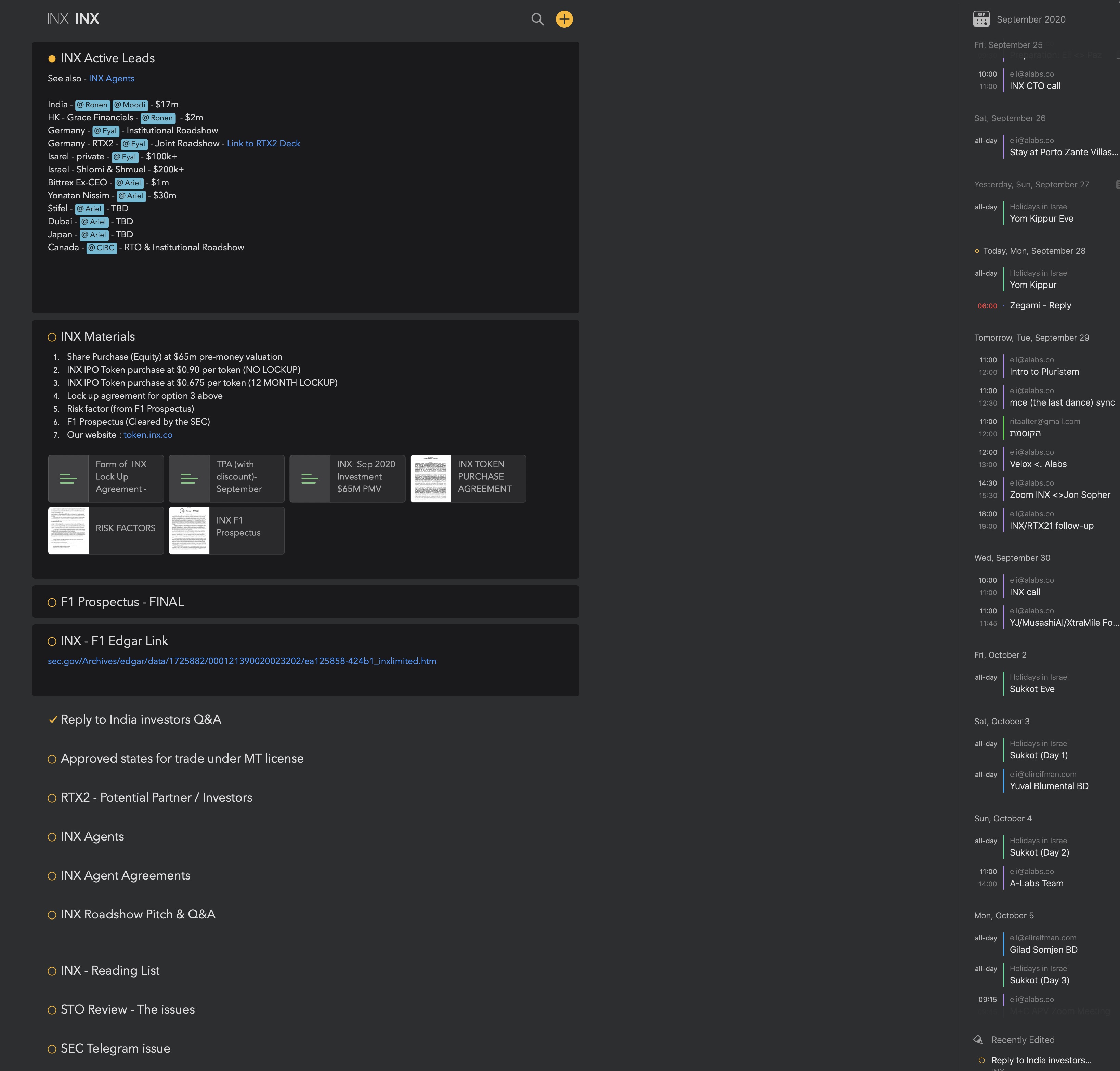
BTW, you have probably done so without intention, but you do provide a note background color for notes pined to the top. Just wanted to share with you this view from my screen and why I love it so much:
!Indeed. Again, we will unlikely introduce some default background for all notes, that goes against the idea that a project is similar to a single long scrollable document of your notes. However, we might add more options when it comes to “highlighting” certain notes with a background color, like we do for pinned notes indeed.
Thank you.
I think it will be great to have an option to highlight certain notes to visually be able to lock into some more central notes.
Thank you for addressing my comments.
It is highly appreciated.
Sorry to bother,
A note export to Spark mail does not work.
Neitehr note nor PDF export.
Is it a known issue?
Thanks
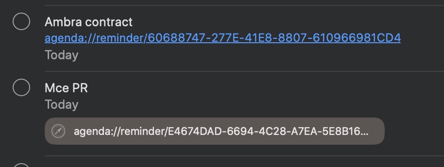
One more thing, when setting a reminder, the link goes into Notes. If the Agenda Link will go into the URL field it will create an immediate clickable link and will take much less space. Please see image, the first is the regular link, the second is the URL link:
A note export to Spark mail does not work.
Neitehr note nor PDF export.
This is best to take up with the support of Spark as we use the standard Sharing possibilities of the system and it works with other app.
Regarding the clickable URL, we are looking into this as it might have finally changed for iOS14, but so far this has proven to be complicated due to how this was previously causing sync issues. See URL field and Reminders
The idea of lines is appealing and enough - this would be great.


