I been posting a lot lately but I like to post my ideas fresh when I am using the app.
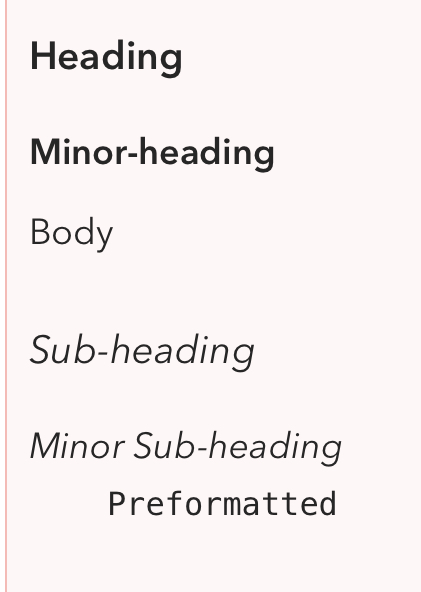
While using text formats I noticed that there\s no much distinction between the formats. A body looks close to the minor sub-heading and the title looks close to a sub-heading.
I think it’s better for the eye to have more clear difference in text size.
The differences are not huge, but I think generally visible. The use of extra line space also helps distinguish a heading, for example, so it is not just about font.
You also have to consider we are working with a stream of notes in our interface, which I don’t think any other notes app has. So we have to make sure the headings etc do not conflict with the note title and other UI.
We hope to offer control over styling in future, so you can choose your own look.
We want a project to feel like a single page rather than a series of boxes. I talk about how we tried that in an early alpha of Agenda in the video in the below post in case you’re curious
It’d be awesome to have control over it. The main point from having different formats (headers and sub headers) is to distinguish importance. Right now looking at the screenshot I uploaded I really find it hard to distinguish. I think the distinction in formatting should be very clear to the eye.
Thanks a lot for replying. I really enjoy using the app. It urges me to write.