Hello there,
I know that custom text format is something that you plan to do someday (with colors, font size etc…) but you already have a really useful set of “Styles” that, in my opinion, could be drastically improved.
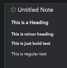
Your heading style is just too similar to the regular one and I really can’t understand the line-height logic with different styles.
Why there is more space between two regular paragraphs compared to the line height between the minor heading and the next paragraph?
I think that the Heading should be bigger. It’s really too similar to regular bold text.
For the same reason of the previous point, the minor heading is just the same compared to bold text and I really can’t tell the difference.
In understand that implementing a custom format could be difficult but improving the default styles should be a priority to start having better notes in a short term.
Thanks!
Edit:
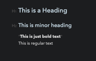
Take a look to Bear for example.
same font used in Agenda but the bold looks bolder (especially in dark mode). Really useful to notice the difference compared to the regular text.
The heading is much bigger compared to the regular paragraph. And the heading doesn’t even looks bold as much as the bold in paragraph. Really clean and smart choice.
In dark mode, it’s even harder to understand the difference between heading and regular text. They chose to have a different color for headings that is just a different shape of gray. Really clean choice again in order to have a clean note.
The problem is that if we make the Heading (H1) bigger, it starts to compete with the title and in turn we would now have to make that one bigger. Instead, try to think of the H1 from Bear as the title in Agenda, and H2 of Bear as being comparable to the Major Heading in Agenda. The fact that bold text is comparable to a heading is just fine in our opinion as often people will just use bold text as a heading, it’s which ever you prefer really. Also, you also still have the italic subheading variants if you prefer a different style.
I understand the problem with font size compared to the note title but I think it could be useful to have a different detail for headings like a really soft color change like Bear especially for dark mode.
It’s almost imperceptible but it really improves readability… don’t you think?
I understand the issues with the various font sizes, but it would be nice to be able to set the color of the text, this would help identify updates to an item that has been around for months and you get updates only every couple of weeks. I would also provide the ability to highlight a priority with RED text or a color different than the gray