Enhancement feedback on color feature & title, text styling

Thanks for updating the community & creating this color feature for us! I’ve been using this feature for a while now, and I’m loving it. I love the fact that we can use the colorpicker to choose our own preferred colors!

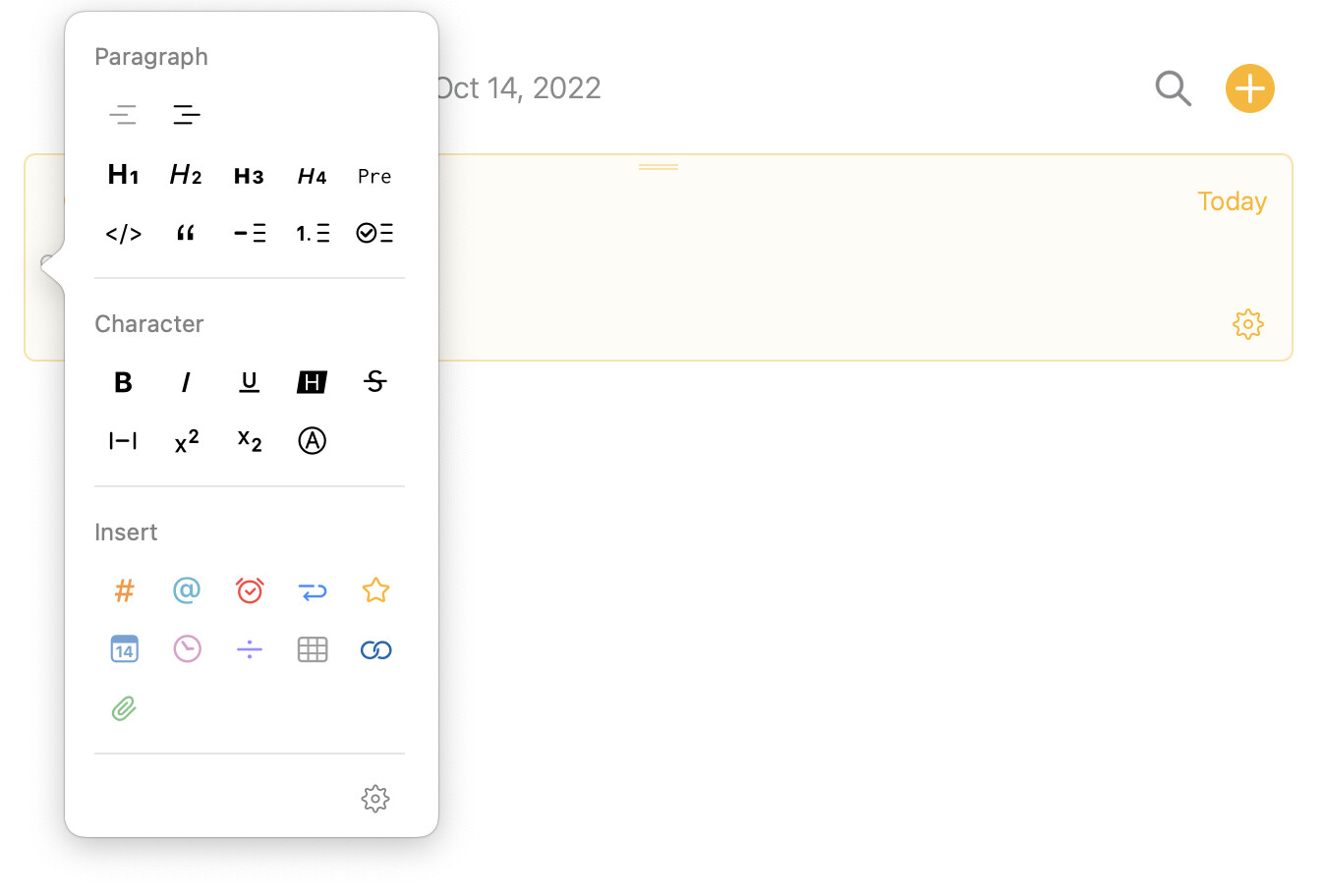
One thing about improving the user experience is that it takes a bit more steps (it takes around 3 clicks) to actually finish the color feature (highlight text or change text color) using the little dot panel ( see attached little dot panel.jpg).

As a user who uses this feature a lot, I’d like the color done more easily and quickly.

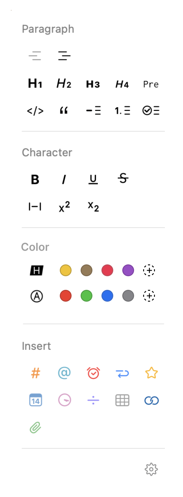
For example, perhaps placing the text color options below the "character section” as a new section, in the panel which shows up after clicking the little dot next to the text (see attached Little dot panel (color section).png ).

I can tell from Preferences in the Settings that the team is trying to give us more opportunities to customize the app interface based on our own preferences which is a really great idea. So another idea on customization I have for the little dot panel in the text is that maybe the team can think about allowing users to “pin their own most commonly used features” somewhere (e.g. at the top under the project title?) in the main project interface. (see the attached Pinned Tools Bar.jpg)

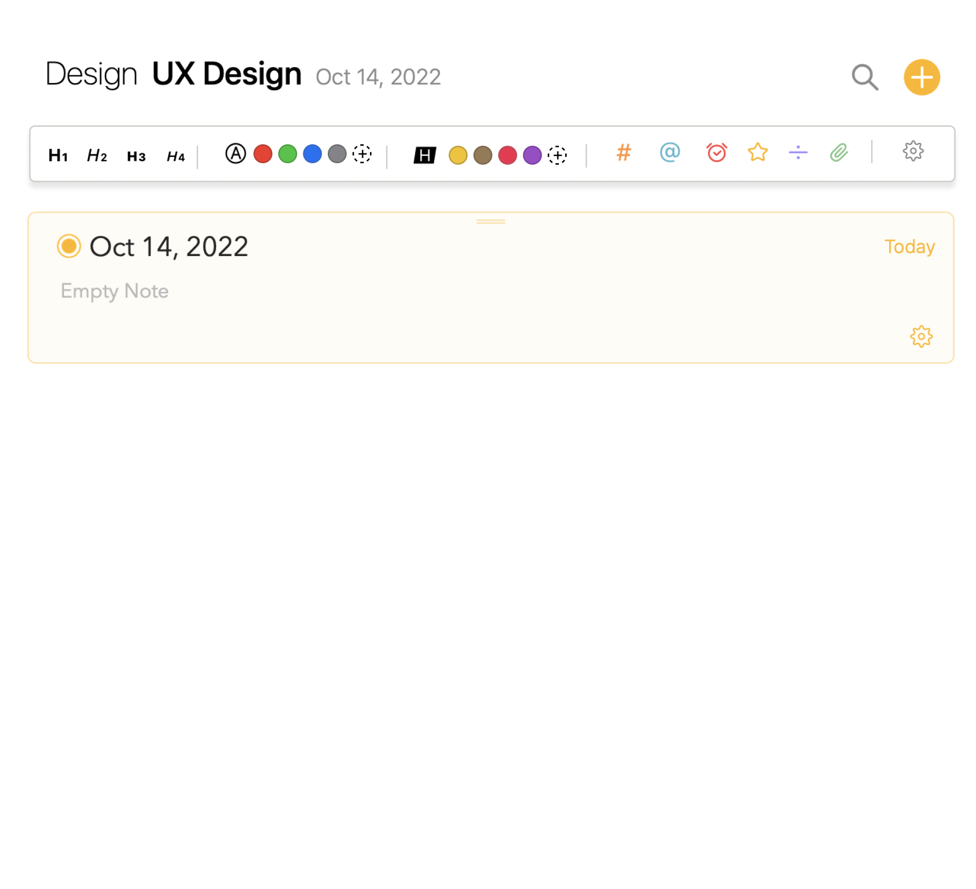
The pinned tool bar is obvious and the pinned tools are easily accessible so users can be more productive on note taking, which is exactly what this app does: be more efficient and productive on note-taking.

This could be a useful tool and a premium feature I believe!

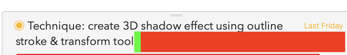
Another thing on the user experience of editing note title is that sometimes when I click into the Note Title area it doesn’t activate the text field. It’s only when I click into the last aphabet of a word in an existing title then I can start editing. I find this quite annoying because every time I have to move my cursor right next to the last alphabet (green box in attached image) to activate the title field to make changes.
I think for better experience the white space in the same field (red box in the attached image) should also be activitatble.

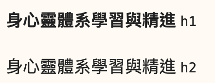
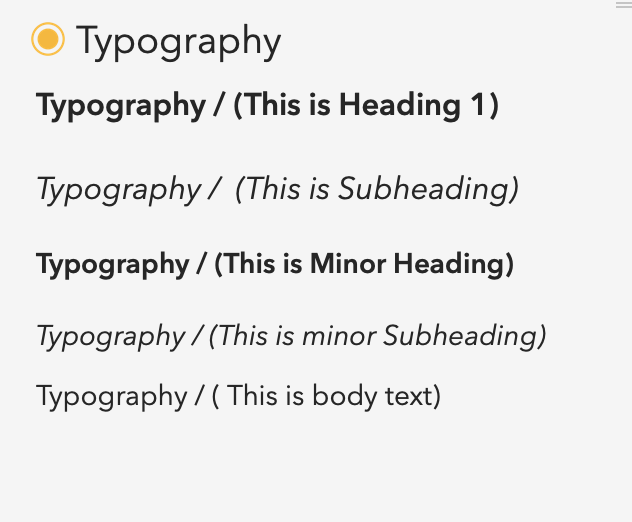
One last thing I’d like to provide feedback is the text styling. Currently the heading, subheading and body texts are pretty similar in font size so when in a large content, the heading and Subheading cannot stand out, so do the minor ones. (As a user, I’d like to see a clearer contrast among them (in terms of font size) so there’s a more obvious visual hierachy for lengthy text structure) (see the attached text styling.jpg)

Thank you so much for reading this! I hope my feedbacks as a user experience designer are useful to you. This is still an amazing app and I enjoy the app very much!

Thanks for the feedback! Very detailed analysis.

As you know, design is an exercise in compromise. Do we add a bar for text formatting and clutter the UI, or put it behind a button? That type of decision.

I like some of the designs you are presenting, and we’ll certainly take them on board for future discussions.

Really appreciate your input. Thanks!

1 Like

I would suggest the same items to make the headings more clear among each style, as a Chinese user the H2 is not work as well as you planned for English. The italic style is not work in Chinese characters that it makes us hard to read the differences between H1 and H2, as well as H3 and H4, see screen cap below.

From my points of view, it would be better to use not only font style blod or italic for each heading style, but also we can have some options to customize setting. For example, to fixed the font-size but varied by each, h1 will bigger than h2…, as I do love the simple and clear of Agenda UI/UX, and then I can set the font style like bold or italic.

image

1 Like

If you’re willing to spend 7 dollars, I posted about a cool utility yesterday that greatly simplifies adding color to text, hilite colors to text and pretty much everything else.

It’s callled Paletro and it an Alfred-like command palette that focuses solely on making every menu item in an app (Mac OS) complete accesible by simply typing a few letters in the menu name.

I too love the new color features and found it cumbersome to repeatedly add color to text. Same with hilighted text. I’ve been using it all day today where I collorize multiple different text blocks with different colors in each note and it’s a breeze.

To colorize text I simply type my shortcut for accessing Paletro (which is option-A, but yours can be anything you want) and then type the letters “te” a space and the letters “col" and the text color menu appears. Return and then the first couple letters of the color I want and it’s done. If I want a custo m color I type cu and the custom color picker pops up. The great thing is that it remembers your last choice so if I want to add custom colors repeatedly to differenet color sections you just go through the above once, and then next times just type option-A to access Paletro and you’re ready to apply the custom picker to the next one.

It works identically for hilighting text. Absolutely every Agenda menu is included. Also you can just start typing the name of one of your categories or sub categories and it will either add a new note to that category or move the current note to that category, depending on which you choose.

Pretty cool and well worth the $7 if this is something you are doing a lot.

Here’s the link to my post which includes the link to the App

Agree on faster access to colour format.