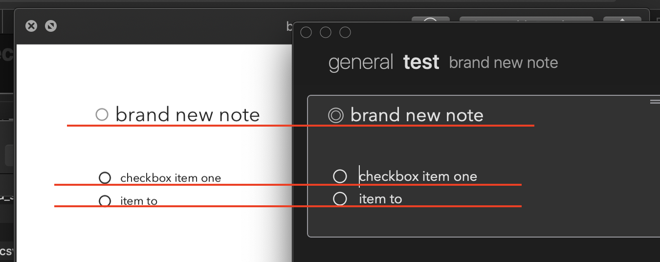
what title says. i can adjust (unnaturally broad by default) line spacing inside the Agenda app, but when i export my note to .pdf i get that outstretched formatting again. it’d be awesome to get exported text similarly looking to the original note.
Is this on macOS or iOS? They have quite different approaches to making PDFs.
it’s on macOS Mojave, latest Agenda app
Currently we only support keeping the same spacing as in the app, down the line we’d like to add more options when it comes to printing.
this is what i expected — pdf would have the same line spacing, but it’s much larger than in the app
Are you sure it is actually proportionally larger? One problem comparing screen with printed output is just that often the screen has a higher resolution. Eg. text appears bigger printed out. Is the line spacing the same size relative to the text, or do you think it is still relatively bigger than the text?
I think the scale on the paper is a bit different. Difficult to avoid that. If you print out a note from Apple Notes, you will probably also find the text looks much bigger than on the screen.
This is a big issue for me.
Whenever I export a document—be it PDF or other format, even if I just C/P into Pages—I always have to correct line spacing to 1 so that it’s properly displayed.
Export is heavily borked, and it’s very frustrating. I can’t export a document to PDF without having to correct line spacing afterwards, else all documents would have these gigantic spaces between paragraphs.
Please fix this!
PS: I’m having this issue mainly on iOS as I don’t use the Mac version.
We’ll see if we can offer more options in this area, thanks for the feedback.
Beauty is in the eye of the beholder of course, but I’ve had many people comment very favourably on the looks of pdfs generated by Agenda! Elegant is a word they often use.
Admittedly I generally create short briefing notes, 1 to 3 pages, rather than long reports where a denser layout may work better.
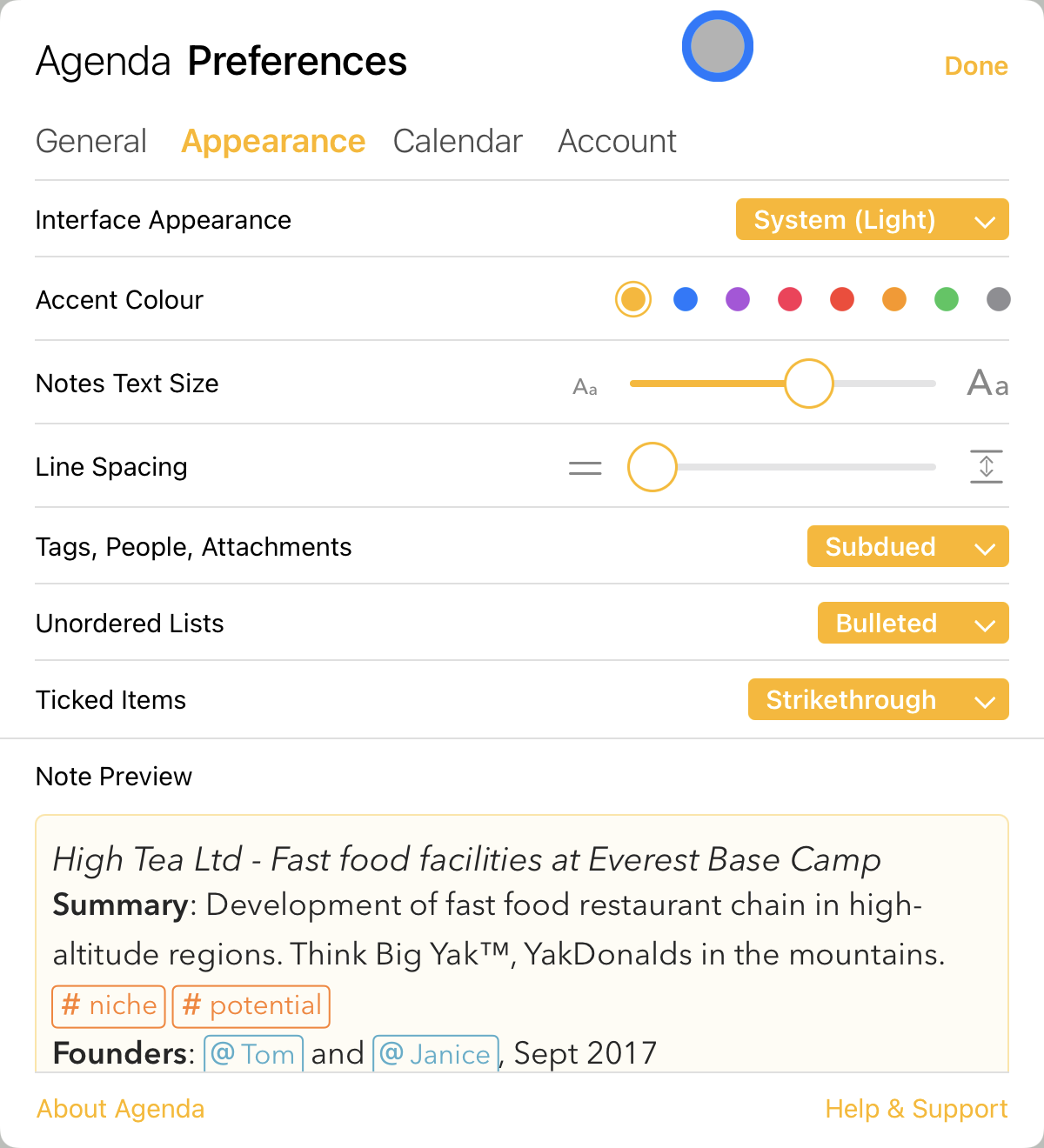
Thanks for sharing that, indeed we would not change the default but rather add the option to adjust in the print dialog if so desired. @SNH out of interest, what are your linespacing settings in the Agenda preferences under the appearance tab that you use, are you using something different than the default there as well?
These are my settings:
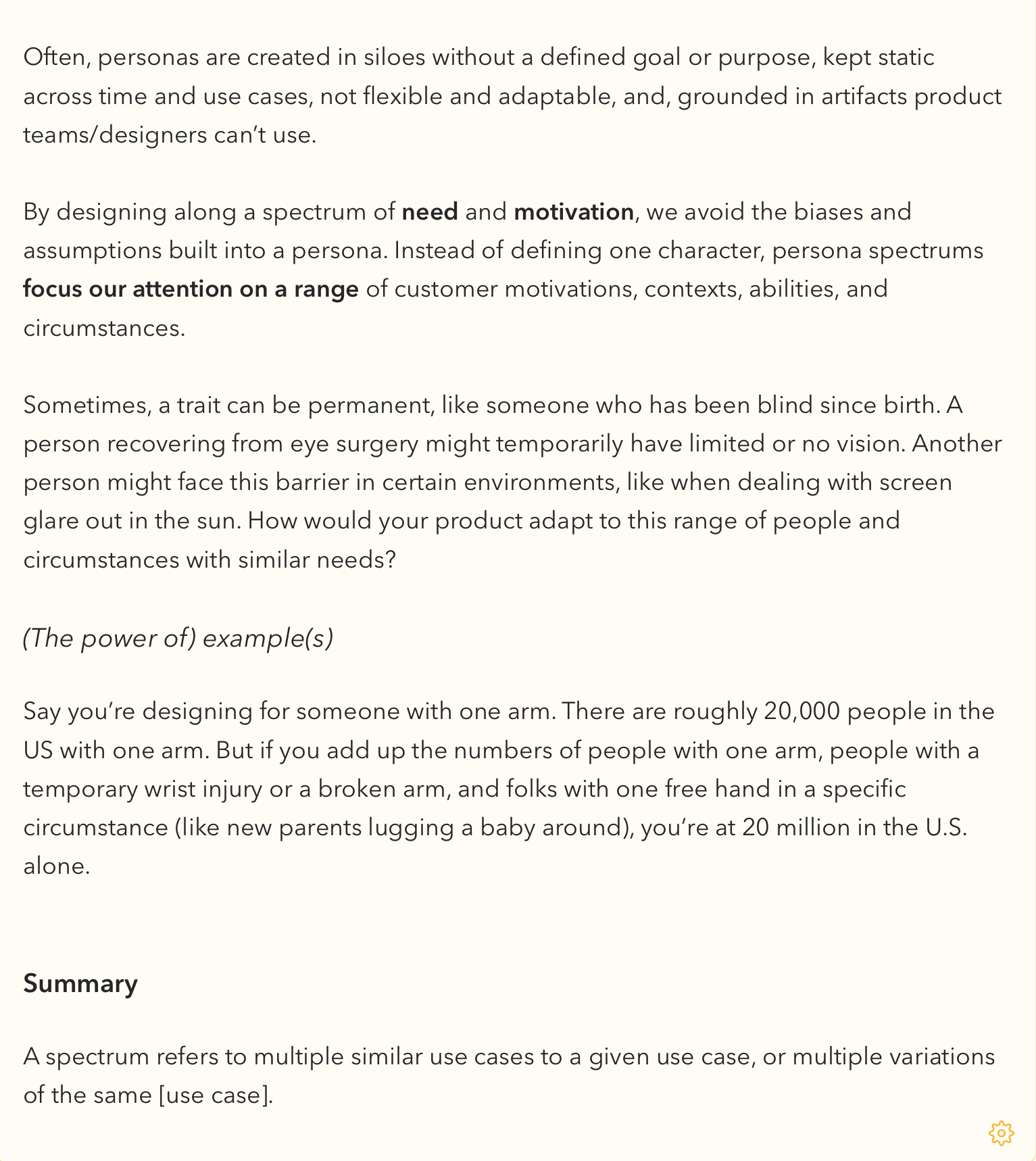
An example of how I like to style my text:
But when I export, the gaps between text are at least 1 extra line, and I need it to be a 1:1 result as seen in this document. If I would export this what would normally be for maybe 1, 2 pages would stretch to double the amount thanks to bad line spacing.
Thanks for sending that, that’s helpful, we’ll make a note and see if things can be improved.
Any ETA on this? Because export is borked, and I work with PDFs mostly, I was forced to stop using Agenda and go with alternatives that handle export well, at least until this is fixed.
I miss using Agenda, but I simply cannot use it until I get PDFs exported 1:1, or WISIWIG.
This would be useful for me too. One option which might make sense is allowing users to pick their CSS for printing, like Taskpaper did (does?).
This way users can self serve on changes and more hands on community members can share their creations.
Thanks!
It can’t ever by 1:1 or WISIWIG really, because we don’t have a WISIWIG editor. It is not a word processor, which preserves layout. It is a note taking app, and the layout changes on every screen, and even if you change the window size.
Of course, we would like to improve printing so that it generally works well, but it will never print like Microsoft Word. I would suggest copying content into a WISIWIG editor if you need that much control over output layout.
What aspects of the PDF layout would help the most? Control over font size? Line spacing?
I believe task paper is a markdown editor, which means it generates HTML. This is why you can style the output with CSS.
Agenda is not a markdown editor. It supports some markdown shortcuts, but text is converted to styled text. I think a better solution for Agenda would be style themes, both for the UI itself, and for printing. You could pick the theme you wanted, and perhaps make your own (eg choose fonts etc).
These themes are certainly in our roadmap.
After I got tired of constantly having to copy/paste my text into Pages and fix line spacing for a proper export I went with Bear Notes app, which also isn’t a WYSIWIG but a Markdown editor, and export works flawlessly. There’s lots to learn from them 
I’m not asking for Agenda to be anything like Word, but if other note taking apps can handle export well, which is quite an important part (well, depending on use cases anyway) of certain workflows, then why not Agenda?
Of course, I’m not aware of your intent with the app, and I wouldn’t want it to steer from its original course, but export, c’mon, export really could be improved.
If you want, I can post a sample PDF of how it exports now, how other apps export (I can use Bear as an example), and you’ll also see that a lot of Markdown features aren’t exported well in Agenda compared with Bear, one example are horizontal lines.
But my guess is that Bear is not giving you WYSIWYG, right? The note on the screen looks different to what is printed. That was my point.
What are you talking about? We have had PDF export from day 1. Free too (unlike Bear).
As far as I can tell, you dislike aspects of the PDF export. By all means point them out, and we can try to improve them. So far, the only thing you really mention is horizontal rules, which were added much later and could use some polishing.
Instead of spouting this, come up with explicit things you would like to see improved. Because I use PDF export a lot myself, and it is far from “borked”.


