‘We’re not a word processor’ reads as a rude response when talking about accessibilty features, a simple choice between 3-4 varied fonts would be preferable to a ‘take it or leave it’ approach. Some of us users find the default font difficult to read.
3 Likes
I agree in the point that the font might be not so easy to read for some users.
Well, for me more a question of taste, I don’t like it and would love to change it.
Between a word processor app like Pages or 1AWriter and on the other side Agenda with some additional text design options is a still a huge difference.
In Agenda we work with text, sometimes a huge amount of text. Notes are “made” of text. In my opinion it need some more options for the optical change of text (color and font).
1 Like
I just want to chime in so that this topic might rise a bit on the Agenda agenda …
I also dislike Avenir here (and the typography in general in some details (italic titles)). It has too large ascenders for my taste and is generally too thin. I like the typography choices and options of the Bear Notes app. It is a set of different distinct fonts and it has some important settings to adjust spacings.
And I think this is a rather important feature - it touches accessibility and usability for everyone at the core of a notes taking app: typography!
I think note taking apps are something very personal and so it would surely be beneficial for users to be able to adjust certain key aspects of the typography to their taste and habits.
I am actually considering settling with Bear because of this. Though I really love the Agenda pricing model and your interaction with the community … tough choices ^^
Cheers
2 Likes
What I meant with “not a word processor”, is that we will not offer extensive font manipulation options, especially not in a way where you’d determine the font and size on a per title, paragraph or word level. What we do have on our own wish list already for a long while, is exactly what you describe, to add the choice to pick from a few different options that would cater to most. Unfortunately this is where it comes to priorities, 24hrs in a day, etc.
So, in summary, yes, we will add the possibilities to pick a different font at some point, but we can’t yet promise when.
1 Like
Hello!,
I just came back to Agenda because of the new set of recently added features. I am happy to be here!
I bought the premium package back in December 2018 (which I don’t regret since I really like your business model of allowing us to keep the premium features we “catch” forever) but I am quite sad to see that there is still no movement on adding more fonts.
I would be good with Arial, at least it’s more readable and the font sizes are more distinguishable.
You mentioned that font change is in this list however I can’t find it. Is it under Accessibility improvements?
Thank you,
MJ
1 Like
Good to have you back MJ! For Agenda 14 we’re making quite large under-the-hood changes to the text editor that are also needed for supporting more fonts, something still on our todo-list for a following update.
2 Likes
Thank you for letting us know! #exciting
1 Like
I hope you might consider the Amazon Ember font. Absolutely beautiful. Bold one is perfect for headings and light one is impeccable for the rest.
Dark mode sample:
Light mode sample:
1 Like
Given it’s Amazon’s “brand” font, I don’t think they would allow us to distribute the font alongside the app.
Just purchased the premium version today and the first thing I wanted to do was to change the font, but unfortuantely it seems this isn’t possible even after almost 4 years of the first post here.
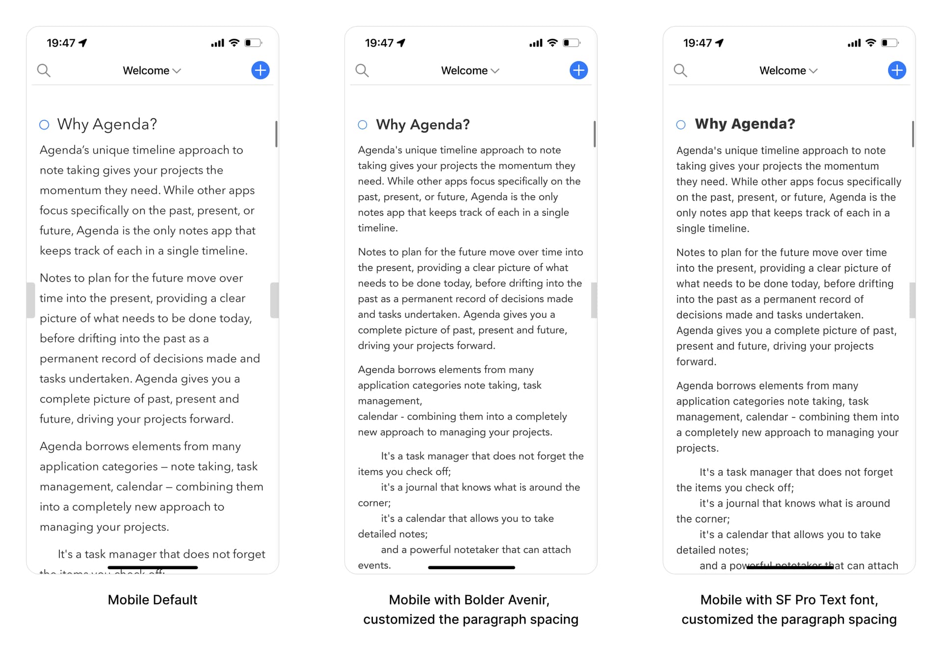
Like others said, I don’t like Avenir, and somehow I found I dislike the Avenir font in Agenda more than in Bear. Then I wondered what would other fonts look like in Agenda? So I created a few mockups for both the mobile and desktop version of Agenda, and now I know why we don’t like Avenir in Agenda in some extent …
Here let’s take a look at these screens:
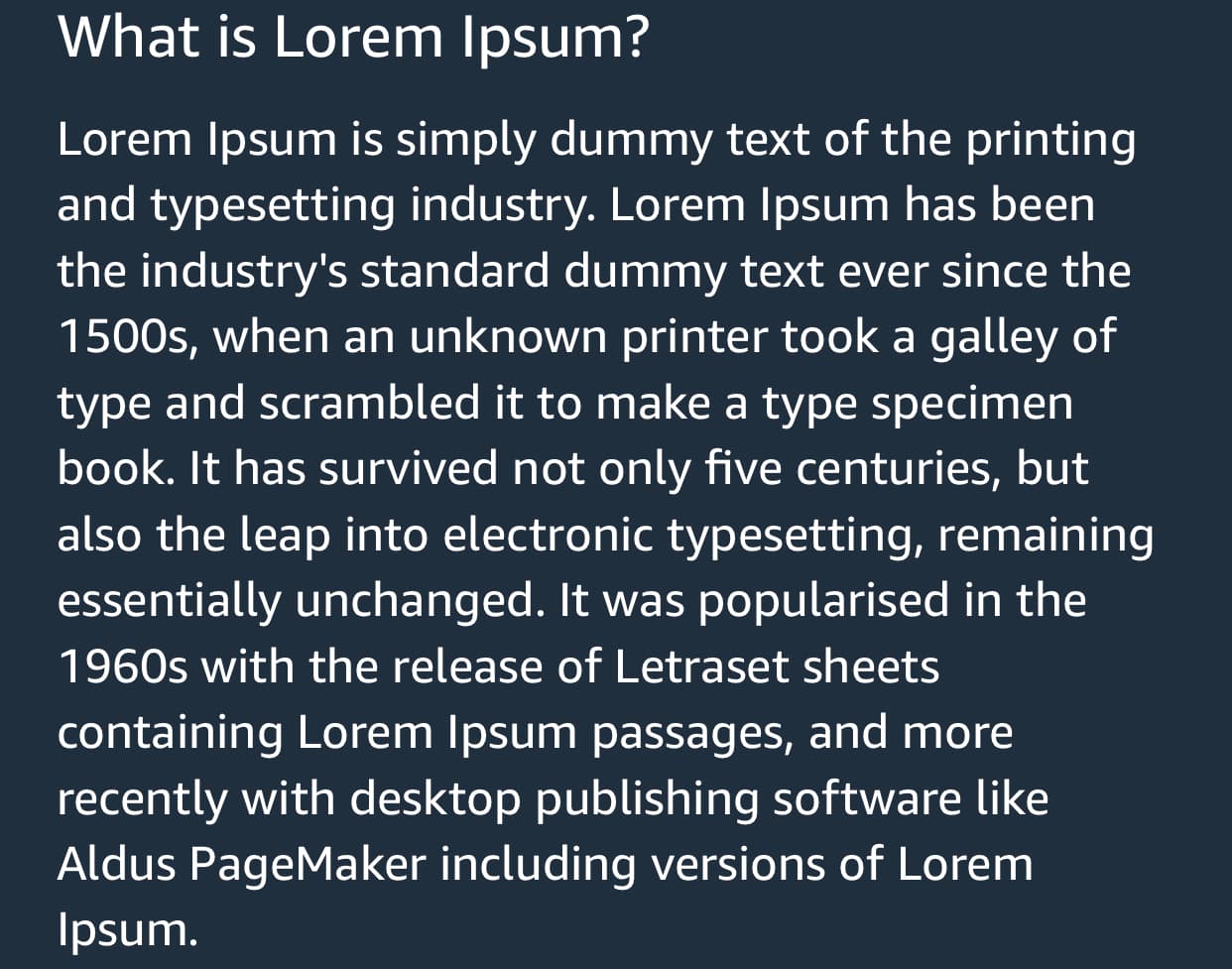
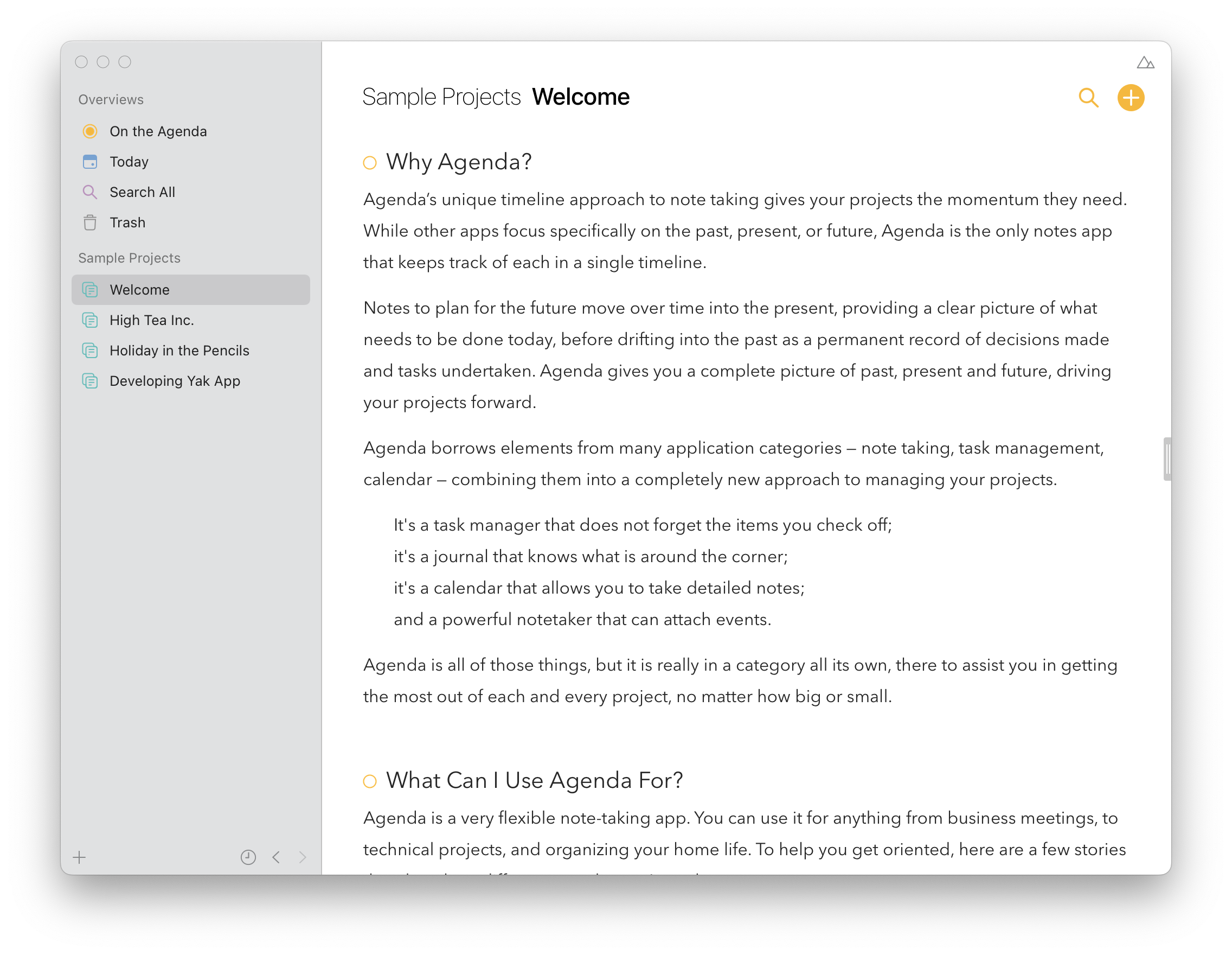
Desktop Default
Desktop with Bolder Avenir, also customized the paragraph spacing
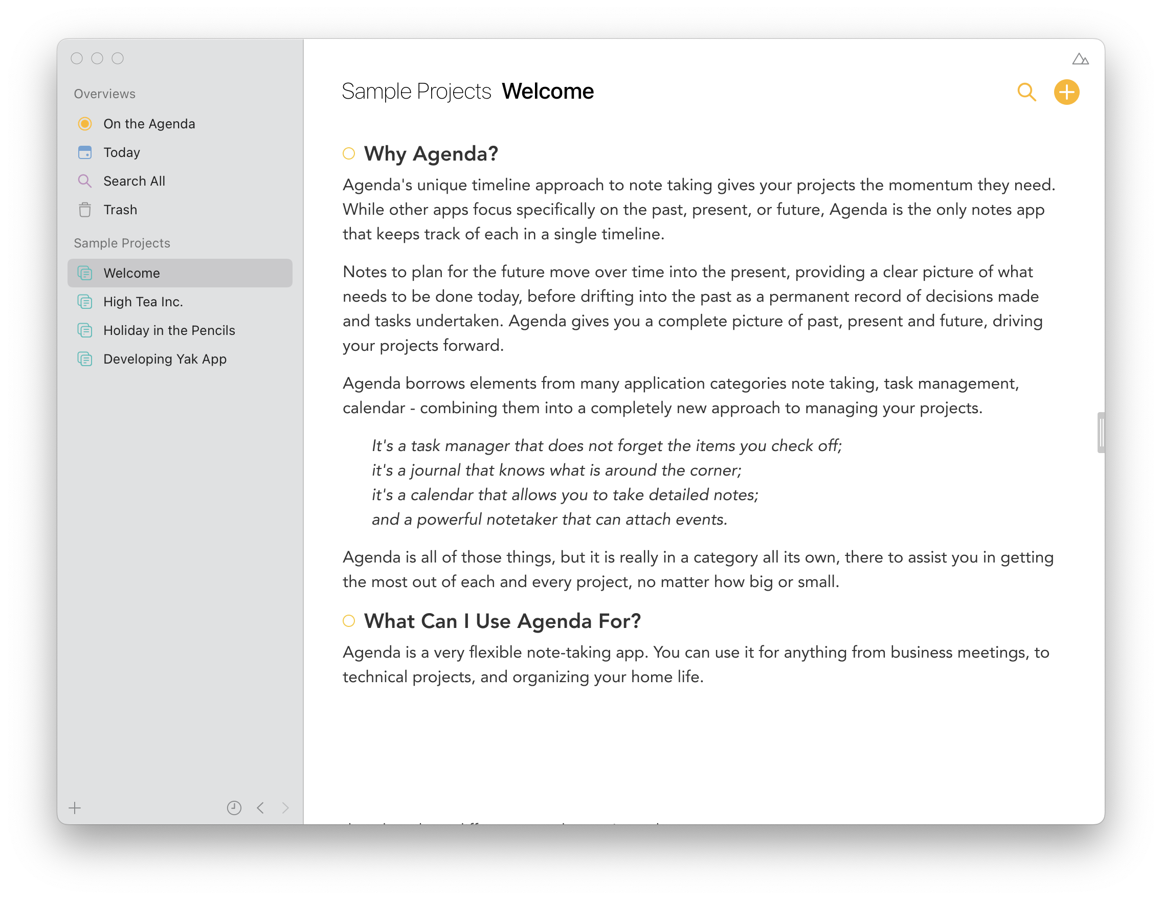
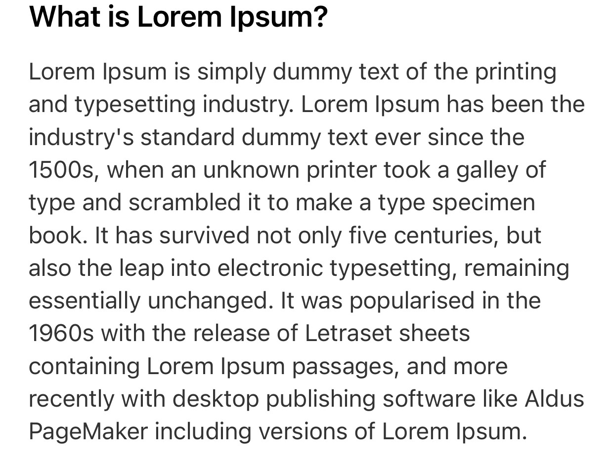
Desktop with SF Pro Text font (Apple’s default font), also customized the paragraph spacing
Ah new user is only allowed to embed 3 images in a post, so maybe I’m gonna post it in a new reply below.
Mobile Comparison
Conclusion
Personally I think it’d be great if we can have the option to change font, and to be honest it should be a quite simple feature to add from my experience; if for some reason you don’t want to add that feature, please try spend sometime on the default typography optimization.
Anyway, thank you for making this awesome note taking tool!
1 Like
Thank you for the work you have made to show Agenda in a different font.
I agree 100%, the option to use a different font is important and needed.
Yes, we still want to add this even though we don’t see it as the one thing with top priority right now. Personally of the options you show I like our default most, and I also think there’s a factor of getting used to it if you just switched from another app (you then tend to make the new app look as close to what you’re used to). But again, we see how everyone can have it’s own preference so we will get to it sooner or later.
1 Like
I’m afraid you couldn’t be more wrong, changing the font touches literally every aspect of the app, it’s definitely not a small project.
To be more specific, the request here is to change the font in Notes instead of the entire app. Correct me if i’m wrong, of the entire app Avenir is only used in the notes whereas everything else is System.
Unfortunately the weight choices in Agenda is not accessible enough. The light Avenir is too much of a strain to focus on. I have to increase the text size to make it bearable but it’s still a strain.
I also moved away because of the font issue and returned because the agenda workflow isn’t available in any other apps.
I really hope this is prioritised - a note taking app should be first and foremost accessible to read and write. I’m disappointed there has been no progress on this in years. Accessibility should be prioritised despite it being minority request - in this context the core feature of the app is not accessible enough as voiced by others and myself. I can see Accessibility is in the roadmap - will this include font weight?
At a minimum, I would like to see the font weight for Avenir bumped up. I can’t see the complexity in doing this. Avenir is only used in writing notes. Wouldn’t it be a case of reviewing the font choices in notes and updating them?
There are only 6 styles including body and note headline + character permutations like bold, italic etc. You could copy Notes.app to begin with?
That’s correct. And yes, as said we would like to offer more font choices. Which might not per se mean choosing all possible avenir font weights, but instead could mean you simply pick one of the alternative font choices that has a thicker font weight.
4 Likes
Yes, that would be ideal.
1 Like
I couldn’t agree more about the choice of Avenir. It is a very particular font with a distinct style that, to my eye, is ugly and also difficult to read (for my middle-aged eyes – don’t forget about your older users!). The system font would be far preferable and ideally a choice would be perfect. The use of Avenir for me is a deal-breaker, as others have said. Thank you.
1 Like
I also find Avenir displeasing, I think the reason for that is it a geometric font which looks good for titles and headings, but in abundance gives the impression of reading the google terms of service. I just purchased a year subscription to try out Agenda but I am mildly regretting this at the moment. I noticed this has been on the agenda since ’18. Is there some major blocker to this happening? I would have thought the entire interface inherits from one configuration for the default font.
1 Like
I know I would love to experiment with other fonts in Agenda. I’m a little weary of enabling font selection though, as Avenir has been an important part of Agenda’s personality for a long time now. The system font would give a rather bland look. And once it is possible to change the font, it won’t be possible to take the option back, even if in the end it is detrimental to Agenda…