Hope this is the right place to post this. I just updated today and am noticing some issues I thought I’d report on:
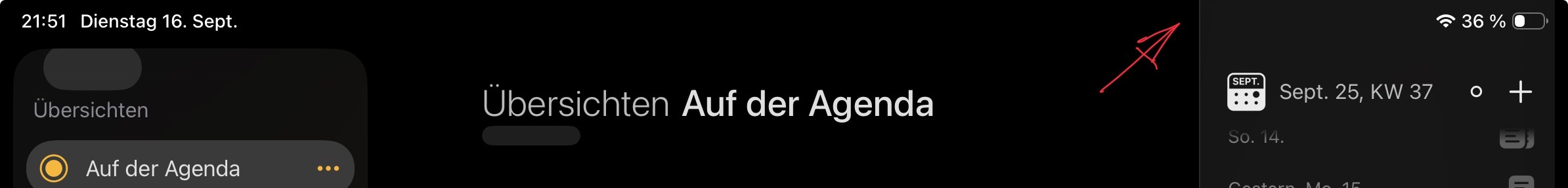
The Agenda Community button doesn’t seem to work (clicking it does nothing, doesn’t open the community window)
When my Mac automatically switched from light to dark mode, the “Ask Agenda” pop-up didn’t change (although the rest of the app did). The Ask Agenda pop-up remained white (light mode), with the text in the input field changes to white. Restarting the app while in dark mode fixed it.
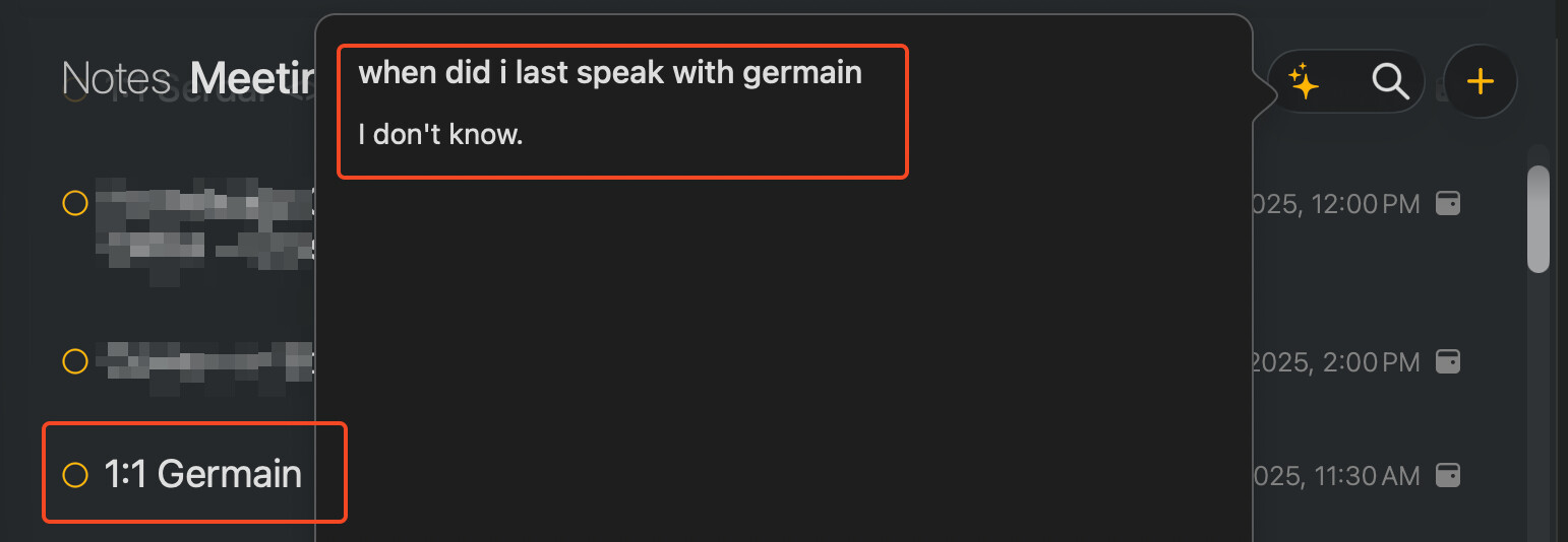
Ask Agenda itself could use some tuning. I can find some general information, but questions like this one either return no results (even though there’s a note about that recently as shown). For others with who I have 1:1s, if I ask “when was the last time I spoke with Mike?” it displays 1 result from July… but I’ve had one every week since then. Am I using it wrong? The proper results do show up in the search though (using the magnifying glass right beside Ask Agenda)
I love the refreshed look. It works with iOS 26! It’s just that the UI needs a bit more thought. On iPhones, the navigation sidebar items are pill-shaped. On Macs, they are rounded rectangles. The height of glass buttons and pills are the same on iPhone, but not so on Mac. (The Agenda community button is also in a weird position).
It’s strange, but the handles for collpasing sidebars are gone on Mac too.
Also and finally, I’m in a region where Apple Intelligence cannot be enabled on any device. Please find a way to detect if it’s on. If not, hide the assistant button. Or, add an in-app option to turn off the assistant.
Thanks for reporting the community button. Had not noticed that yet.
We have also noticed some switching issues with color. Need to work more on it. (literally everything has changed in this release)
Ask Agenda certainly has limitations. We wanted to get a foot in the door, but the on-device LLM is underpowered. We don’t actually give it the date info about the notes. Perhaps we can include that too. In future, you should be able to do a lot more with it, perhaps even automate some stuff.
Ask Agenda is slow, yes. Again, it is a very limited LLM. It can’t fit in all your notes. So we first have to dissect the question, do many searches, get best note candidates, and put those into the LLM. But the real slow bit is just the LLMs we use along the way. They are slow by nature, and the on-device one is particularly so. That will get better naturally over time.
Note that some differences between platforms are deliberate. And a few things you mention have not changed. Eg. the Mac grips work the same. They appear if you hover over the split.
Ah, ok. Consider this some customer input that date information (including the time) is important for my AI assistant in Agenda to really excel, my notes are all date and time based afterall. Thanks for explaining the speed; you’re on the cutting edge with this implemented on day 1; looking forward to seeing it develop.
Amazing work through, Agenda 21 feels fresh. I know the 26 releases were a huge lift for devs just on the front-end alone. Really well done! I’m not even looking UpNote’s way anymore! (See what I did there?
The right hand one cannot appear because it’s blocked by the scroll bar. Also, sometimes behavior when resizing the window gets very, very weird. And you cannot move the window by dragging the top of it (it might even drag the note…), only dragging the navigation sidebar works everywhere. Maybe it’s best to set a safe zone on the top of the window, so one cannot mis-interact with the note underneath when trying to move the window by dragging the top.
Thank you so much. Please have some consideration for harmony in layout and strike a balance between that and accounting for the differences across platforms. I have to say, the top right corner looked much better before the upgrade — but the general design update is awsome. Very appreciated. Thank you.
So what am I seeing there. It looks completely broken. Is that right? Does restarting Agenda help fix the related panel on the right?
I’m wondering if it is because you have the scrollbars visible permanently. Perhaps you could test by turning that feature off and see if it still has the issue.
I can’t fully tell what each video is showing, but I think you might be showing that there is text that you can’t get to. That is a bug, and think we have a fix. For now, switching to another project and back fixes it.
Can confirm: if I set scrollbars to display “always” the handle doesn’t show up, and if i resize/hid it I basically can’t drag it back in. Setting it back to automatically show/hide resolves the issue in realtime without restarting Agenda.
Similar here. With time line closed, decreasing the window width from near full, to where hills and new note buttons meet is smooth, after that, ‘jerky’. With timeline open, the buttons don’t converge and is smooth all the way.
Both side panels are much smoother. Even a quick drag of the timeline is smooth. I noticed that if you close/open projects list via ⌥⌘S the side bar handle doesn’t re-appear.
I can confirm that in settings, I have scroll bar set to auto. The scrollbar does not automatically disappear. Might be a bug with MacOS 26, but that needs further testing to prove.
Also, the other issue was that the content width doesn’t adjust to the window width. Please see this video for the current behavior. I can confirm that it doesn’t fix itself on restarting Agenda.
Also notice how the selected & highlighted yellow project names don’t go back to black on switching away.
That looks completely wrong. I don’t see anything on the right panel, there should be no scroll bars, and the content in the middle should be centered.
Can you try deleting the app, emptying the trash, and then installing again from the Mac App Store? Your data is not stored in the app so is safe.
Can you guess what buttons they might be? Sometimes there are things there. Eg. when you change the order of notes by tapping the project title at the top. Perhaps that is what it is.
Can you experiment a little, switching projects, and see under which circumstances they appear?
 The proper results do show up in the search though (using the magnifying glass right beside Ask Agenda)