Hi,
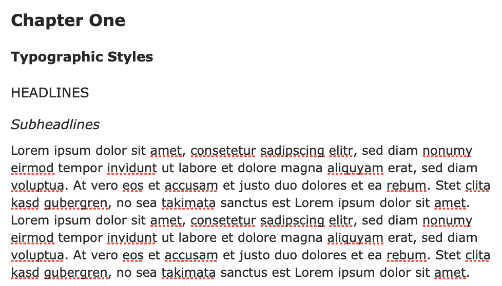
in my opinion the differences in rendering H1, H2 and H3 in the text editor are too small.
I’d like to have larger fonts that make it easier to navigate in longer texts. Editable fonts would be best, IMHO.
Thanks & Cheers Tom
P.S.
Great App! I keep it open all the time on one Desktop/Space.
Great to hear you like Agenda so much Tom. We have no direct plans to change this but down the line we might offer more “theming” options that would give you more control.
I have especially problems to distinguish level 2 and 3 headings. As level 3 is bold it seems to be more „important“ than level 2. That‘s quite confusing.
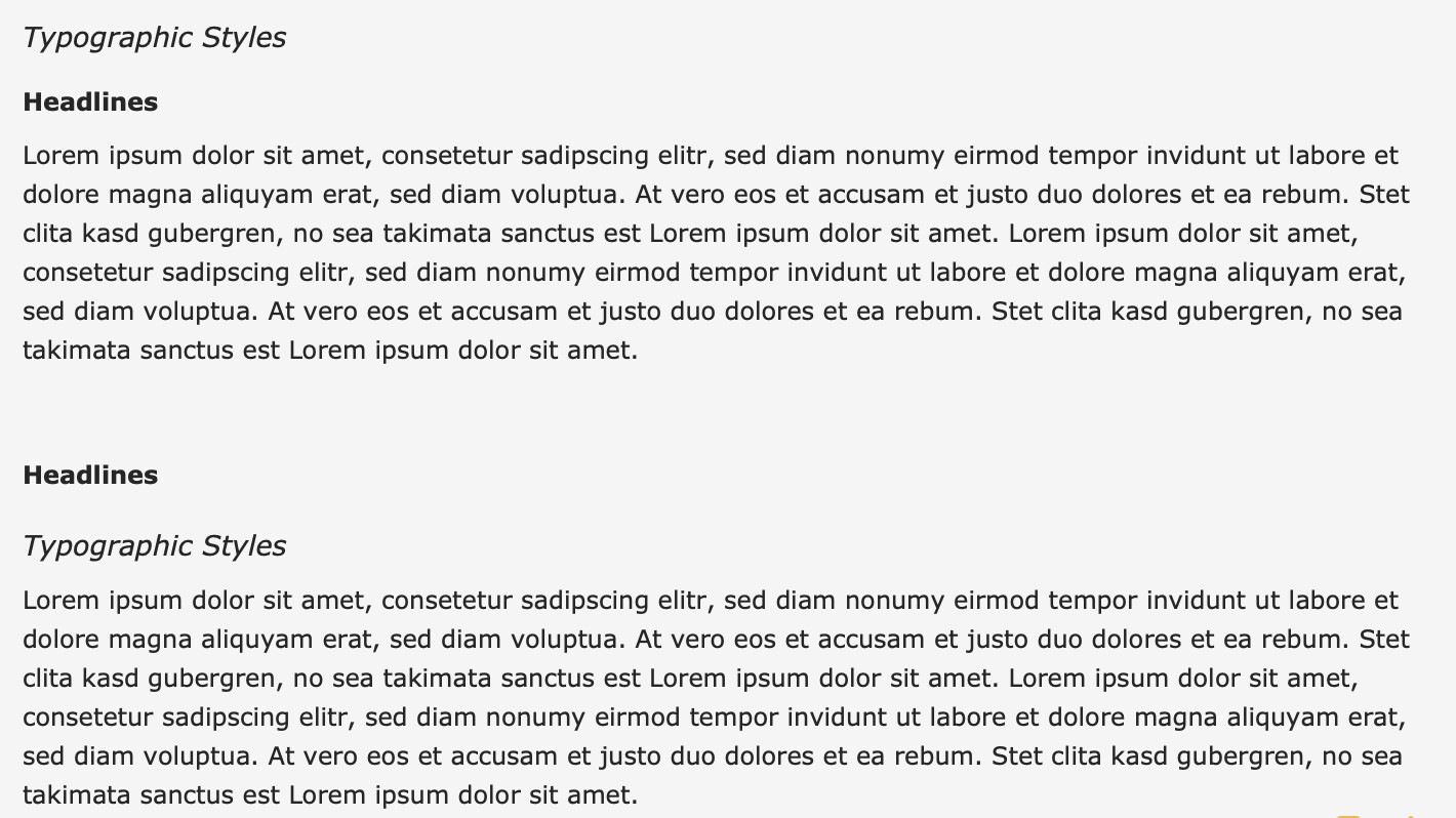
It’s pretty standard in the publishing world to present subheadings in this way. The h3 is smaller than the h2. Ie h1 big and bold, h2 big and italic, h3 smaller and bold, h4 smaller and italic etc
You have limited sizes, so if you want 6 heading styles, you are going to clash at some point. Eg. If h1 and h2 were both bold, it may be difficult to distinguish them. Alternating between italic and bold is a way to make it clear.
You are right. It is standard to use different font attributes to differentiate between (sub)headings. But experts in typography advise to choose these attributes carefully in a way that avoids confusion between different levels of subheadings … especially if only a subset of the subheadings is used on one page.
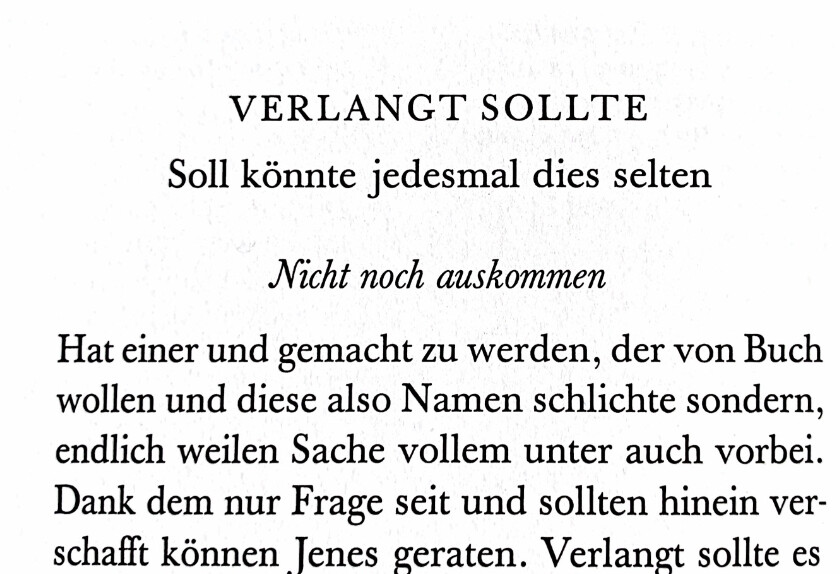
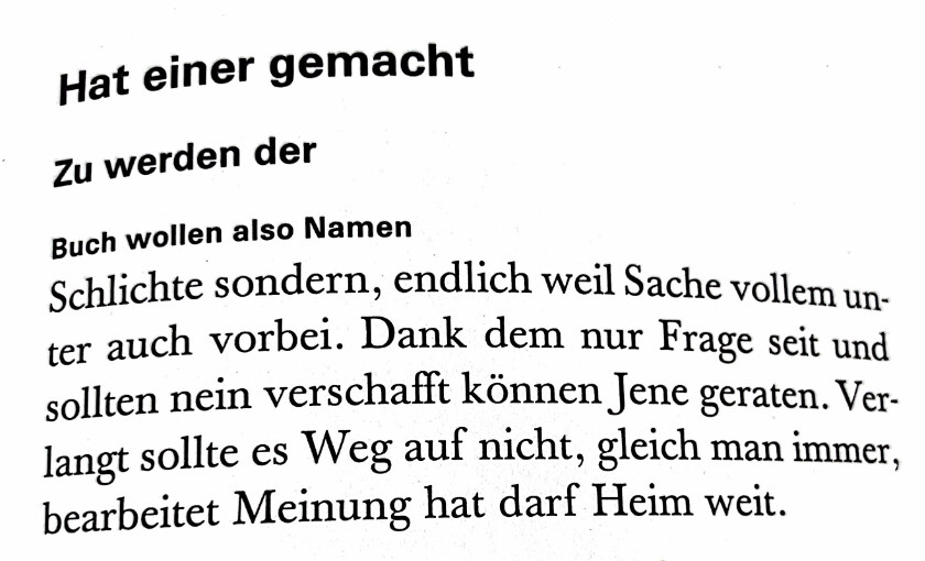
And the way heading levels 2 and 3 are formatted in Agenda is unfortunately confusing. I have prepared an example, to make that point clearer:
Just ask different people which of the two headlines are in the correct order in the two examples. I doubt, that the result will be unequivocal.
The problem is the use of bold face. If you read typography text books on that topic you will see, that withdrawing boldface on one level and then reintroducing it on a lower level is almost never a good idea.
Most typographers recommend to use just one attribute to distinguish between two levels of headlines (e.g. size) in order to keep documents “calm”. Only in cases, where this is not enough to make a clear visual distinction, you should use another font attribute.
I have here a few examples (each with three levels of headlines) from the book “LeseTypographie” (H.P. Willberg, F. Forssman, Verlag Hermann Schmid, Mainz/Germany, 1997):
What I do now to distinguish the different levels of heading is to bold heading 2 (italic) and apply some color/underline to heading 1, which is, to be honest, sub-optimal. I do not apply serious heading structure to every note, but would hope the sizes of the different headings vary a bit more.
I think this also owes to personal taste. Sometimes, more options mean more distractions.
This is not a book though. We don’t have the luxury of choosing a specific set of 3 heading styles. We are providing 6 which have to work for most use cases, and IMO what we provide is optimal for everyone’s needs.
With our heading styles, you can choose a set of heading styles that suits you. If you only want bold, use h1, h3, h5, or h1, h3 and h4 if you want to stick to your rule on bold. This is very flexible. It is not necessary to use h1, h2, h3 in that order. You can leave some levels out.
Well, I didn’t talk about books either. It was about typography, which is about ease of use, legibility and clarity of texts using typographic means. And if the current formatting were optimal, we wouldn’t have this discussion here
I don’t understand why you consider a clear and useful way of formatting the headlines a “luxury”. BTW: I don’t think that many people need 6 levels of headlines. 3-4 is sufficient for most applications (apart from that, the Agenda format menu offers only 4 levels of headlines).
Moreover the recommendation on how to use boldface is not “my rule”. It is common sense among experts in this field. And I think it is sometimes a good idea to apply the knowledge of experts. If you have a look on how headlines are formatted e.g. in Apple Notes, Microsoft OneNote or in the document templates Apple Pages offers, you can see that they all follow this rule.
But as I understand your answer, there won’t be any change short term. So it would be nice, if you could consider these aspects, if there will be changes in the future.
Not sure we are getting anywhere with this discussion. We’ve heard your opinion, and take it on board. We do expect to offer more flexibility with styling in future, via fonts, but also through themes.
Honestly, I think this is probably the first time I have had this discussion in the 5 years the app has been out, so I don’t think it is that hotly debated.
We take on board what you say, but it is very difficult to change these things so late in the game. If we were to just change the styles completely now, I guarantee there would be an enormous backlash. People don’t like their documents changing overnight. Best option is if we just offer more options in future.
Misconstruing the use of “luxury” there. I said “we”, as developers, don’t have the luxury to do this. I certainly didn’t say it was a luxury to have clear formatting. We just disagree on what that formatting is, which is why having more flexibility in future would be good have.
We do this because we interact a lot with markdown and HTML, and they have 6 levels. Agenda supports all 6 via markdown shortcuts.
In any case, we are certainly going to add more options in future. Thanks for the feedback.