Kia ora @drewmccormack @mekentosj
I hope you’ve been well. Here’s another small increment for your consideration.
Context:
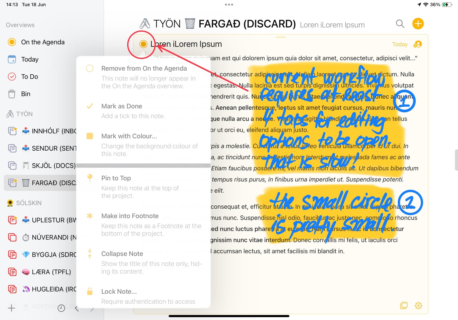
Currently, opening the editing options of a given note can take up to 5 taps/clicks maximum (considering the locating, expanding and editing parts of the workflow).
That is slow.
Adding to this issue, there is also an experience hurdle of correctly hitting the small icon that triggers the touch estate itself - top-left “circle” icon.
Most times (specially on mobile) is pretty hit-and-miss, and may/often result in even more taps/clicks due a non-ignorable human error rate.
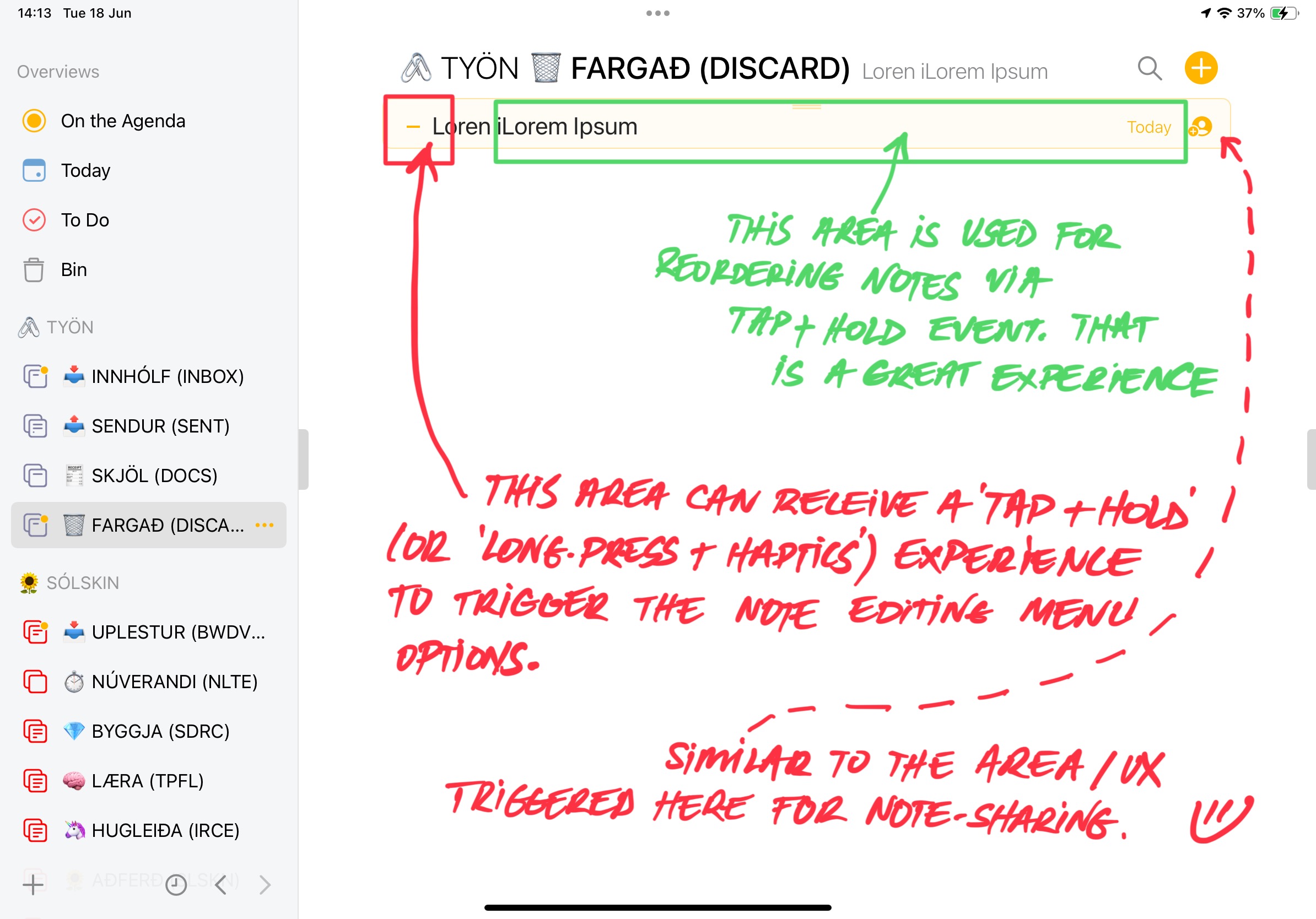
This can be greatly improved with the addition of a new touch, click and/or long-press UX event on the left side of the note’s header - similar to what happens on its rightmost side, with the sharing feature.
Story:
As a user, I want to be able to quickly pull the editing card of a note for rapid and efficient processing, without being encumbered by click/tapping errors caused by the small target real estate of the on-screen iconography.
CNH (Cost of Not Having):
A single UX event to trigger the editing menu > than 3-5 events.
This would represent a time saving experience that is at least 4x faster (in average).
Regardless, since forever, Agenda is still my favourite application by a long shot.
As always, cheers for considering this.


1 Like
Can you be more specific about the sort of editing options you mean?
We will take on board the dot button issue. Perhaps we can make the hit area bigger.
1 Like
Hey @drewmccormack
Sure thing. I believe that the button ‘area’ (as in a bit more around the little icon) could trigger the exact same menu that it currently does.
I called “editing menu” the popup card on the first image (I don’t know how you guys call that model internally).
In short:
- increase the targeted touch surface area around the icon to reduce error
- nice to have: press-and-hold as the trigger event
- the same existing menu/card pops (Remove from The Agenda, Mark as Done, Mark with colour…etc)
Sorry for not being clearer before.
What is the idea behind having press-and-hold? Currently it works with a standard tap, which I think is easier to discover.
I just did some testing, and one of the difficult aspects is that the title is nearby, meaning it is quite easy to select that instead of hit the button. Not sure what we could do there.
1 Like
Essentially it means holding the finger over the button icon and having the menu opening with it.
I myself struggle a bit and tap a few times, then open the option card, then I do what I want.
Pressing and holding that area could open the menu card automatically.
This thread is 5 years old 
Are you having trouble opening the menu on macOS? When clicking the orange dot button top-left?
If that isn’t it, can you explain a bit more?
My bad, I forgotten to mention that this suggestion would be for the iOS app.
Thinks like:
- opening a note requires double tap at the title area
- opening a note’s menu card require two taps at the circle icon
- Etc
These things could use a “hold your finger over the task” so that options are shown, instead of the multiple taps.
Hope that’s a bit clearer.
The menu should open on one tap. The exception may be if the note is not selected yet. Once a note is selected it should be a single tap.
That is deliberate, so that you don’t have to be really careful when scrolling etc. We require notes be selected before you can do certain operations.
Hope that helps!
![]()
![]()

