Love the look and feel of Agenda, though the icon jumps out a bit in the dock. Since it is a notes and calander app, I’d like to suggest to tilt the icon to the left a little. So it fits right in with Apple’s native Notes and Calander apps.
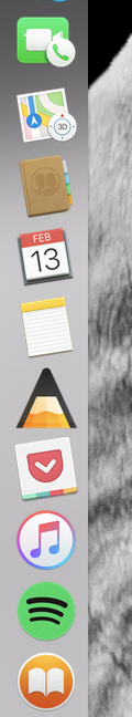
The tilt is designed for, and works best for, icons based on rectangles, such as pages, or maps. It would not look good with the Agenda A.
There are many untitled titles, including plenty from Apple (eg Finder). Attaching a few.
Thanks for the feedback!
Kind regards,
Drew
Hi Drew,
I see your point. And VLC does the same thing with the icon of course. So I guess you guys did the right thing there. It’s just that it jumps out a bit, but can’t put my finger on it. If something comes to mind, I’ll let you know. Thanks for the quick response.
Best regards,
André Kolmeijer
1 Like