Hello! Here’s a comment about the behaviour of the layout when the side panels are made visible and then hidden.
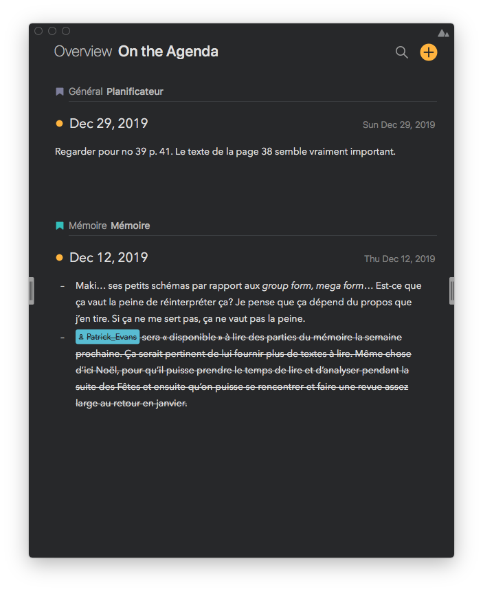
I like to work within Agenda when the side panels are hidden. I’m more focused this way. I also like to keep it short, so I work with a narrow window. It makes Agenda looks more like an agenda than a text editor, which I prefer. Here’s an example:
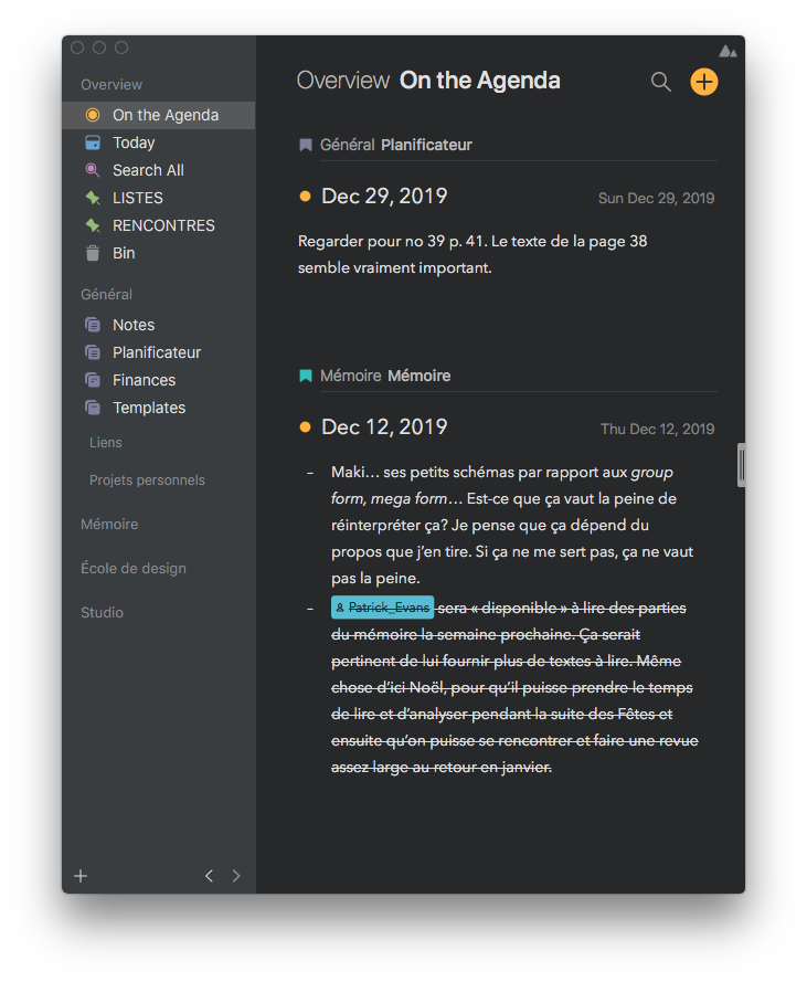
When I open the left panel, the whole window keeps the same width and the sidebar is added “inside” of it. The content is then much narrower. For me, this behaviour is not really pleasant, because it makes me often lose track from where I was in the note I was reading or editing:
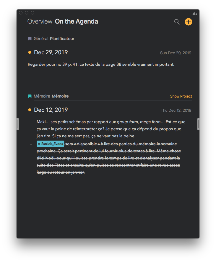
When I hide the side panel though, the content reclaims its original size, which is cool. Like I said, it’d be better if it had kept its original size from the beginning. Back to the original width:
The right panel has the opposite behaviour. When it shows itself, it is “added” on the right-hand side. The size of the content stays the same (awesome!) and the side bar appears on the right:

But something weird happens when I hide the right side panel: the content takes the width of the full window, including the width of the now-hidden sidebar:
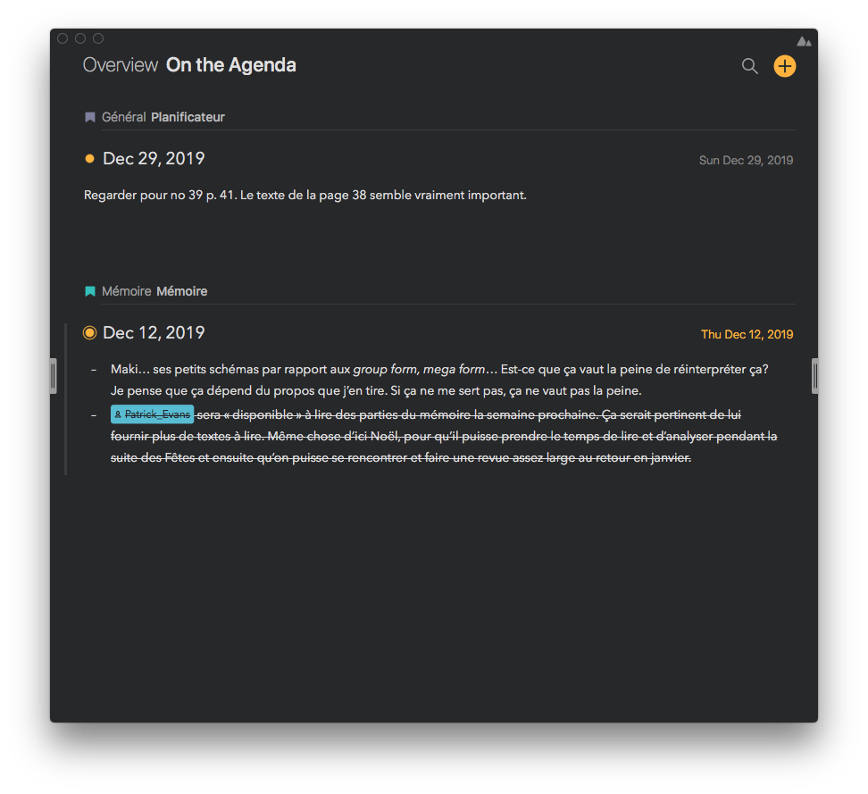
I have to manually resize the window so it takes the original size I wanted.
Am I missing something here? Is there a purpose for those two different behaviours? What seems logical for me would be to have the same behaviour for both side panels. The width of the content should be static (defined manually by the user when resizing) and the sidebars should be added on both sides. When the sidebars are hidden, the content area should retain its original width. I’m obviously talking about a non-fullscreen behaviour here, I know it can’t work that way when in full-screen mode.
Thanks for reading!