Looove Agenda. Sometimes I just want to execute on tasks and not so much on notes.
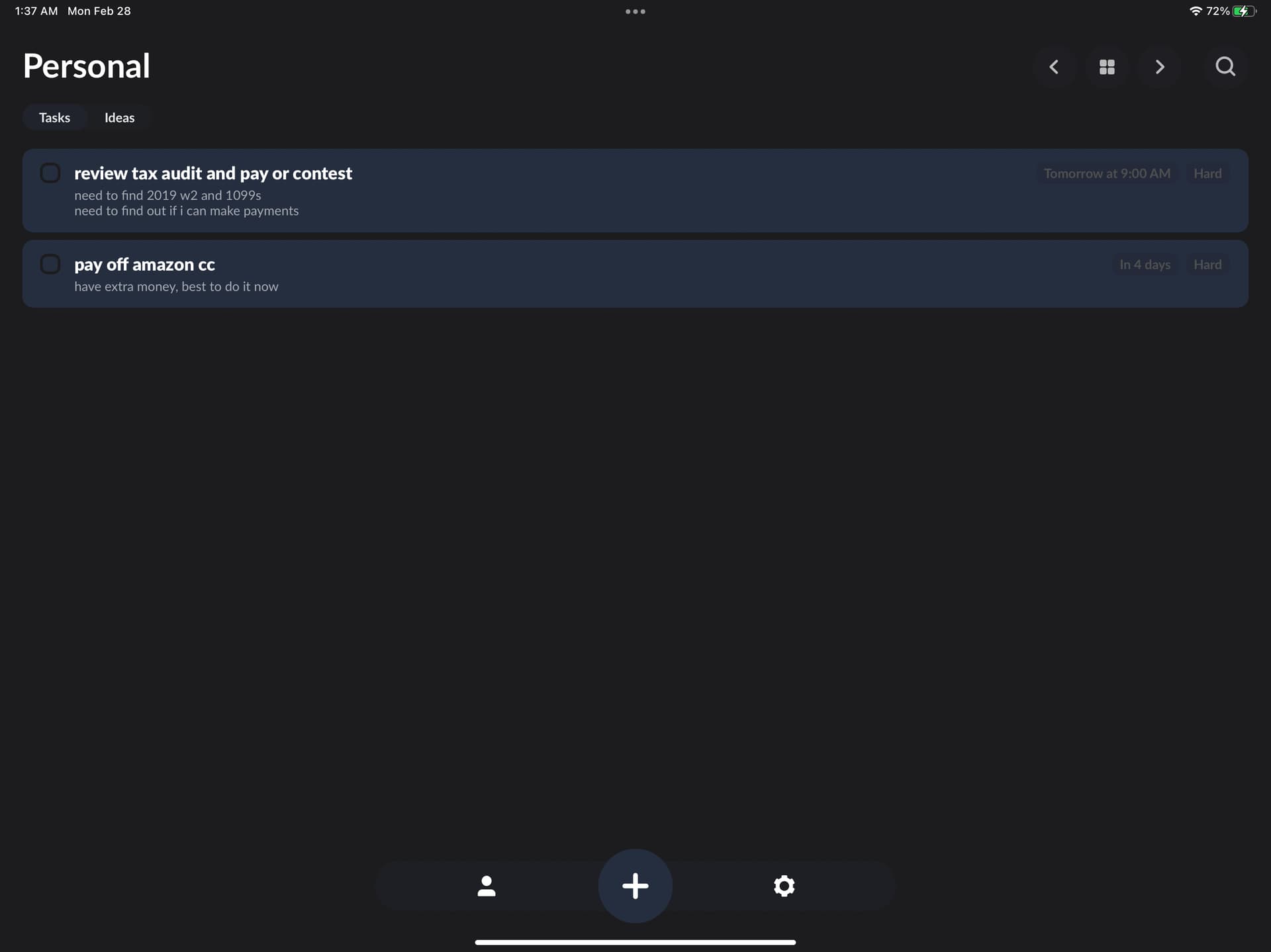
What if you took this iOS Zones app idea of having a tab at the top that switches between ideas/notes and tasks?
if i could put both your apps together into one it would be the ultimate app.
it would totally replace notion for me.
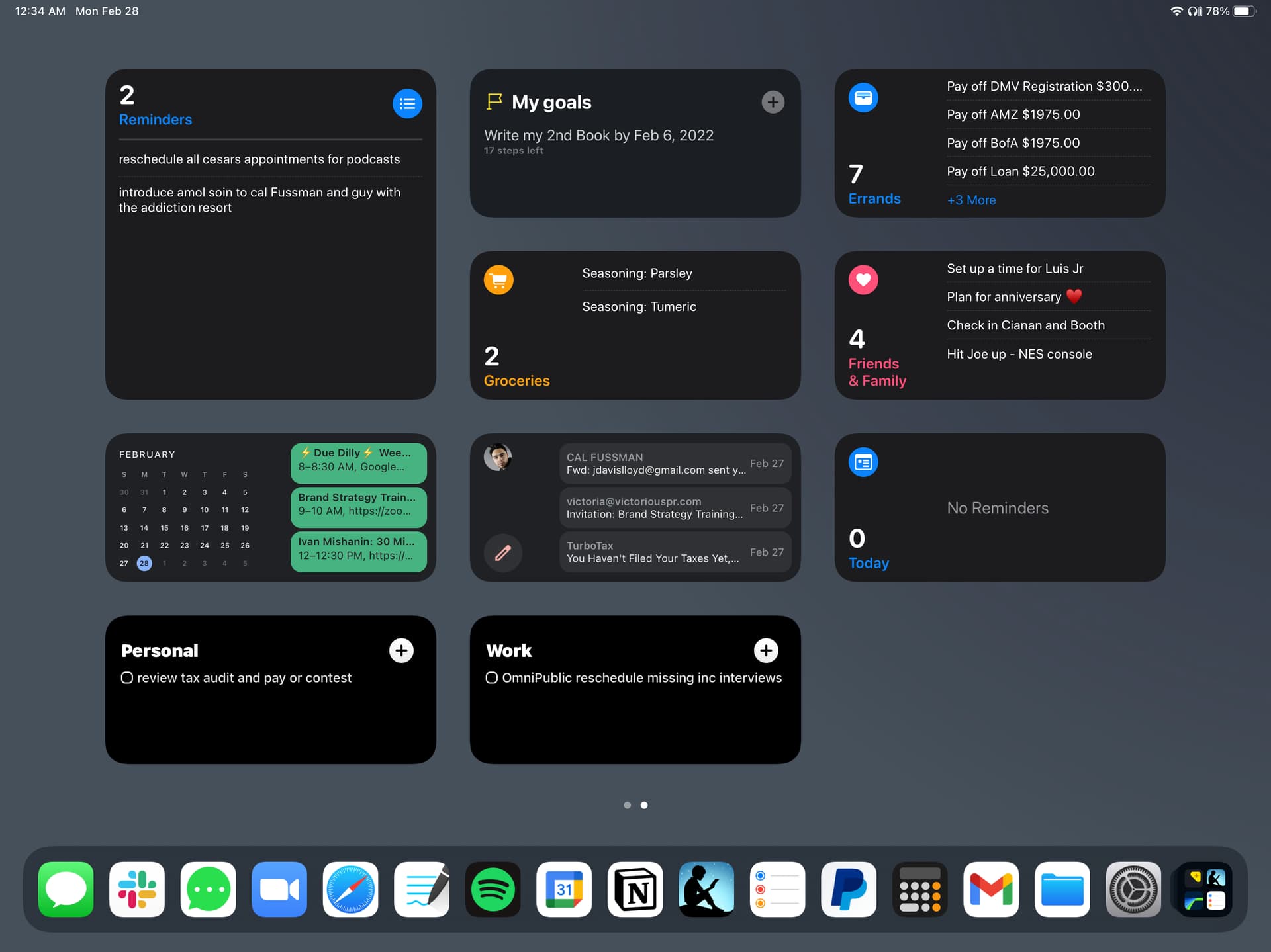
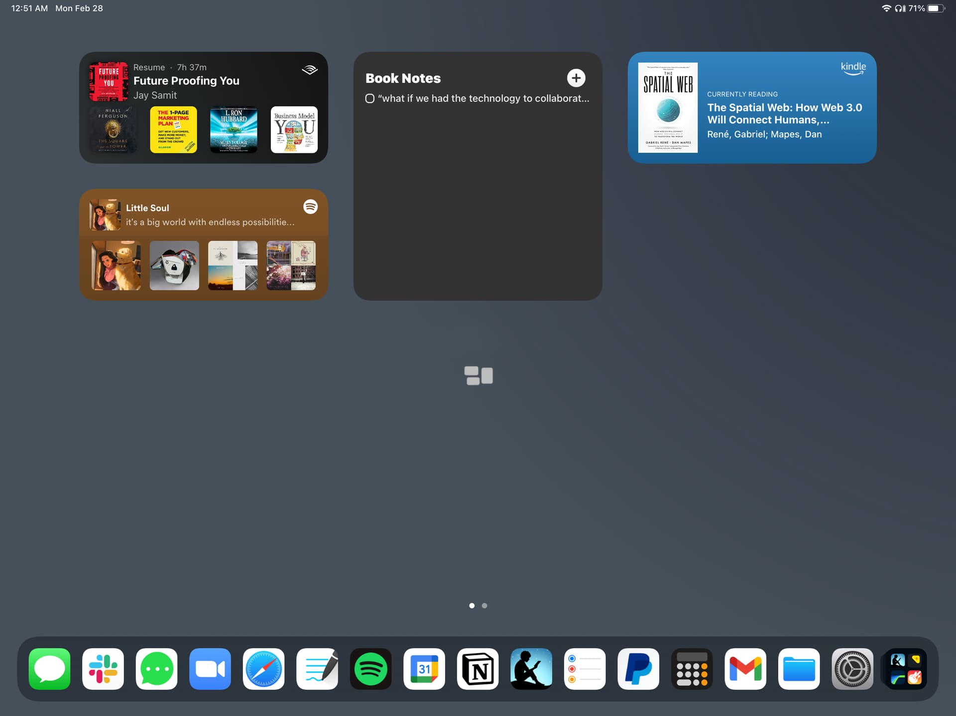
They also have awesome widgets that essentially resemble reminders on apple, if you added a tasks mode you could then likely offer simple task/list based widgets on ios. so that one could do this for top glance and habit trigger jump back into app
I think that would get really messy in Agenda’s note timeline approach. Remember, other notes typically show a single note at a time, and Agenda may have a timeline of hundreds.
But we hear that you want a way to filter down to just see tasks, and that is certainly in our roadmap.
2 Likes
Love the timing man - really appreciate you.
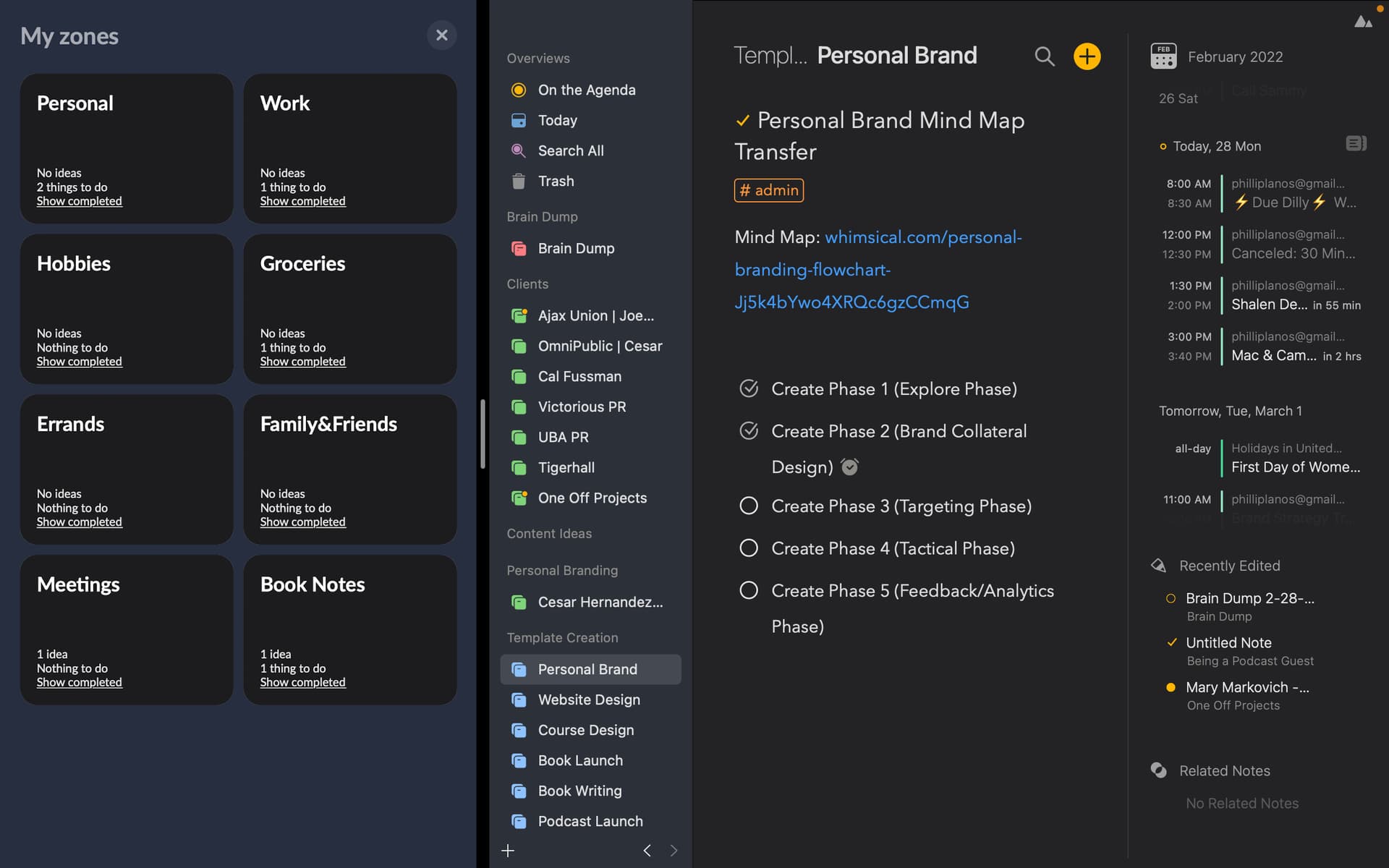
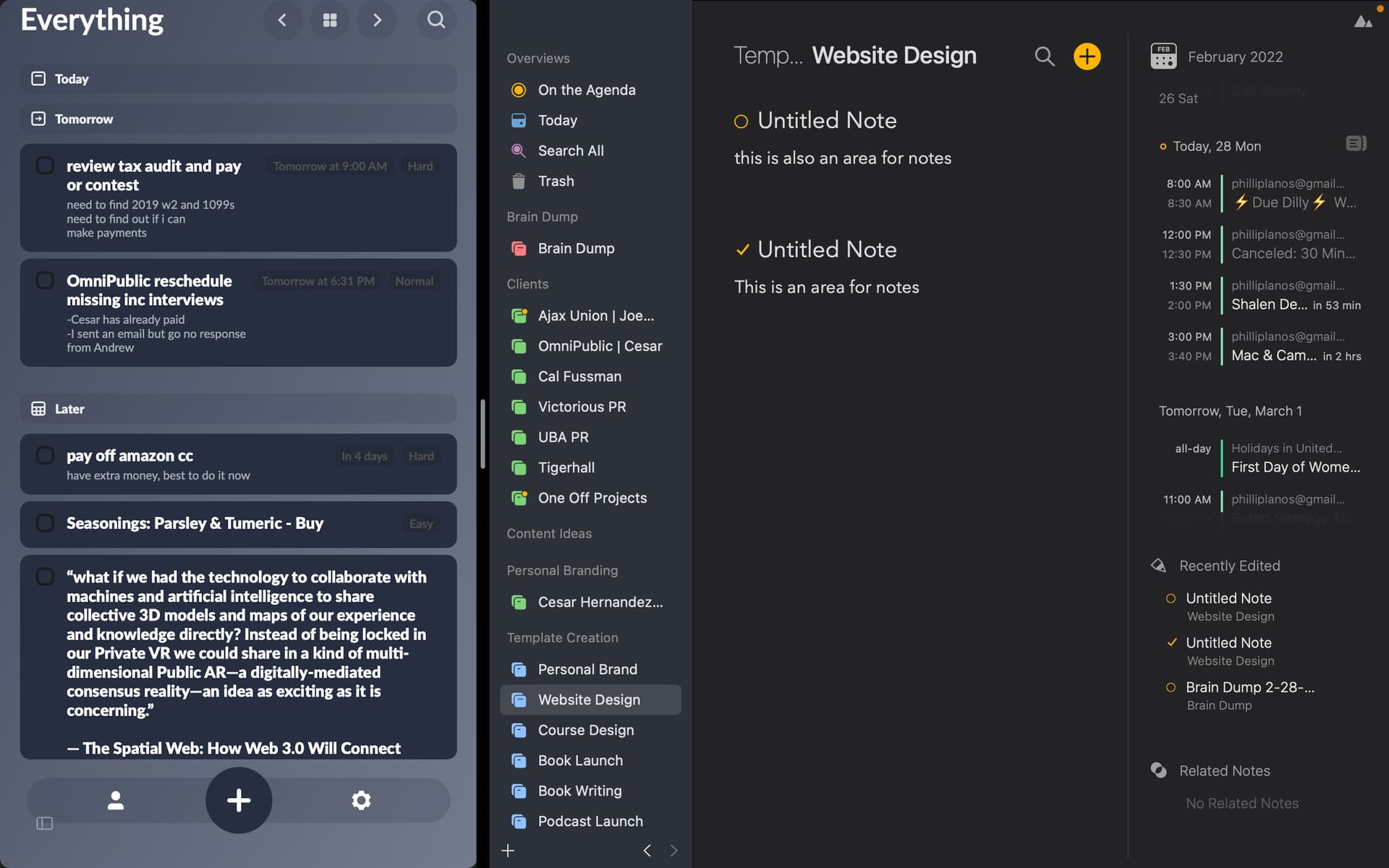
So I was looking at the apps side by side and realized the only reason im able to see thinsg as more actonable on the Zones app has to do with the little bubble background segmenting them.
This really helps me see that its a different issue/idea/action space.
Otherwise you do have the dot to the left of the title and you have far more functionality.
Your navigation is smoother too:
The everything page on their app is a little easier to navigate than on the On The Agenda but again I think it has a lot more to do with the infinite feed that is the signature. I love for quick searching or deep timeline analysis for context.
Its hard to plot out action items and then activate those into a place where they live for broad overview. I’m trying to keep in mind the idea of not only solviung my problems but how everyone else’s will be impacted by the suggestion.
I’m making the effort to see how this functionality may already exist…
You do have broders for notes that are active only when writing in the note. So It may just be a matter of getting used to the ux/ui youve developed.
I appreciate you hearing me out though.
(image above is the ux/ui case in point about shading to differentiate between notes/ideas)
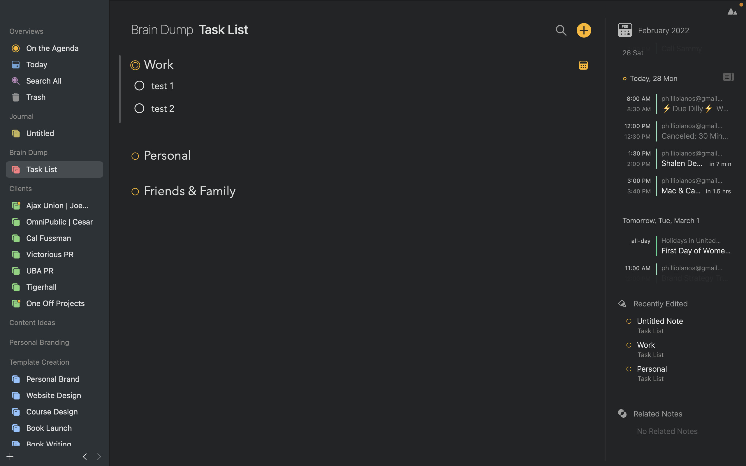
Ahh, just figured out how to do it so that I get what I need by using one category for tasks.
Sure it doesn’t integrate into widgets but as long as i stay in the app it will do. I suppose it just took some getting used to the ux/ui
You will probably find that that Task List is often in your widget, just because you edit it a lot. I have a similar list, and it is almost in my widget for quick access. I edit it daily.
Re: borders etc. We thought a lot about this when designing the app in the beginning. I think we even did have borders like the other app right at the start. We decided in the end we wanted a cleaner look, where the project felt more like a single document than a bunch of messages or tweets. So we went with more spacing between notes, and title font size + yellow dot. We think these keep that clean uncluttered look, and still keep the notes separate enough.
Thanks for the feedback!
3 Likes
Yeah, I can see that argument.
My own fault in appraoching Agenda the same way I did other apps is the key.
Its clearly been given a lot of thought and its not your first app so a lot of the design flaws from yoru otehr apps were taken into account and I can see that.
The best thing I ever did was make sure to leave behind all preconceived notions of the way a notes and project management tool is supposed to work and really play with Agenda’s possibilities.
Once I did that I was able to figure out that if I really want to - book a checklist can be had…
In fact, alot like google keep, a user can add a label to a note for global search.
Again - it just takes some getting used to but im starting to see it….AND you ultimate feature is the way the calendar lives on the right hand side….that baby right there keeps me from goign anywhere else and stay in the app.
1 Like
Tags are a great way to add structure to your notes. Eg. type #projectA and you have a tag for that. You can search and make overviews if you want to. And it is visually different, so stands out a bit.
Agenda 14, which is coming in about 6 weeks, has lots of improvements to tags too.
5 Likes
Agenda 14 baby that’s what I’m talking about it’s gonna be great
3 Likes
Ill try that out and see what tags do. Cant wait for the update in Agenda 14.
1 Like
