I enjoy using Tables in Agenda notes. An enhancement that could improve the Tables UX would be to automatically adjust the table width (and column width) to span the width of the note.
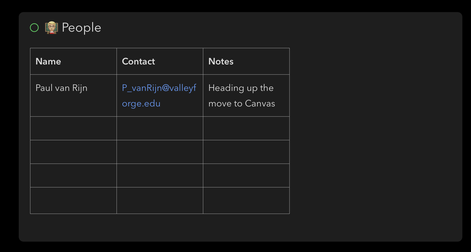
Take a look at the note below. Notice how the three columns contain text that wraps. Ideally, when the note is saved, the table would automatically adjust to 100% width of the note and each column would be roughly the same width.
That’s a bit tricky. We would like to give control over column width at some point, but it is not so simple, because whatever we do has to work on big Mac screens, as well as tiny iPhone screens. We can’t just have a fixed width.
Your preference in this case is that we use the full width, which I understand for this particular table. But you can imagine that just making something full width when there are two columns of simple numbers would be ugly, and difficult to read. So it very much depends on the table.
We will think more about the problem, and hopefully be able to address it in future, giving more control.
Hi Drew - I was just gonna put in a support request about this but saw your reply so I figured I’d push this along here.
Do you still think the tables issue is tricky because of the need to fit within screen sizes or do you think there’s a solution?
Basically I’ve just started a training course which has 35 modules, each with its own finish date.
Because of the fixed width of columns, it’s not really practical for me to use a table, even though it’s a perfect use for one.
I’m wondering if the solution is to use the original “responsive web design” idea. The user could maybe be given the option to increase the width of the table as a whole and the percentage of that width given over to each column.
Therefore, with my 2-column training project, I could drag the table width to fill effectively the full width of the available screen width within the app. I could then drag column 1’s width to be, say, 70% of the full width, giving the date column the remaining 30%.
Then when I go to my iPhone, that 70%/30% split is replicated, and the “responsive” rendering will mean that the full table height will radically increase.
It would work perfectly for me. I’m not an app designer, so I might be talking total nonsense.
Yes, we have been thinking about possibilities, and ones like one you describe are possible. Another approach would be to simply allow the user to pick an absolute width, and then have sideways scrolling of the whole table. I generally don’t like scrolling within scrolling, but may not be a better solution here.
The percentage idea seems to make sense, but then you realize it will probably also be a nightmare for people to use across platforms. Eg. 10% width on Mac fits a bigger piece of text or number than on iPhone, where you would start to get wrapping.
Even if we can solve it with scrolling, you then can’t print the document or make a PDF without losing things off the side. So you can see, it is a hornets nest. We’ll see what we can do when we come back to a second round of table improvements. For now, for advanced tables, you are probably better with Excel and Numbers, and attaching the doc to Agenda.
Just adding my 2 cents that tables are just so hard to use in Agenda because line-lengths are so short. I understand the “responsive issues” (as a web developer) that tables bring. Compromising the desktop experience for the mobile experience isn’t really the solution here.
I think for my common use case, having one of the columns expand to take up the rest of the space would be a sufficient step.
I also have no problem with scrolling horizontally on mobile. I think we need at least the option to make tables more usable on bigger screens.
May I add to this. I would really like this functionality a lot. I decided to use Agenda as my primary projects/notes/sync up and scheduling because of it’s clean and simple minimalist look which I greatly appreciate. May I make a slight suggestion. The same way we have images or attachments that can be 25%, 50%, 100% width, it would be lovely to have this with tables. So there could be the standard that shows up as it is, but then you can choose to make it full width and slide the columns to taste. I do understand that it would look different on mobile (which makes everything a challenge), but using percentages of column size and table size I think would be a good workaround and everyone is happy. Just looking around Notion has this capability and very robust tables and databases for a note app, so I think it’s very doable. I look forward to your reply. Thanks guys.