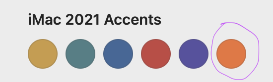
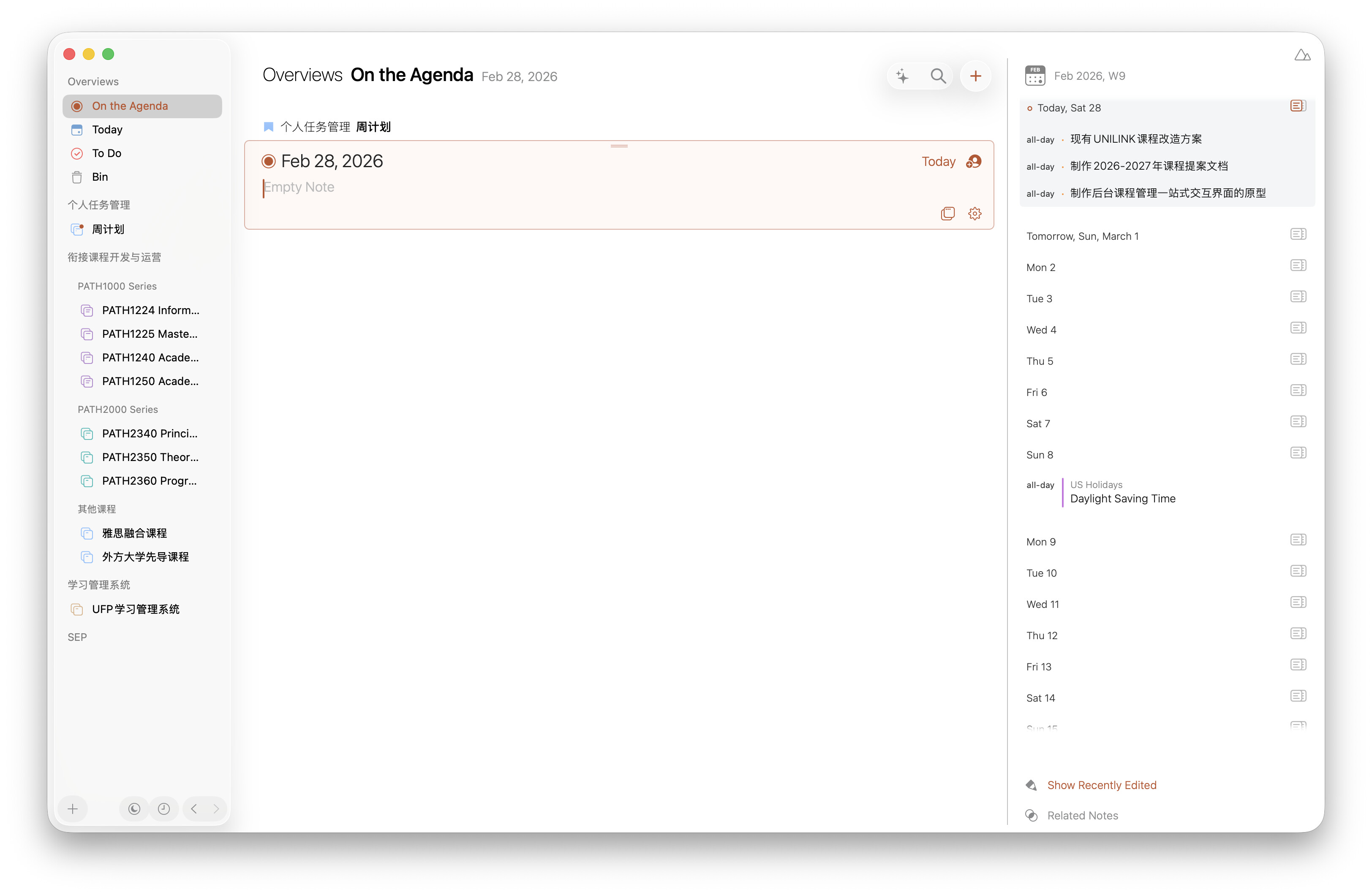
I have found that the default “orange” accent color on Agenda for macOS lacks readability in Light Mode and after some search, I actually find this darker orange accent used in 2021 iMacs having higher contrast, and I set my Agenda accent color to it, the result is jaw dropping to me, and I also find this color closer to the orange accent color on iOS. Here’s the interface with the new darker orange accent:
Thanks for the feedback! We’ll take a look at the default and see if a darker shade would work better. We’ll take it along.