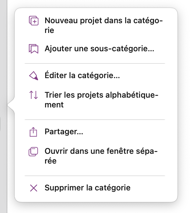
I know I’m nitpicking, but I can’t help but think there must be a way to improve the layout of this popup menu ![]() As you can see, the titles of three of the 7 items feature line breaks for a few characters. I’m sure it looks fine in English, is there a way to account for the slightly longer lines in French?
As you can see, the titles of three of the 7 items feature line breaks for a few characters. I’m sure it looks fine in English, is there a way to account for the slightly longer lines in French?
We’ll take a look.
1 Like