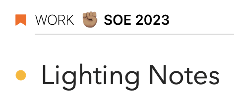
It would be nice, if the project headline would stick and remain visible at the top of the screen while I am scrolling down. It appears that I have sometimes multiple notes of multiple projects in my "On the Agenda“ or even my „Today“ view. And sometimes I’m in the middle of my agenda and want to know to which project the currently visible note belongs. I have to scroll up to see the corresponding project.
The behaviour I mean can be seen in the Apple Contacts app. While you scroll through the list of your contacts the current starting letter remains visible at the top. I believe it’s called a grouped table view with section headers?
I hope, I could explain what I mean. 
We actually already use this UI in the calendar in the related panel on the right, the day header will stick to top. While this is an option that Apple indeed provides (as you noticed in the contacts app), it’s unfortunately riddled with bugs. This is for example why the calendar day sticks to the top in Agenda for Mac but not Agenda for iPhone and iPad. We also tried it in the notes list but graphical issues forced us to turn it off again alas.
I migth be wrong, but I have the impression that this is the case. When I scroll down the category, the projekt and the title of the note are presented on the top.
Yes, but this is the project/overview title selected in the sidebar, what @jander was referring to is the project dividers in overviews like On the Agenda that group the notes per project.
How hard would it be to make the project titles bigger to be more eye-catching while quickly scrolling through?
Not quite as elegant as freezing the project title, but would perhaps help fix the issue at heart: being able to quickly identify which project a given note is filed under…
Solutions: options to align project titles center/left, heavier horizontal stroke after project titles, ability to add color to project titles, make the project flag image bigger…
This is especially relevant when the user increases the text size of notes, and project titles don’t scale. In a long list this font sizing differential makes catching project titles tricky. Example below:

This is the reason we show the coloured “ribbon” and don’t pull the line all the way to the left, both are cues to make the project separators stand out more.

