Quick links are very nice! One thing I’m struggling with is navigating to a note when I don’t necessarily know its name, but I know the project it’s in.
I have a project called “viaduct” with a bunch of notes. So I type [[ to show the notes list, and then viaduct to filter the notes. It shows me the viaduct project, as well as any notes with viaduct in the name. I can’t, however “drill down” to the viaduct project to see its notes.
I can drill down if I don’t type anything, and I use the arrow keys. But I have a handful of smart overviews, and lots of projects, that I need to skip over before I get to viaduct. At that point I can use the right arrow key to navigate to the list of notes in the project.
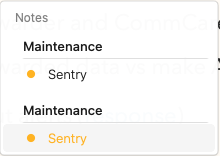
Also, when looking at the notes in a project list, they seem to be ordered “earliest date first” even though I have that project set as “latest date first.”
So two requests (unless of course I’m missing some setting):
- When I type to filter notes & projects, I’d like to be able to select a project with up/down, and then use the right arrow to display the list of notes. That way I can quickly navigate to a note in a known project, but whose name I might not know off the top of my head.
- The notes list for a project should respect earliest/latest date first setting for that project.