Not really a bug or anything per se but I have always struggled with the way notes are navigated in Agenda. The left column for the areas makes sense. I feel there should be a second column with note titles (filtered by selected area in first column) and then finally a “preview pane” or note edit area. I guess similar to how most apps do it.
My primary challenge with the current setup is expanding/collapsing notes. I may be missing something but it has always been a bit of a nightmare. How is this supposed to work? Where am I supposed to click or press to expand/collapse? If I click the title it edits the title, if I click the circle it gives me some options for the circle, if I click the date it brings up a calendar…at the very top of a note there is like a hamburger thingy …is that where you are meant to click? If so it’s very hard to hit IMO.
If I am missing the obvious please do tell!
Thanks!
1 Like
Mark,
Do you know about the drop down list of notes that appears if you touch the project/search group title at the top of the screen for notes?
I expect there are defined names for some of these objects, but anyway this is essentially a list of contents. There is no preview, however.
Hi guyse
I agree wit you Mark. I struggle with the same issue.
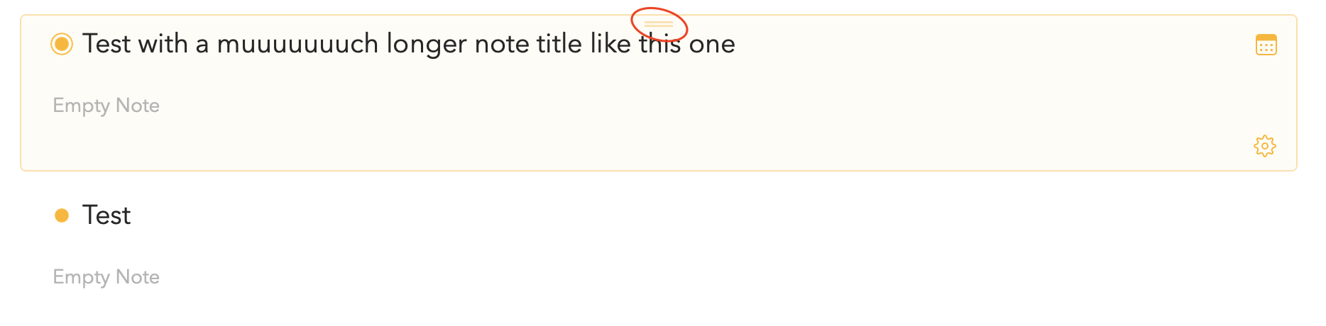
One way to collapse and expand it is to double-click the two lines at the top in the center. But it’s kinda not possible to do so, when the title of the note is long enough to overlap this button.
Maybe there is a shortcut for this?  Would be happy to hear your opinions.
Cheers
1 Like
Double-click on the header is in a way the shortcut, indeed with longer titles it’s more difficult to hit, we’ll see if this can be improved.
Having said that, the commands to collapse/expand can be found under the Note menu, along with the corresponding keyboard shortcuts.
2 Likes
Thanks I did see it mentioned in another thread. I don’t have many notes yet, I wo wonder how well that scales when you have many notes. But it is nice to have. Thanks.
1 Like
To follow up on my previous message, I’ve made some changes to make sure that even with long titles the drag handle remains double-clickable, this should be in the next update.
4 Likes
Yup, I completely agree. Navigation between notes is somehow a cause of friction and makes bringing the note you are looking for more difficult than it should be - in both iOS and MacOS clients. I would love if this could be improved … Probably my #1 improvement wish for this app