More distinguishable fonts (especially dark mode)

Hi is there any way to change the formatting in Agenda , to make it more distinguishable? Or can that be a new feature?

I saw a thread in the community over 3 years ago, but hadn’t seen the features, so I am making a new post.
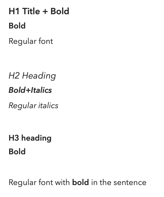
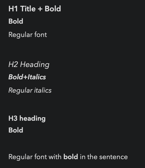
The fonts are hard to tell apart, especially in dark mode.
Attached are the examples for both light and dark modes

I understand that the difference is “generally visible”, and also that there is a lot more that needs to be considered than just the fonts.
But I would love a bigger distinction between the fonts.

The app is beautiful and awesome! But I was recommending this app to a friend, and he loved the features, but was concerned about the text formats being hard to tell apart. “Not standing out as much”
And to be honest it was something that I had been feeling too.

I can see the difference if I look carefully, but it’s not very obvious at a glance.

  • The bold font in my opinion is very close to the regular font
  • Bold font also very close to the H1 heading, and it can be really difficult for me to tell them apart when looking back on my notes
  • H3 headings v.s. the bold fonts, I can’t tell which is which…
    For me, I think that H1 header being double size of the regular fonts would be awesome. I can see people having their preference though, so control over the size and formatting sounds great. (a page in the preference where you can customize each formatting type, or a few templates that you could choose from with various grades of contrast?)
    Right now I tend to avoid the H3, 4 headings, and even the Bold font sometimes, because they don’t stand out enough for me… :cry:

I think this is really important, because the point (for me too) to format text is the contrast, so I can focus on the important points in the note. Not trying to tell them apart.

I personally feel, that having this wider contrast in the fonts might really compliment the app, making the fonts pop more will help make the app even more beautiful than it is right now.

Thank you for your consideration.

1 Like

+10000000000. Absolutely agree with you.

1 Like

It’s a balance. The sizes have been carefully chosen to work with the title of the note. If they were much bigger, you wouldn’t see the distinct notes.

Note that we also use spacing to highlight the differences. Yes, it can be similar to bold, but when you see it in a real document, it is completely clear, because of the paragraph spacings we use.

You will be happy to know we have text improvements coming. Colors and highlights, and the choice of font style. Perhaps those will help.

It is also worth looking at the horizontal rule. Perhaps that is something you can use if you feel some sections need more separation.

You can also change the size of the text in the preferences/settings already, but this doesn’t change the relationships between the sizes.

Thanks for the reply.

I understand your point regarding the relationship between the title.
However the title is always clear that it’s the title because of where it is located + the circle on the left. Text inside notes do not have that advantage.

I also understand the line spacing for the headings, which does make a difference. Also you can’t mix the headers with other fonts(at least it doesn’t seem like you can), so it’s harder for them to just blend together.
Though headings still seem close, and I feel like making them larger will still be great for the app, even with the consideration for the note title, personally my bigger concern is for the bold text.
I just can’t find them easily enough, and I seem to miss some when reading my notes(especially in dark mode)

Although they may be “clear” to an extent, like others have said, it feels so close, to the point that it it’s not always “clear” enough, and not “easy” enough to tell them apart, especially at a glance, and again especially in dark mode.
The text doesn’t pop out enough to make the emphasis wanted when looking back on the notes.
An argument could be made to disable dark mode, which I do during the day, but at night I rely on dark mode, for a more pleasant experience.

Colors highlights and font styles would be great. I may not use them all, but there seems to be a great request for them on the internet.
When you say “font styles” do you mean a fonts like “Helvetica”, “Times New Roman” etc? If so they may be great, but I’’ guessing it’s not the choice to make the Bold stand out more?

I have been using horizontal rule, for this reason, but it still doesn’t help the issue with me finding bold texts, if they are in the middle of a paragraph or sentence.

I know I am just 1 user, and 1 voice.
I don’t want the app to change for just my needs, as that would not be fair for the experience of others. Also if I am the only one, it probably isn’t the best path for the app anyway.
Also I know there are other very complex considerations that are needed for the entire app, witch I assume is a very difficult task.
But it does seem I am not alone in this request, and would personally greatly appreciate it if you could final a way to improve on making the text formatting stand out more.

Nothing users can do if developers have made up their mind. OP clearly shown headings in dark mode and clearly shown there that they are so difficult to distinguish and yet can’t convince developers. This is one of my biggest annoyance with this app having to flip between my preference of dark mode and light mode to read my notes. Using spaces is ridiculous IMO to solve something that should be simple. Developers should try to work in dark mode for a week then you’ll see how terrible it is.

Plus my previous bug report on template which supposed to be fixed soon.

Recently renewed subscription but I’m moving to another app, trying a couple now. Suggest OP also explore alternatives. I have given up again with agenda.

We’ll take the feedback on board. If we hear this complaint more often, we’ll look into it more. So far, it is not something that has come up a lot to be honest. I haven’t heard complaints about the boldness of the text before.

For now, you do have few options which may help to accentuate text more, like underlining, italic, or italic-bold. And as I mentioned, we have much stronger highlighting coming, as well as colored text which works well to highlight too. So maybe with some combination of those, you can find something that works well.

We hope to eventually provide more control over individual elements of the text, like headings etc, but it is not planned for the next release. The next release allows the formatting I mentioned above, as well as choosing a font (eg Helvetica).

Thanks for the feedback!

PS For completeness, I work in dark mode all day. I never use light mode on my computer. And…it is true we have made our mind up: we have always planned to give more control over font characteristics in styles like headings, but we are doing this in steps, in parallel with other major projects. (The original app did not even allow line spacing or text sizing.)

To be clear, I’m not trying to complain.
I am just a user hoping for certain features. But I am a little surprised if there aren’t a lot of people thinking this.

I love Agenda, but to be honest the distinguishability, has forced me to, take text to another app, edit there, and later bring it back to the Agenda app.(especially when sharing screens on a zoom calls or other) Which is honestly a pity since I love the app so much, and would be much nicer if I could just live out of the app.

Yes there are other formatting available, but somethings I wish they could have been achieved with the bold, or Headings in the app.
The more I think about it, the more I am feeling that I struggle with the bold text. It’s so subtle for me.
Maybe it’s my eyes?

Sorry if the request is an inconvenience, but I really do hope for some more flexibility in the future, and I hope that the controls you plan to provide includes control for distinguishability for the bold fonts too.

Hopefully our future changes will improve things. We are continually improving the text editor.

1 Like

Everyone has their own needs and preferences! But I have to say I find the current style of headings, bold etc work fine for me.

1 Like

For what it’s worth re: bold not being bold enough, we prefer to use the bold font as the designer of the font intended to use it and not try to “extra” bold it, which would help perhaps to make it stand out more, but doesn’t necessarily result in something more pleasant to read. Having said that, the amount of thickness of the bold font vs the regular font is a choice from the font designer and therefore varies per font. The fact that Agenda 15 will offer more choices in which font to use for your notes will perhaps solve the issue for you.

Thanks for the comment.

I’m actually happy to hear that.
That means it’s probably a “me” issue(or at least me + the others that have mentioned this on the forums as well)

It still doesn’t help me distinguish the fonts better, but I feel less frustrated knowing it’s more personal, and less the app.

I’m probably not making much sense, and it’s hard to explain, but thanks for the comment :slight_smile:

That is a very interesting point.
I assume(please correct me if I am wrong) that it wouldn’t do much, in the sense of helping the headers stand out. But it’s great to know that this may help the contrast with bold, italics etc.

I actually do like the font agenda uses, but this may help my needs, and would definitely be something to look into, when the update comes out, and am now looking forward to.

Also, I’m not sure how much you can tell us, but the update that allows us to change the fonts. Would that be an app wide thing? Or is that going to be adjustable per text (like how you can have multiple fonts in 1 document for apps like Word and Pages)
I ask because I may not try that feature if it mean I have to update all of my previous notes with the new font, per note.
I assume that it would be the former, and that the font settings will be in the appearance section of the app settings, which will change the font for all of the notes in the app, every time you change the fonts(which would be pretty convenient in my opinion).
Or maybe you have plans for managing fonts for individual notes(more customization, but rather tedious and may stop people trying the new look?), or maybe its by category?
Either way just curious.

Thank you

It’s the former indeed, we don’t want to turn Agenda into a word processor ala Word, that wouldn’t make sense. Likewise, changing fonts per note or category wouldn’t make justify the added complexity either. It’s will simply be an Agenda wide preference.

Awesome.

I will definitely need to try it out once it is out.

Thank you for very confirming the details!

1 Like