Please make the context menu smaller on iOS. It’s so large it’s actually harder to scan what I’m looking for. Other apps seem to use a more modern approach with a context menu smaller in size similar to macOS.
Which context menu do you mean in particular? It depends on the “context”, ie where you click. Is there a particular menu you had in mind?
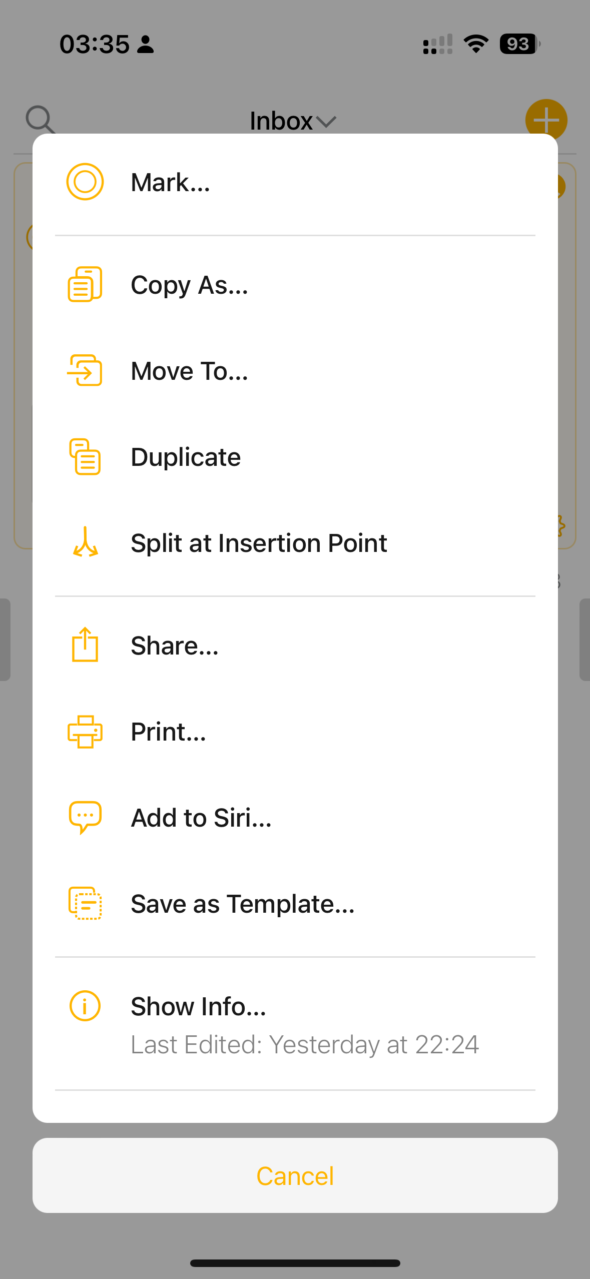
We’ll take it into consideration, it’s not really a context menu though, and some of the functionality can’t be provided in Apple’s menus, but we’ll see if it makes sense.