Hello,
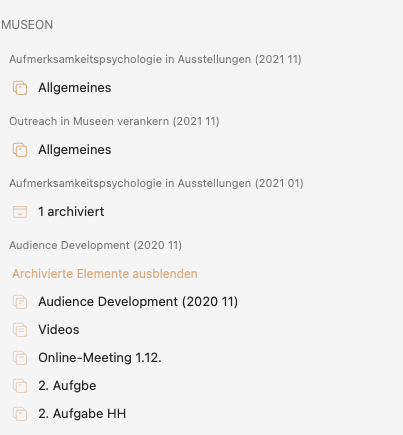
in the left pane, in the list of categories and projects, I have various entries. See attached picture.
I get always confused of the order of the entries because of the wrong font size.
MUSEUM is the main category.
„Outreach …“ and “Aufmerksamkeitspsychologie …“ are sub categories.
„Allgemeines“ is the project in e.g. „“Outreach …”.
I get confused because the fontsize of the sub categories is smaller than the the one of projects. In my opinion it should be at least the same font size.
Even „Hide/show archived elements“ (?, Ido not know the exact title in English right now) is larger than the sub categroy.
Alsothe line distance between each entriy is the same. I think above each sub category the distance should be a little bit higher. And between the projects smaller.
Also the proejcts can be some pixels further to the right.
Don’t know if this should be the other way around, because those entries should be easily clickable in a touch-based interface.
But I do find some typography choices within the interface of Agenda a bit confusing, too. Same goes for ‘On the agenda’ where category titles use a lot of space.
In both cases those categories / location paths could remain small, if some subtle contrasting background colours and font styles are added to create (repeating) sections in the UI.
As always it’s a tricky balance, we’ve tried many things but settled on this as the best option. It has to be clear that the it’s a category (same color and font as the parent category) and that it’s a subcategory, which would be much harder to quickly tell if the font size would be the same and you would only have to rely on indentation (we would have to increase indentation, which would then leave less space for longer titles).
I also disagree that it’s a problem that the subcategory font size than the one of the project title, the finder does the same thing:
Long story short, we’re not very likely to change the sidebar look at this moment.
For me, the sidebar in Finder shows something different. These are locations or containers without another layer of informations.
In Agenda we habe a hierachy of data and informations.
In my case above I have „Allgemein“ (similar to „General Infos“), there could be also „Contacts“ or „Customers“. In each subcategory (in my case these are projects) more or less the same structure. Now I see two times „Allgemeines“ because both projects are open.
As the projects titles are smaller than e.g. „Allgemeines“ I need search first for the sub category as I want to edit e.g. „Allgemeines“ in the first subcategory. My focus is forst on „Allgmeines“, then the subcategory and then again on „Allgemeines“.
It would be much easier to put the optical focus on the subcategory and then e.g. „Allgemeines“.
For me the way how it is designed now is a failure in GUI as it does not follow (optically) the logical way of hierachical structuring of information.
The subcategory title is smaller than the projects titles. Looking at the categories I see first 3x „Types“, then I have to find „Berries“ and then again „Types“. Better would be to have optical mor present „Berries“ as I need to edit „Types“ in „Berries".
I’m sorry, but have you ever tried to add some sub-folders to the sidebar? It results in the same problem @clausimausi describes here.
You can sort / drag those folders underneath their corresponding (cloud) drive locations, but as they have the same size, color and spacing, etc. there’s no support for visually separating them.
Folders and entries in a nested (or collapsible) tree structure are by far a better example for the navigation in apps like Agenda. And, with the indentations in the current layout, that’s exactly what you’re after.
Those suggestions are about stylesheet-based improvements to the UI, not a complete rewrite of the left-side menu and notes list.
Last days I started too create a bigger project in Agenda by creating a structure and adding notes.
For me, now the left pane looks very (too) crowded - very difficult to get a (quick) overview. It takes always (!) up to several seconds to find the category, the subcategory, the project I search for.
The (in my opinion) wrong font size (too small) of categories (same size as projects)
Font size of subcategories is smaller than the font size of projects
Colour - grey on grey - of categories makes it more difficult to read
Not enough indentation for categories, subcategories and projects
Wrong distance before and after a category (same distance to the category above and below to a subcategory)
The left pane in Finder is also not a good idea for a comparison as the left pane in Agenda is „alive“, we change the content of left pane much more often, adding categories, subcategories, projects.
I wonder how other users manage the left pane - using a lot of categories, subcategories and projects - in different colours.
Now, after about two, three weeks of working on two (little bit bigger) projects in Agenda I decided to think about another solution. I am not able to adapt to the look&feel of the project pane. For me the GUI is chaotic and does not correspond to how projects are structured hierarchically. As I already described above the sucategories are much too small, not enough indentation, spacing, plus gray on gray … I have several categories with less „content“, all in all difficult to find quickly what I searched for. For organizing notes, informations it is ok for me, but not to manage a project with a more extensive structure.
Alex, I am sorry to start again with this topic (and I know your answer as you have answered here already).
I tried again to set up something like a structure for an upcoming project - with categries, sub categories and project.
But I almost get „upset“ to see the design of the left pane (the project pane). It gets so confusing to see (sub) categories displayed in a snaller font that the projects - and in gray!
Agenda would be perfect for this project - notes based - but with the design of the important project pane it makes no sense. I always search for the right project but get confused by the missleading design.
How do other user think about the left pane?
After a closer look I actually agree with you @csterneck even though, because I don’t have a lot of categories with a lot of projects inside, it actually doesnt make it so bad, but I would agree that it needs a second look and refresh. Now, having said that, I understand that @mekentosj and the team might be focusing on other things and the list is long. I just don’t agree this should be a closed topic: there’s definitely room to improve.
I’ve never said it’s a closed topic, nothing ever is in making a good app. But it’s exactly what you say, there are a ton of things on the list that have a higher priority.
In the mean time, and looking again at your original screenshot @clausimausi, would be to use much shorter category and subcategory titles. I would argue that the clutter you feel you bump into has as much to do with the very long titles you pick as with the looks. For instance is it really adding any info to use:
MUSEON
Outreach in Museen verankern (2021 11)
over simply
MUSEON
Outreach (2021 11)
You will find that a lot of clutter in the sidebar can already be reduced by picking simpler project and category names.
Interesting thread. I’ve just had a conscious look at my category list. The current font weight etc works ok for me, because the project name is what I’m scanning for. The categories and subcategories are more like visual dividers.
However, I can see that if the same project names were repeated in a number of categories, it would be very frustrating.
Another approach to the problem, that I would find really useful, is ‘spring-loaded’ categories (and possibly sub-categories). By this I mean: the option to have all categories collapsed, thus:
Category 1
C2
C3
Then, when I click on a category, it opens to revel the projects:
Category 1
C2
Project 1
P2
P3
C3
While I’m working in that category, the list should stay open, but when I navigate away, say to OTA or another category, it should close like it is spring-loaded. (So different behaviour from collapsing notes).
EDIT:
The reason this would be useful for me is that my list in the left hand pane is getting really long and takes a lot of scrolling. Probably about 5 screen-heights on my MacBookAir. I probably could archive some, but it would still be several screens worths.
Springloaded categories would (I believe) make is easier and quicker to find what I’m looking for.
Yes, I didnt want to mean that for sure (that you said it). Was just saying that this should definitely be reviewed at some point but that I fully support your POV that there are too many priorities that need to be launched way before the team will have room to look into this, some of those, things that in my book are definitely going to take this app to a new level.
Let me join the call for a revisit of the readability of the left panel. I would already be happy if the visibility of the categories and subcategories could be improved (make them a bit lighter in dark mode - and I agree make the font a bit larger).
Projects reside in categories, but their names cannot always be unique (especially if we keep them short), which makes it important that it is immediately clear in which category (and subcategory) a project sits. Right now I find that isn’t the case.
I note as an example that the preferences do allow us to set tags, people and attachments to either subdued or prominent, so there is a precedent… and for me subdued is already more prominent than I’d like to see in the categories.
Being a bit provocative: one way to make the categories more prominent would be to add icons to them - similar to the Finder.
@MichielvH : Thank you for supporting this topic. For me, the left pane was the reason why I switched to DevonThink (though oversized) for one bigger „project". I needed a much better overview of categories, subcategories, (sub-)projects.