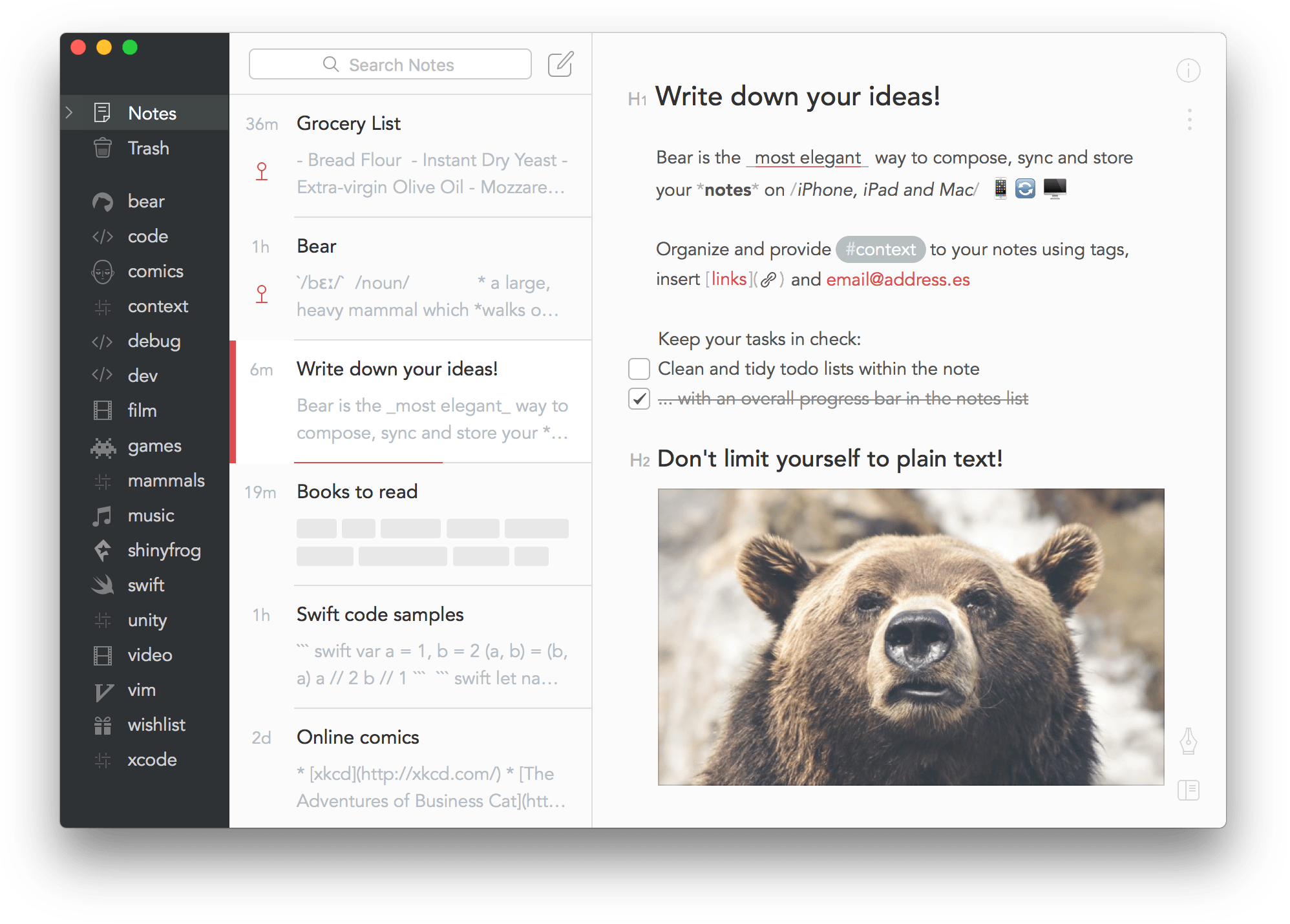
I find this a lot messier personally, and not at all very different from what Agenda does:
Even more, if you deselect the note and hide the inspector on the right (which Bear doesn’t have), you actually come very close IMO. Plus the low contrast of a lot of grey text in Bear is also not everyone will appreciate I think (again showing that a lot of these things are subjective).
Yes, it’s not yet possible to activate a so-called focus mode, but we have mentioned in elsewhere already that this is something we hope to add later in the year.
