I’m using the “favourite note” widget on my iPhone 14 pro max, which lets me choose a note to display.
It’s really great in principle: I can make a daily task list in Agenda and then see my tasks right in front of me.
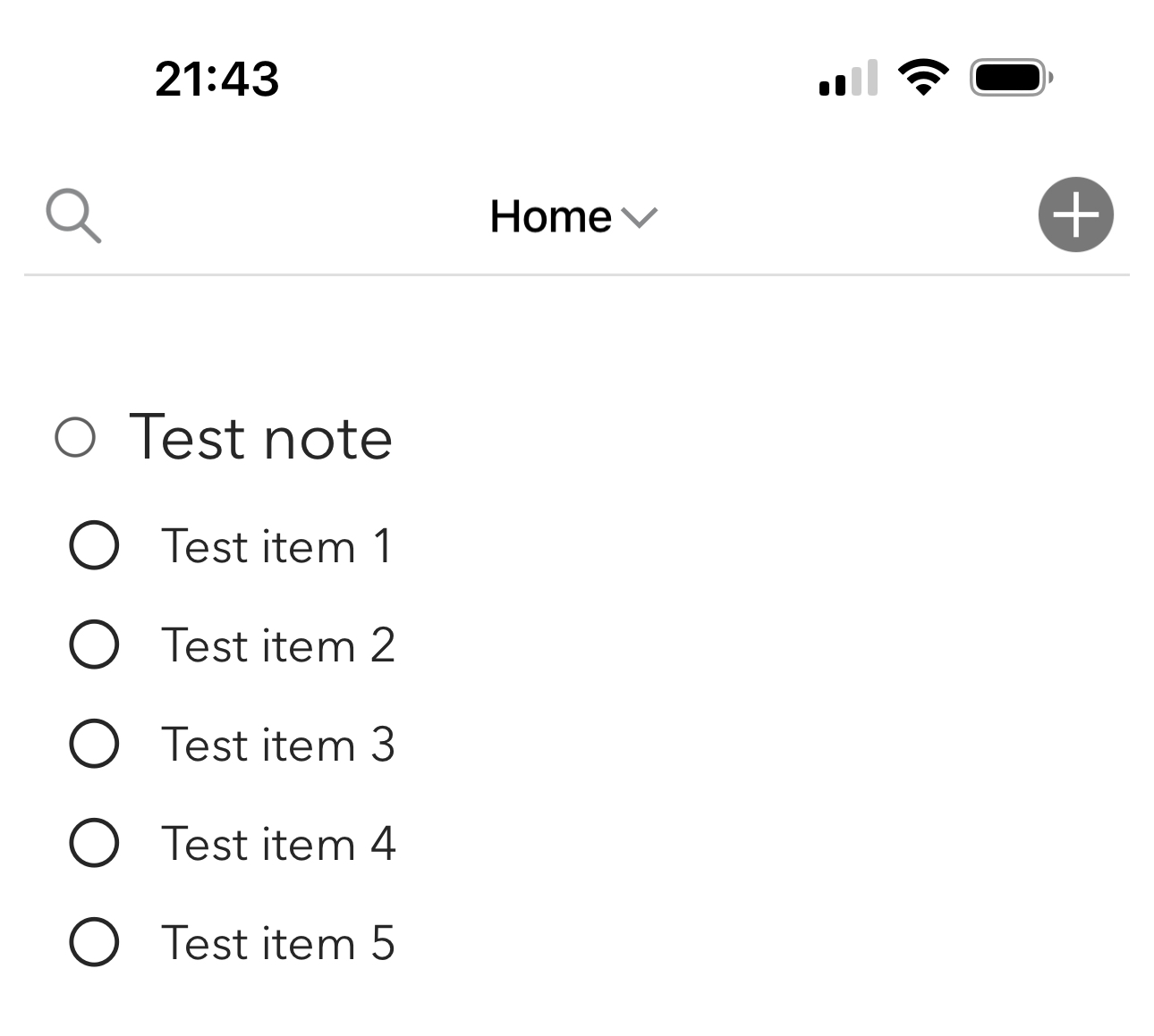
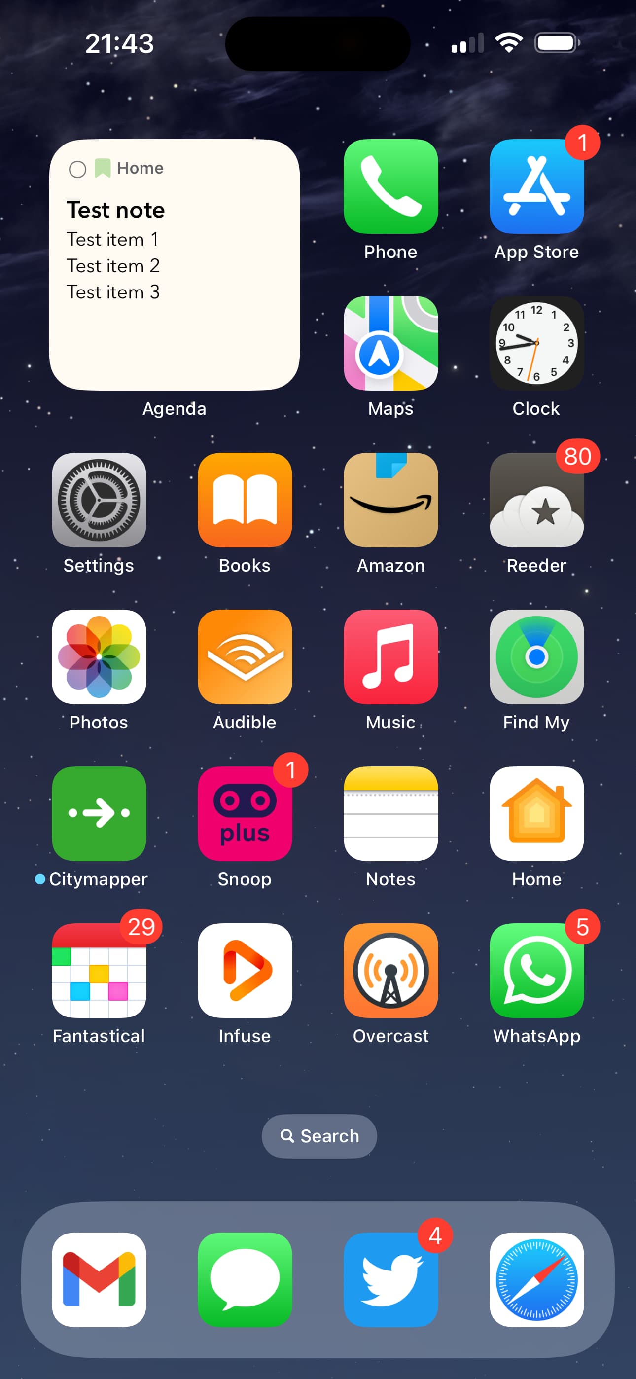
Strangely, the widget only lists 3 items. But there’s space in the box for 2-3 more items - instead, it’s just left as blank space.
I’ve attached a couple of pics - the list, and the way agenda displays it.
It doesn’t seem right that it shows 3 items then shows the same amount of white space underneath it. Hopefully it’s clear that I’m not just complaining about not being able to see more than 3 items - it seems like something is wrong here.
The way widgets work, we have to be a bit conservative with how much data we store. We don’t want to copy across all your notes.
I think we did choose for a 3 line limit. That’s a bit arbitrary. Usually, with longer items, 3 items will fill the area. We’ll take a look and see if in future we could take more data along somehow.
Hi Drew. Thanks for replying, and thank you for explaining it so clearly. I had no idea it could be so difficult to get more lines in, but having read your explanation I can see how ugly the widget could get, and how it was necessary to be conservative at the start;
Maybe it’ll change, maybe it won’t - it’s a very low priority even for me
But also, I really like the small font that you use. Other app widgets often have ugly, larger fonts that ruin the widget. Your use of very small fonts suits the Home Screen perfectly, and that’s where I’ve got my Agenda widget
 )
)