I just downloaded this app and I really enjoyed it so far. Thank you for all the effort and this is absolutely an amazing app to use!
However, I think there is no text colors function? That’d be a pity because it can help us highlight the key and important note for the agenda which saves our time to read the whole paragraph. I believe this is useful function for many users! Hope this feature will be added soon! I’m a big fan of this app now and really hope our feedbacks will be taken and can improve others’ experience in using this app too! I wish you all the success in gaining more users!
Thanks for updating the community & creating this color feature for us! I’ve been using this feature for a while now, and I’m loving it. I love the fact that we can use the colorpicker to choose our own preferred colors!
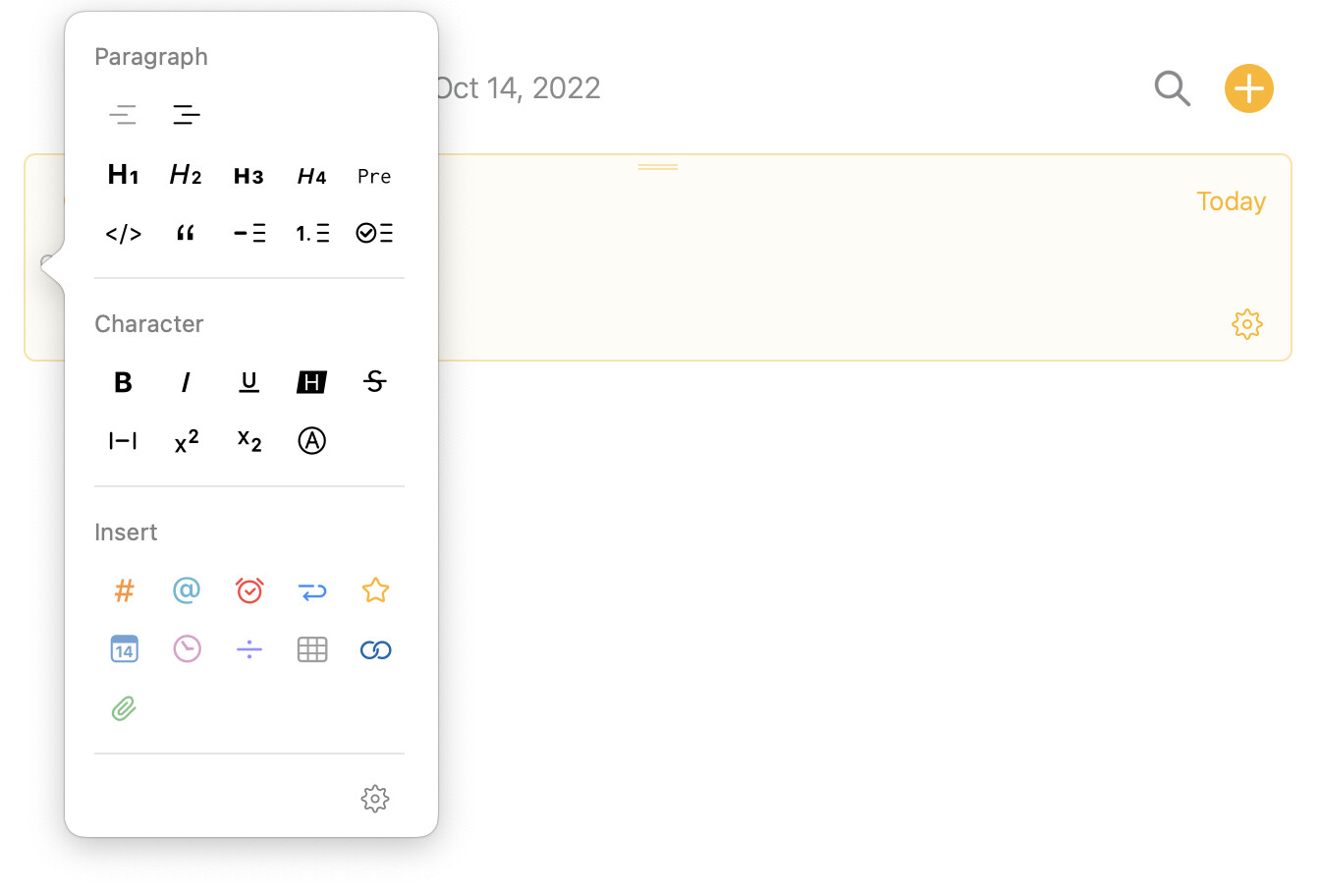
One thing about improving the user experience is that it takes a bit more steps (it takes around 3 clicks) to actually finish the color feature (highlight text or change text color) using the little dot panel ( see attached little dot panel.jpg).
As a user who uses this feature a lot, I’d like the color done more easily and quickly.
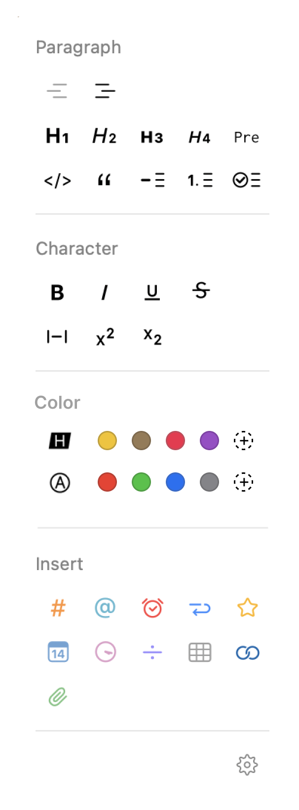
For example, perhaps placing the text color options below the "character section” as a new section, in the panel which shows up after clicking the little dot next to the text (see attached Little dot panel (color section).png).
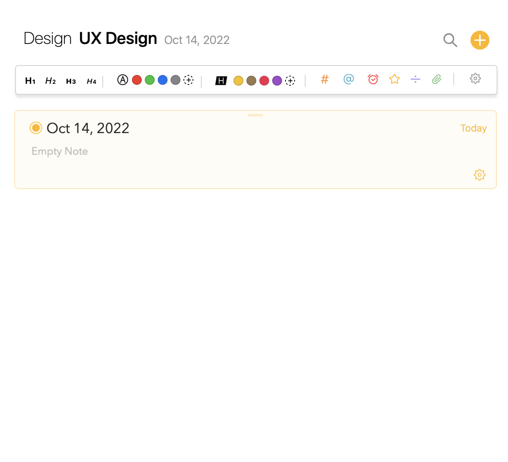
I can tell from Preferences in the Settings that the team is trying to give us more opportunities to customize the app interface based on our own preferences which is a really great idea. So another idea on customization I have for the little dot panel in the text is that maybe the team can think about allowing users to “pin their own most commonly used features” somewhere (e.g. at the top under the project title?) in the main project interface. (see the attached Pinned Tools Bar.jpg)
The pinned tool bar is obvious and the pinned tools are easily accessible so users can be more productive on note taking, which is exactly what this app does: be more efficient and productive on note-taking.
This could be a useful tool and a premium feature I believe!
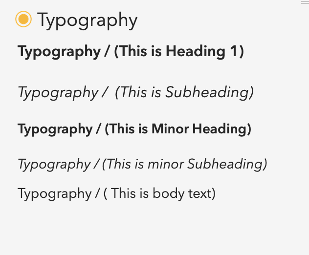
One last thing I’d like to provide feedback is the text styling. Currently the heading, subheading and body texts are pretty similar in font size so when in a large content, the heading and Subheading cannot stand out, so do the minor ones. (As a user, I’d like to see a clearer contrast among them (in terms of font size) so there’s a more obvious visual hierachy for lengthy text structure) (see the attached text styling.jpg)
Thank you so much for reading this! I hope my feedbacks as a user experience designer are useful to you. This is still an amazing app and I enjoy the app very much!
Ps. I think Drew has already answered to some suggestions here, in general (and independent from the fact that we really like your suggestions, the mockups are great!), please don’t “double-post” across multiple threads and if possible separate the suggestions in one per post as it prevents that a thread ends up in a soup of the responses to different parts of your post, which would be a shame.