Hi everyone,
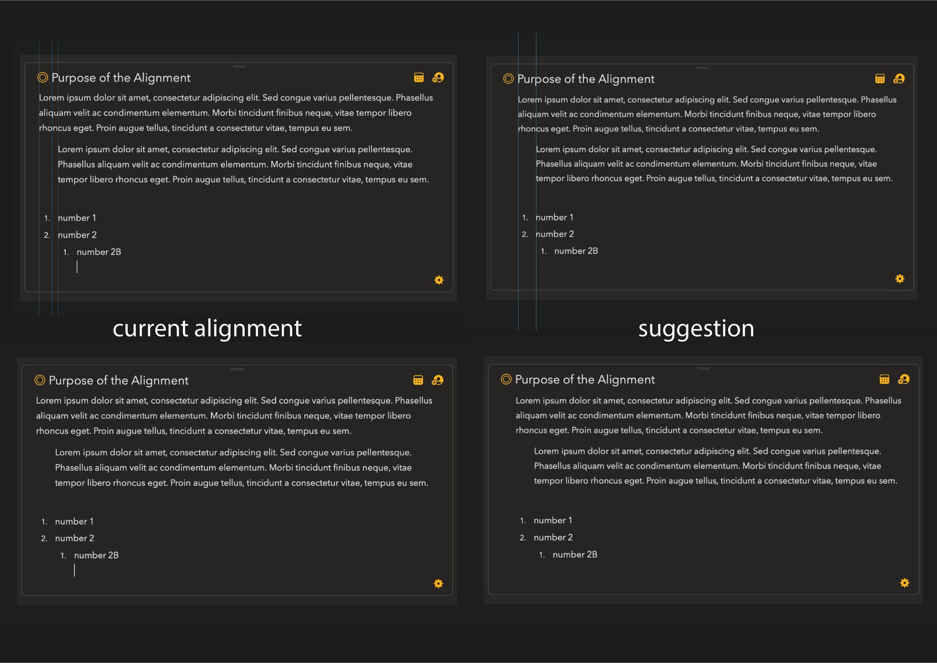
Is there a specific reason for text to be aligned on the far left edge of the notes ? Am I missing something ? I believe it can be better if text would be aligned to the title. As it is it feels a bit messy, no ?
It’s a balance between use of screen space and design, especially on smaller screens and windows it would mean quite a bit of wasted space and it would IMO also look off compared with the margin on the right side of the note.
Thank you for the prompt reply. I see, I can understand the use of space on smaller screens ios, but is there a way to implement this as feature so we can toggle it if we want for Mac os or bigger screen ipads ? In the end all the books, magazines, websites even on this forum, everything is neatly aligned to the left edge of the title.(at least most of the time).
Also I am curious what others think as well.
I see. Then how about this ; can we get a re-adjustment on indentation so that first level would align with the title. It looks like indentation is roughly ~1.5 space further away than the title. Or as we can adjust “spacing” in the settings maybe we can get a “indentation” slider. Implementation is really up to you but I’m curious if you would consider something like this in the future. Thank you.
I think it looks better as it is when the text is aligned to the button on the left. In the new suggestion the button looks out of place. Besides, I would not have liked to be dependent on indenting back the text every time I wrote a new note.
I am using Agenda both on iPad an iPhone, and it would be a waste of space on that small screen. As it is now Agenda is the note taking app that is most suitable for the phone.
I think it looks better as it is when the text is aligned to the button on the left.
Unfortunately it is not perfectly aligned to the button on the left.
In the new suggestion the button looks out of place
I would argue with this as well. Button is a graphical element, nothing to do with text or title. It is an indicator. Currently it acts like the part of the text block which creates visual noise. It would create a cleaner visual perception if it is separated. Same reason when you use bulleted list and keep writing it separates the text from the bullet on the next line. It aligns the text together and keeps the bullet alone and separated.
^ You can see here how it aligns the text together and not aligns to the button on the next line. Why ? because it is visually cleaner and better.
Besides, I would not have liked to be dependent on indenting back the text every time I wrote a new note.
I meant the other way around. If you want to align to title you can indent. So my suggestion was ; app stays and acts like as it is, but when you indent it aligns with title.
I am using Agenda both on iPad an iPhone, and it would be a waste of space on that small screen.
I updated my suggestion if you check my messages, I can understand for iphone but it is not a case for ipad or mac, we have plenty of space there. (I am using ipad mini btw)