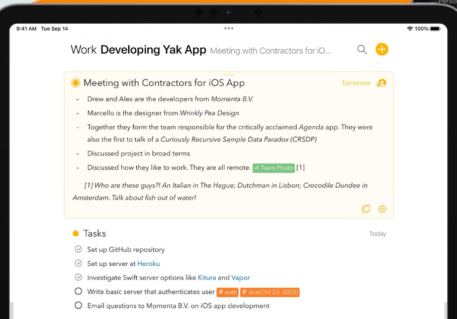
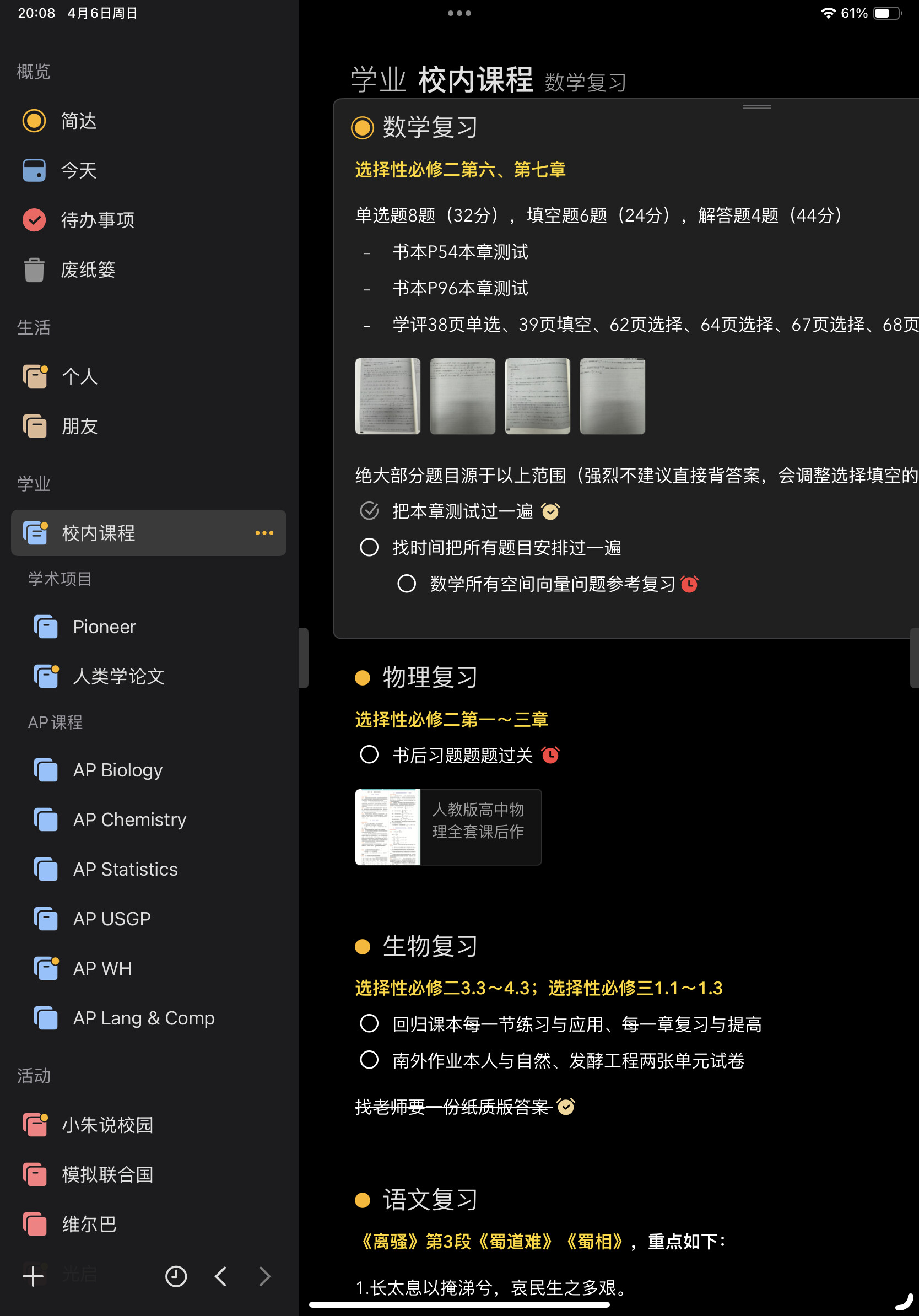
I just started using Agenda, and I am loving the concept and the versatility. One bad issue I’ve ran into is that the title of the page is too close to the note. There should be a little space in between, and I suppose that should be as originally intended.
I know it’s a very small problem, but it’s one of those very painful crevices that jumps out at you every time you open the app. Please kindly find a way to fix this - this app is almost perfectly designed!
Here’s a comparison of what it looks like on the App Store screenshots and on my actual device. I’m using an 11 inch iPad Pro.
Hmm, odd. I will investigate. Thanks!
Thank you! This issue was present for both Chinese (Simplified) and English.
I will be investigating for the next release.
This issue is cosmetic correct? You can still use the app OK, but it looks bad. Is that right?
I have a fix for this now, I think. It will be in the next release. Hopefully not too long.
Thanks for reporting this.
1 Like


