I think the readability could be improved by increasing the spacing between paragraphs and between caption and note text a bit (maybe even make it configurable?).
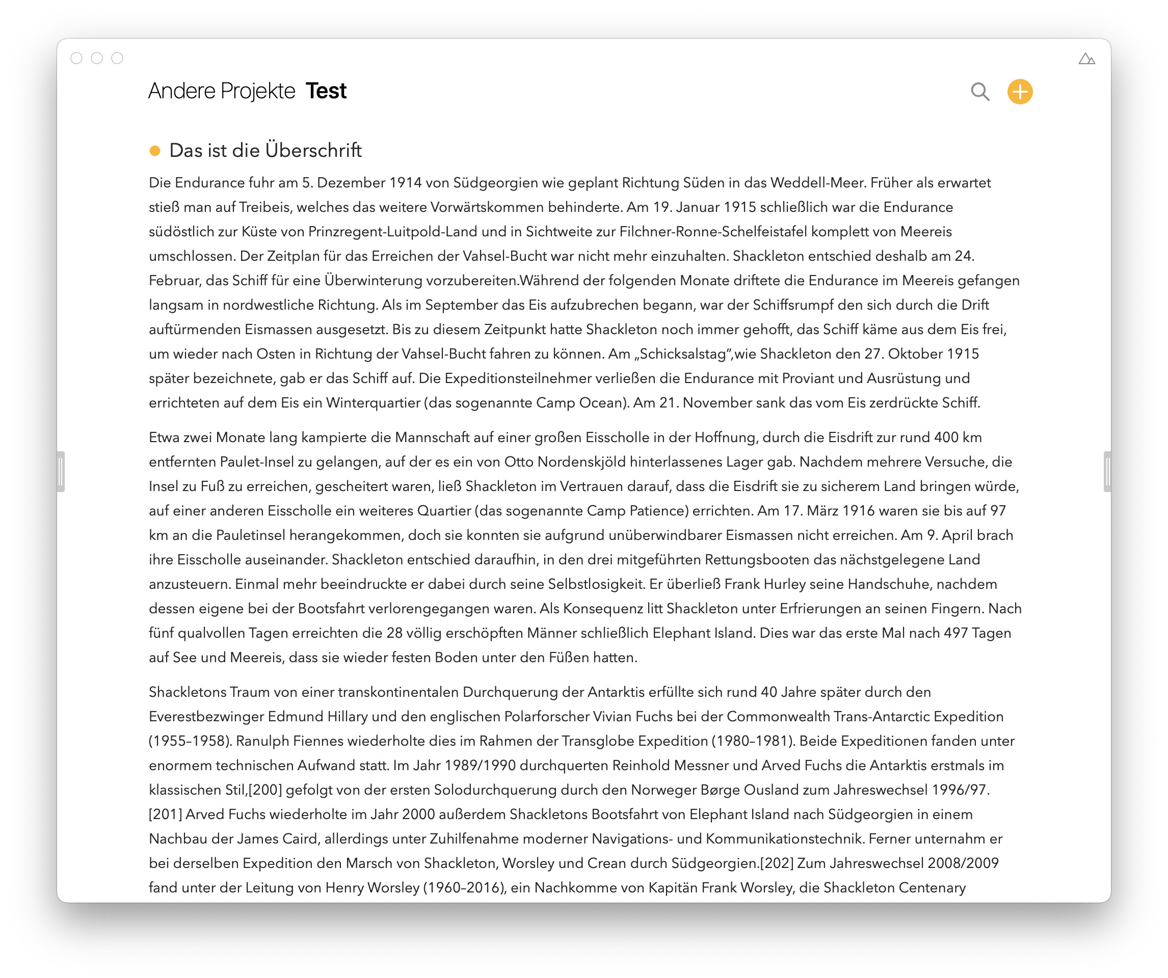
This is the spacing how it is now:
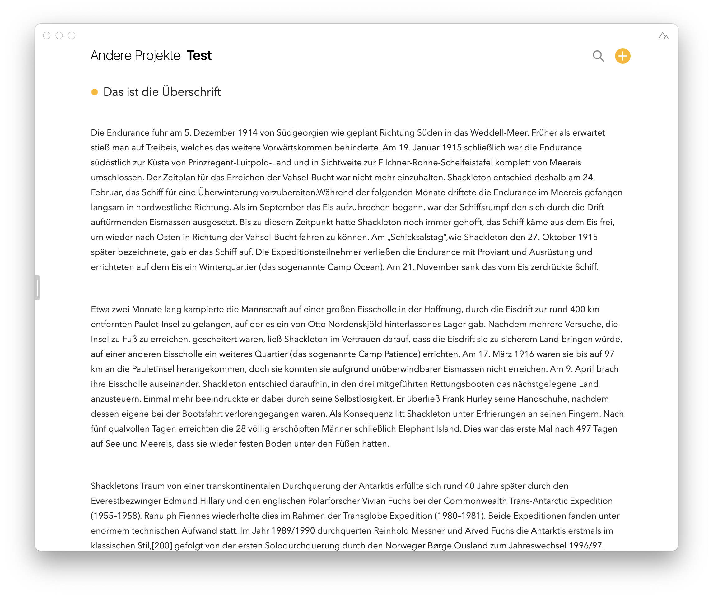
This is how it looks if I use newlines between the paragraphs and on top of the note, which I think is too much (I know this could be reduced by sacrificing line spacing, but that wouldn’t increase the readability either):
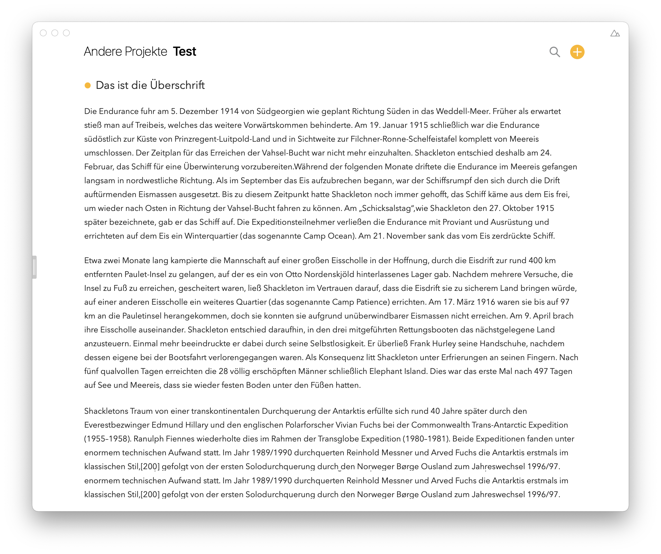
So this is now my suggestion for how it could be looking like. The spacing on top of the paragraphs (or below paragraphs) is less than a new line but more than previously:
It would be great if you could add an option for setting the paragraph spacing like it is already possible to set the line spacing. Probably with providing separate options for spacing of text paragraphs and bullet-point-paragraphs.
5 Likes
To me it looks like you have reduced the line spacing or are using soft-returns between paragraphs? What you show doesn’t look like the default text and line spacing to me?
The line spacing setting is at about the middle of the slider. There are no soft returns between the paragraphs in the first picture.
But my point is rather that I wish to be able to configure the paragraph spacing in a separate option - meaning a smaller line spacing not leading to a smaller paragraph spacing plus some spacing at the top of the note between the first paragraph and the title.
It’s one of these tough balances between adding more configurability and feature bloat, which so far is falling on the latter I’m afraid. We have had some people ask for separate paragraph spacing options, but for most people it would be just another slider added, ala Microsoft Word and its dozens of formatting options.
Ok, I see.
But even if it’s not configuration option, I would still welcome to have a more consistent spacing around headings (for example when using a bullet list immediately after a heading, there is no extra spacing, etc). And - at least for my eyes - the beginning of the notes squeezed a bit too tight to the note title looks kind of unsatisfying.
I think a lot has to do with the fact that you use relatively long paragraphs, which isn’t as common. If you use shorter paragraphs it looks much more consistent and it the spacing you propose would then look too large for those.