It’s hard to use the context menu because the Apple Intelligent Tools icon overlaps the round button, making it tricky to click on options.
Perhaps shift the icon away from the round button could make it easier to use.
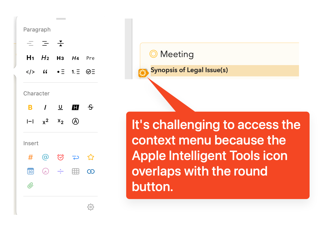
It’s hard to use the context menu because the Apple Intelligent Tools icon overlaps the round button, making it tricky to click on options.
Perhaps shift the icon away from the round button could make it easier to use.
I agree. Unfortunately, Apple don’t give us any control over that AI button at all. It just appears there, we can’t move it, or stop it appearing. Frustrating.
Update: was just playing with this. It seems it only appears when a significant amount of text is selected. I find an easy way to get rid of it is just to move the cursor out the left border, and back in again. Then you can click the styles button.
There isn’t really a nice solution to this:
None of these really feel like a better solution than just moving your cursor over to the side if it appears and you need to access styles button.
I tried your suggestion of moving the cursor out of the left border and then back in, and it worked.
For a solution, I would recommend keeping the button size the same but increasing the invisible gutter area around it. This way, it remains clickable when the mouse cursor is near the button, even if the AI button overlaps with the Agenda button.
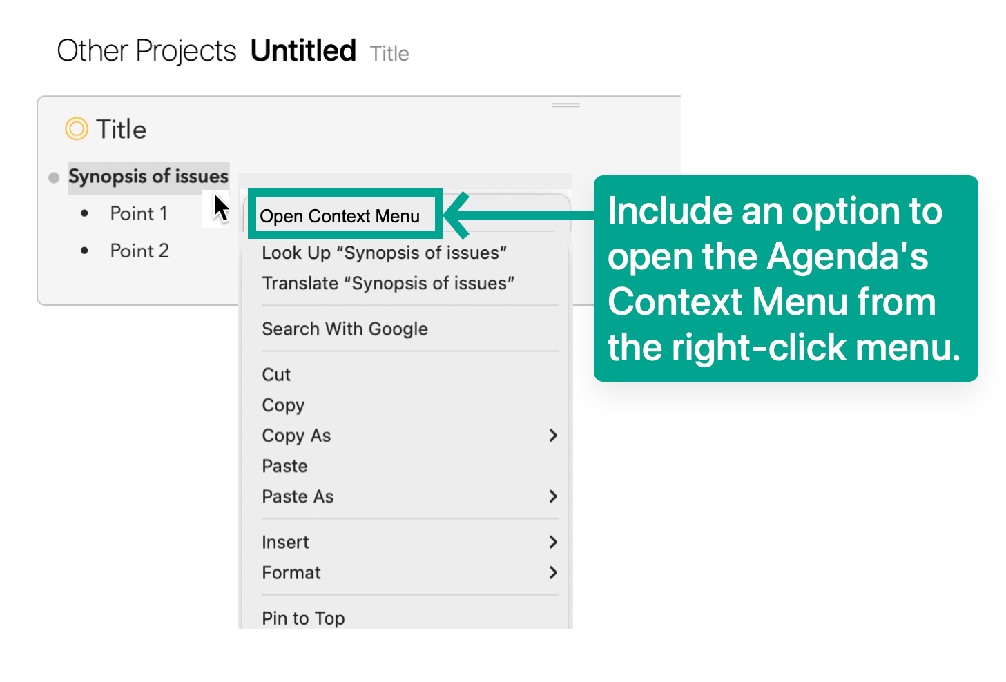
Another option is to allow users to access the Agenda’s context menu through a right-click (refer to the attached screenshot)
Thanks for the feedback!
Note also that most of the formatting options in the palette are also there in the contextual menu under Format. (In case you missed it)
Thanks. Yes I am aware. But yours is much visually more attractive and intutive.
On that note, I have another suggestion for the formatting tool that I’ll share in a new post.
Thanks