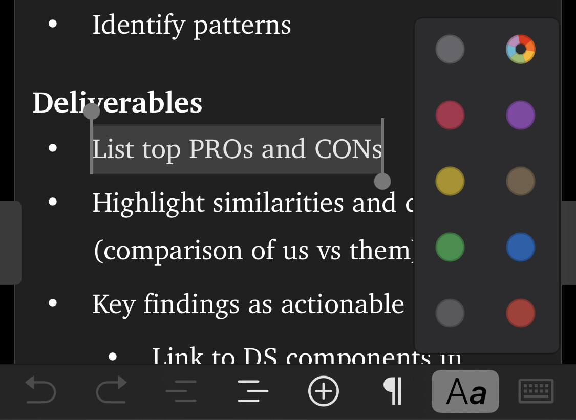
Recently I switched to a monochromatic interface setting and discovered that changing the accent colour overwrites every highlight that was previously default yellow to grey, and that isn’t good, not just from a cosmetic POV, but from an accessibility standpoint either.
By default highlights are a variant of the accent color, only if you pick a dedicated one it will stick. This we consider a feature rather than a bug as it allows for a consistent look of the app if you switch accent color.
In that case may I suggest fine-tuning the dark interface a little bit, so that those who choose to go with a purely monochromatic setup could clearly distinguish where elements are highlighted?
For someone who suffers from photosensitivity like myself, I view everything in dark mode, unless light mode is strictly necessary (strong sunlight outside). But sometimes some highlights may blend into the background and are easily overlooked. For that reason, perhaps tweaking the colours of a dark interface a bit to find better balance would do.
The colors that you use for highlighting from the Format > Highlight menu will stick, and will also be remembered on subsequent invocations of the cmd-! shortcut. So isn’t the trick in your case to just pick the color you want from the list once manually, and after that just use cmd-! ?