Is it possible to make list of highlight colour to choose from brighter for dark mode? Example BLUE in list of colours is very dull compared to BLUE under Apple list in custom. List of highlight colours look much better in light mode but very dull in dark mode.
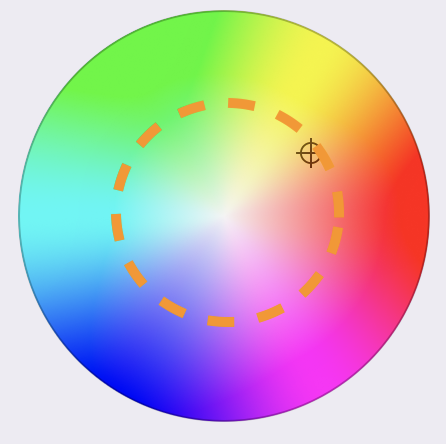
You can pick any color you like when picking a custom color, the saturation you can also determine by switching to the respective picker mode. The trick here is that if you want a custom color it’s up to you to pick one that works in both light and dark modes, the easiest is to pick a color that is in the middle between light and dark:
I know that. It’s stated in my feedback above. Clearly pointed out if you read my comments about different blue. Point is that listed colours are dull in dark mode, why can’t you guys just use brighter shades in listed colours when in dark mode instead of having to choose custom and pick a colour there each time… Dark mode always 2nd class citizen in agenda, like an after thought.
That’s for technical reasons as many people have auto-switching to dark mode we have to find a middle ground between something that does’t hurt the eyes and light mode and is still visible in dark mode. It has nothing to do with dark mode being a 2nd class citizen but reality is that the majority of users use light mode, so it wouldn’t make sense to optimise for dark mode.
Other apps have no issue making it nice for dark mode except Agenda ![]() . Everything on dark mode looks bad on Agenda.
. Everything on dark mode looks bad on Agenda.
Sorry you feel that way but that’s not a feedback we’ve seen from others