Hi,
Could you give the formatting of the Headings a overhaul? It’s so much easier to understand hierarchical headings structure in e.g. Bear:
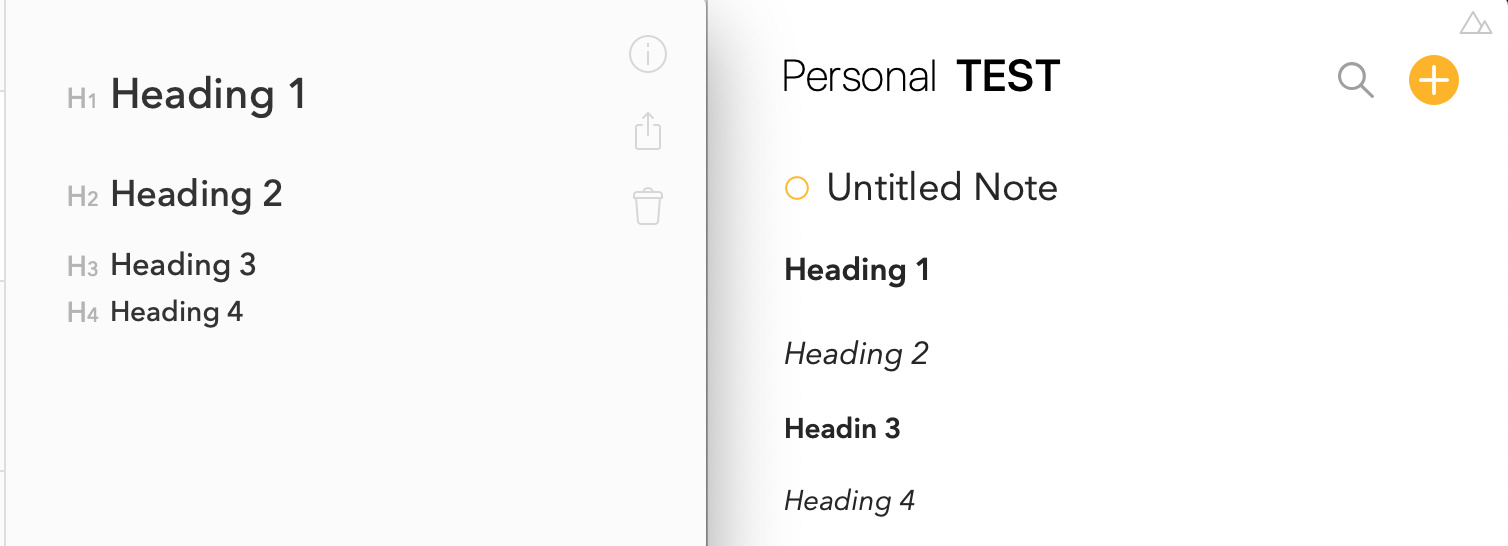
(Bear on left, Agenda on Right)
Hi,
Could you give the formatting of the Headings a overhaul? It’s so much easier to understand hierarchical headings structure in e.g. Bear:
Thanks for the feedback. We probably won’t change the default, because there is more contrast between our H1 and H2, for example, than in Bear, but we do plan to give control over font styles in future, and you could then change that to your liking. That is probably the best approach going forward.
I’ve also found that the heading doesn’t offer enough contrast and was dismayed to learn that selecting it and hitting command + (mac) didn’t bump up the size. More control over this would be stellar. Loving the app BTW! I use it daily 
Command Plus and Minus should change the font sizes used by both text and headings (see the View menu).
And therein is the problem my friend. I only want to change the size of the selected headline. Try it in Notes for Mac if you’re not familiar with it though other editors do pretty much the same. In Agenda this changes the size of everything and that’s not the intended effect and seems odd when only a single line of copy is selected.
Got it, unfortunately we don’t plan to allow this I’m afraid.