Hello
Thank you to the whole team for such a beautiful application.
Since I want to install the system by adhering to the Apple ecosystem, I switched to Agenda last week from my notion + Tick Tick system.
As far as I can see, the AGENDA is the only note -taking application with two -way synchronization support with Apple calendar and reminders.
Everything is good right now.
I want to declare a request/criticism:
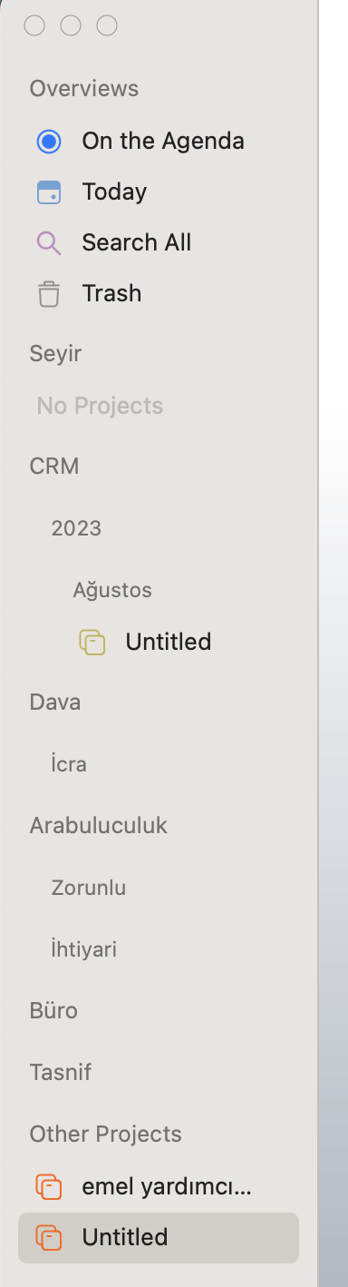
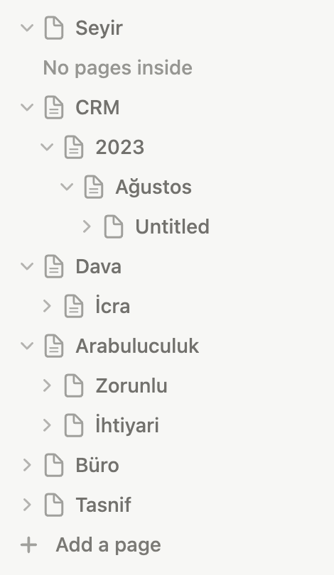
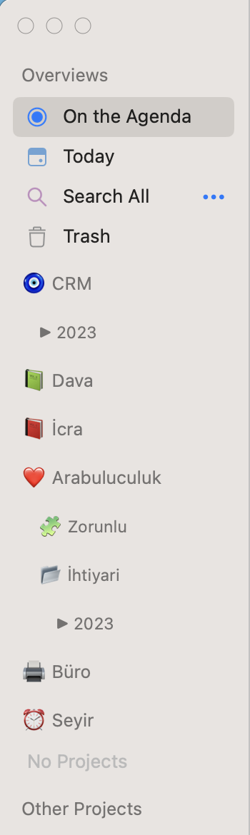
I think the image of hierarchical folders and files is not beautiful in the panel on the left side of the application.
Only a small inward tab appears subfolders.
I think this prevents us from choosing these folders and files. (with our eyes)
(According to my opinion)
It would be great once in a while if it is a line or the triangle that opens off.
(As a suggestion)
Greetings from Turkey…