Perhaps I have missed this somewhere but visually when I am trying to move within my left sidebar, the Projects stand out more than the Categories. As someone who nestles categories under other categories this makes it more difficult to really move things around easily. Can these Categories be Given color options or highlighted in some way so it makes them more easily visible.
1 Like
At the moment the look isn’t customizable I’m afraid, we’ll take your feedback on board, thanks for sharing.
Exactly what I was thinking!
Categories 2.0
Beside adding some color option it would be fantastic to add an icon and a “connection glyph” before the category so that it would be easier to understand the “folder structure”.
Something nicer than this ![]()
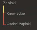
Maybe more flexible use as well, like a real folder. It feels a bit rigid at the moment.
2 Likes