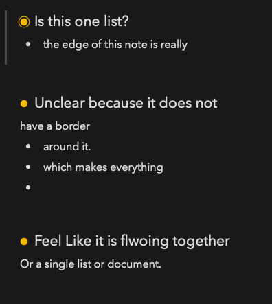
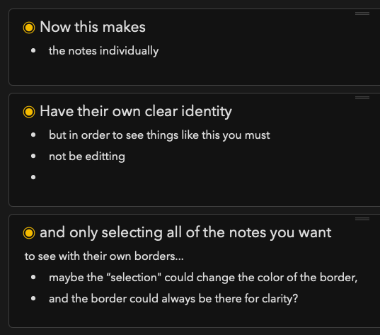
The two picture below demonstrate the UI issue I have with Agenda. When you Select notes, they are given a border, but if you are editting and working in one, the border is only around the selected note. If you deselct, the default view gets rid of a notes border, making the note list feel like another bulleted list of it’s own. I find this design terribly difficult to navigate with ease once multiple notes and lots of content has been built up. I think the stronger choice would be to have notes keep their border by default, and have the border change color when the note is selected.
Anyone else? Huh?
CONFUSING SEPERATION OF CONTENT: CLEAR SEPERATION OF CONTENT:
I can see your point but I think it may depends on how you think about notes and projects. I prefer the current design because I often use Project for a complex task spread over several notes. Seeing all the notes as a large document makes sense in this situation. (To me!)
Actually, I never had a problem with distincting the notes; the yellow dot is as clear a signal as I need it. Plus, the trends in UI design goes towards dropping lines and boxes wherever possible (compare screenshots from 90’s software!!).
However, I use the light mode, and perception might work different here.
From our point of view, we certainly considered this. In fact, I think our first internal builds had exactly this design. But then we decided we wanted Agenda to be clean and as uncluttered as we could, so we opted for just the yellow button, and extra spacing. I think with the extra spacing, it is pretty clear where things start and finish.
As already stated, we also think of a project a bit as a long document, and didn’t want to compartmentalize the notes too much for that reason.
We are in the process of testing horizontal rules. Perhaps that will be a way to separate things more if you really need it in some cases.