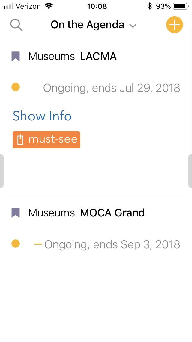
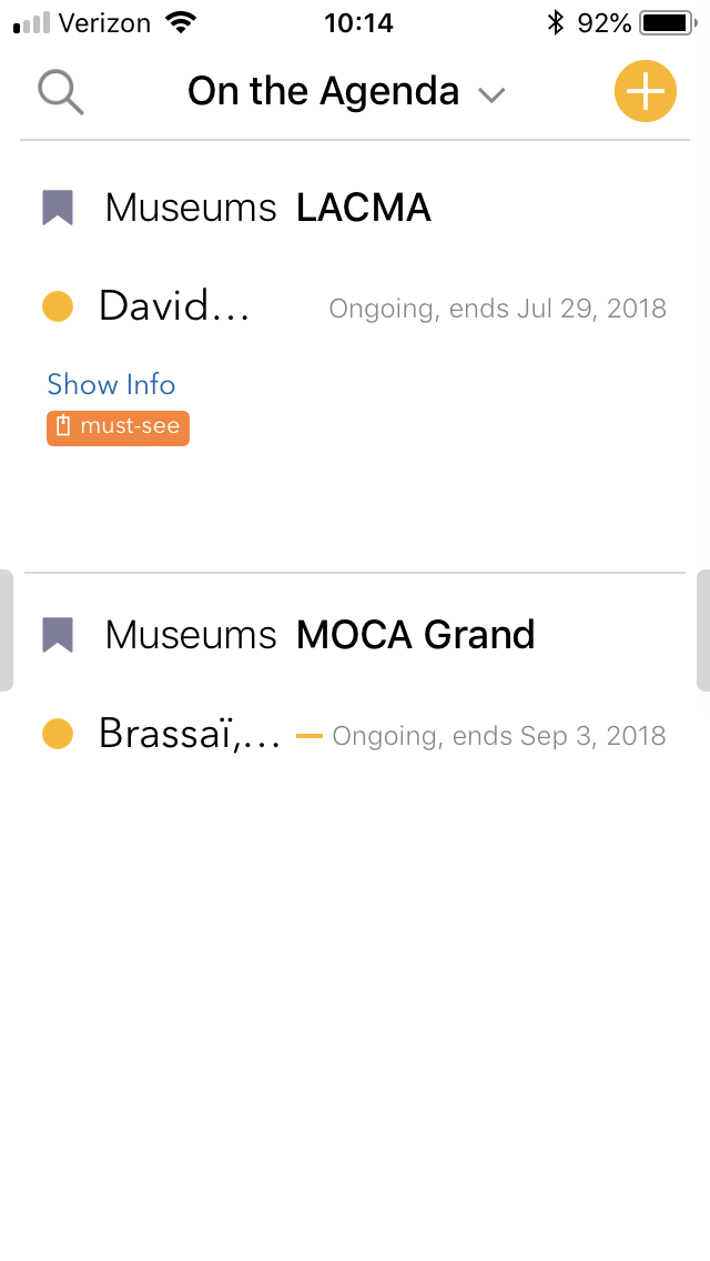
What I did: opened Agenda app
What happened: can only see date, not title of note
What I expected: to see the title and the date
Things that might be helpful to know (Agenda version, OS and model, etc):
Agenda 2.1.1
OS and model - iOS 11.4 on iPhone 7
I’ve attached screenshots.
I really do like the app on my Mac, but it is virtually unusable on the phone. I can’t see any note titles when I have the font size set to the size I want. I can see some truncated titles when I set it to the smallest available.
What I don’t understand is the insistence on keeping the title and date on the same line. It works great on the desktop, but isn’t legible in the portrait orientation of the phone.
At least make it an option to go to two lines or to not display the date at all, please. It’s a pretty severe accessibility problem. If you need the larger font size to be able to read, you are currently out of luck.
5 Likes
Yes, it’s no “insistence”, just a lack of time at this point. We are planning to improve the layout, probably going to two lines.
Thanks for the feedback!
+1. This is a no brainer. It’s so annoying titles are still not visible on iPhones. Please shorten the date/hour or put on 2 lines.
Couldn’t agree more with this thought. It’s simply useless to open this app on my iPhone at the moment because all I see is a list of dates, and no user created titles. Seems like a large oversight to be prioritizing the date and not the title?
Not a programmer, but was very surprised when this detail wasn’t included in the most recent release.
The problem is simply that there are 10-20 of these types of issues, and each person can’t understand why we haven’t fixed the particular one that most affects them. Eg. I don’t use dates that much in notes, so I don’t see this issue much. But for people who use them a lot, it is more serious.
You will be happy to know we are fully aware of the issue, and it is high priority. We will be addressing it soon I think.
Totally. Hear that. Any progress? I know there are folks who use the dates out there, but do time frames really need 3 digits? To have 6 digit date, and a 6 digit time frame seems like overkill? Couldn’t the time at least be hidden? Its only a simple swipe to open the calendar and get that info… without the user title I can imagine a lot of people running into the same issue as me… a bunch of notes labeled “Meet…” for example. I have a hard time convincing myself that people are more likely to remember a note by its time of day, rather than it’s title. My brain for sure goes to the title first, then the date, then the time. shrug don’t think I’m an exception here?
Thanks for the great work! Trullly.
Yep, we hear you. It’s clearly an issue, and we have plans to look at it soon. Thanks!
1 Like
This is indeed a huge oversight and illustrates Agenda could benefit from a GUI makeover. There’s plenty of these things all over the apps.
But in this particular case: The entire reason of existence of Agenda is notes linked to dates, but you can’t read the title of a note because the date/time overlaps. That’s just crazy and should have been addressed in version 1.01. Especially because there are so many easy fixes: a smaller font, shorter date/time, omitting the end hour, putting date/time on the next line,…
I think we made clear we agree this should be fixed, and it is in the planning to fix (…along with everything else that someone thinks should have been fixed in version 1.0.1).
Fact is, there are no easy solutions to this. A smaller font only helps a little. Apart from the fact that differing font sizes is ugly and cluttered, it will only show a bit more text, and then you will still have an issue for longer titles. Other solutions also only improve things a little, because you have very limited space on an iPhone.
The solution we are going to implement is multiple line titles. It has already been designed, but it is a non-trivial solution. We can’t just tweak a font size, or hide the year, we have to change the layout constraints a lot. We plan to do this, but it is not a 5 minute job, and we need to make sure it works very well, because everyone will be affected.
1 Like
Still waiting for a solution.
Agenda on iPhone is useless this way.
Please fix asap!
Thanks,
Francesco
This has a high priority for us. Unfortunately, the fix needs some pretty major changes. We need to make the title wrap around to multiple lines. Sounds simple, but the layout consequences are many.
Sorry for the delay. We should get to this sooner rather than later.
Looking forward to seeing this fixed.
It’s part of the current stint, working on it now…
2 Likes