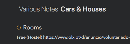
I think that visually speaking it would be better if the breadcrumbs at the top had a slash between the Category and the Project’s name. Here’s the before and after:


That would apply to sub categories as well, of course. It makes everything less cluttered and hard to read, in my opinion