Hi,
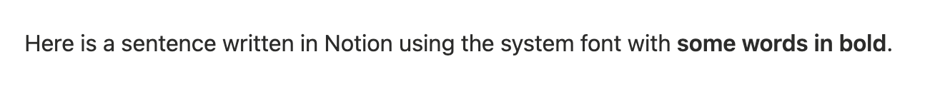
Just some feedback on the typography: I find when using the San Francisco font, it’s quite hard to distinguish bold text. A slightly heavier emphasis would be great.
Thanks for the feedback!