Hello,
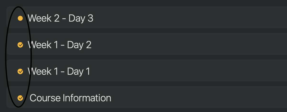
This could be a minor request, but for a person who doesn’t have the best vision, like myself. The check (icons) could be a bit more friendlier to some group of people. Is there a possibility to make it more easily recognizable?
Thank you.
Hello,
This could be a minor request, but for a person who doesn’t have the best vision, like myself. The check (icons) could be a bit more friendlier to some group of people. Is there a possibility to make it more easily recognizable?
Thank you.
Note that the icon you show is kind of special as it’s used for notes that are On the agenda only, if you remove them from On the Agenda they become a more easy to recognise Check mark only. In most case we would assume that notes that are marked as done would normally not be kept on On the Agenda.
Fair enough.
Thank you.