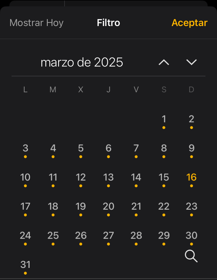
I may be wrong but I feel the up/down icons are pretty confusing. I keep choosing the wrong one half the time.
I mean the arrow icons pointing up or down to navigate to next or previous date. Like in the right sidebar or in the today’s view.
What’s the reasoning for that choice?
I think up arrow should be move to next date. Like going from day one to day two increasing the date. It makes a lot more sense to me.
Even the default order is recent on top and older to bottom so hitting down on the keyboard decreases the date and the other way around.
I think left arrow for previous date and right arrow for the next would be even more easier to understand. This is how it works on a native HTML date picker (just tested).