Basically I’m mainly using Agenda for my University study (it’s like 80% of my usage of the app).
I have a category called University then a project for each Module, in each project I create a new note for each lecture (usually one ~ two lectures per module per week)
Sometimes when a topic takes multi lectures (maybe even multi weeks to cover it) then I end up merging a few notes as they are all covering a specific topic.
Those notes contain things like class notes, links to read, books to check, progress of self-studying it and the progress of any assignment or quizzes related to this topic.
When I finish all of this and I change status of the note complete, it does still showing up in my main list, even the text/title doesn’t for example change colour (grayed out for example).
As I’m now almost near the end of semester (which in January), I’m experiencing a congested look of the all the notes I’ve been working on and finished over the past ~4 months.
Adding an option to hide notes with the ability to view hidden notes within a project would be really, really helpful.
Or grey out the title for notes marked as completed when they are in collapse mode. So the eye is less distracted.
Hiding notes completely is a bit tricky, because then the question is how you get them back. Instead, we offer ways to make them less in your face.
For example, you can collapse notes. Double click the title bar, and the note becomes just the title.
You can also stick notes to the bottom as “footnotes” if you want them out of the way.
With these two things together, you should be able to make your timelines look pretty neat. Just collapse notes that you are done with, and leave the others expanded.
I don’t agree with you for using the footnote feature as solution for this issue. Footnote (even Pin a note) is useful with another type of issues, even if they’re all belongs to the UX of the app.
Even when manually trying sorting the notes by making all competed into the lower section of the project, the app will ask you to remove the Date. Which cause a bigger issue, than trying to clear the congestion, for easier eye scanning.
Hiding a note shouldn’t be a problem TBH. You have to preserve the order of the note in that project according to the assigned date of that note.
How to get them back?
Add an option in the menu of the project to View Hidden Notes (you could make this option below/above Archive Project).
When hidden notes are temporarily unhidden, then the user can either select a specific one to bring back or multi-select notes to brings them back together.
Create a new list in the Overview called Hidden notes, so users can view hidden notes from multiple projects, and they’ll be sorted by date anyway.
The other easier option, specially if you’re feeling lazy about it, add an option in the app settings for users to choose for the behaviour of Marked as Completed notes, (using a drop down selection similar to Ticked Items):
Just as is at the moment, the default option.
Make Marked as Completed notes grey-out, to reduce eye distraction and allows for faster and easier eye scanning.
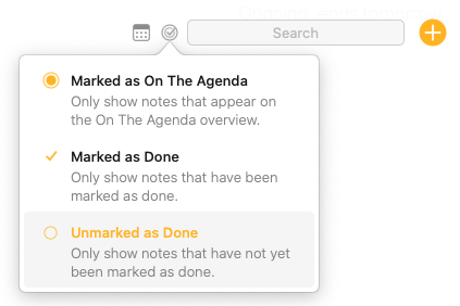
The only mechanism that Agenda currently has for hiding notes from view is via search - whether it’s matching a search term, a tag, OTA status, or Done status.
“Unmarked as Done” is a filter that just happens to be in the search section. Once you’ve toggled it, it persists, so you can navigate to any project you want and it will only show the notes that aren’t Done. You can also save an Overview that show not Done notes.
Per your original post:
Mark notes you want to hide as done, select the “Unmarked as done” filter, and you’re set
Aha I got you, but in this case you have to keep the search active all time, with Unmarked as Done being selected, once you search something else you lose the focus of that filter.
It’s a workaround for the moment, but still feel the developer should think about my feature request. If implemented it can help a lot, specially in large and busy projects.
In most cases when you mark a note as done, then you will not need to do anything about it, maybe once in a month or two you’ll need to copy something from it or read some details to remember something. So it’s wise to give the ability to users to reduce the clutter and make the screen more clearer and easier to eye-scan.
To other solution, as I said in my earlier post, is to make Marked Done notes grey-out so they are less distracting to the eyes.
To add my point of view to this discussion, if I zoom out I see you’re trying to essentially add an additional dimension to your projects, notes you want to keep visible and notes you want to be able to go back to if needed but shouldn’t take up the space within the project so you can focus on those notes that are of more importance still.
Perhaps the solution (or workaround if you want to see it that way) is to think about how you can add such a dimension in a different way. For example, instead of hiding notes that are less important, you can flag notes to me more important (inverting the approach), which I guess is why others have suggested to use On the Agenda.
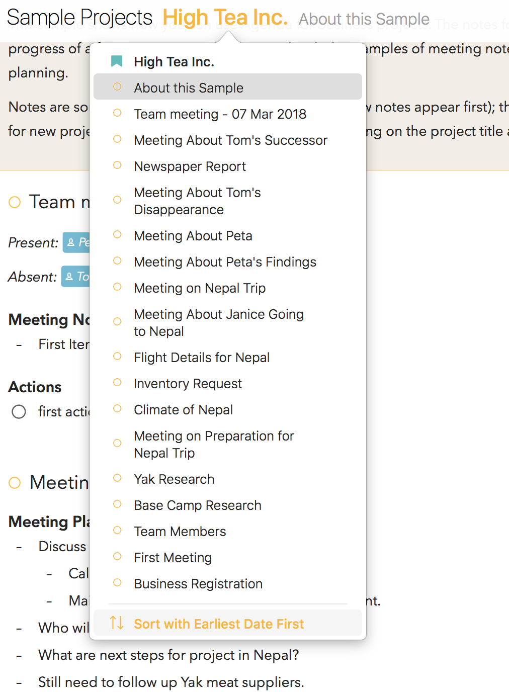
I would suggest another way of adding a dimension and that is to use an additional “layer” or hierarchy level in the sidebar. In other words, certainly for long and large projects (lots of time covered and many notes), you could consider turning them into a Category or (additional) Subcategory. For example, originally I had an hierarchy that was like this:
Category Development, containing:
Project Agenda, containing
Notes for:
each major Agenda update
plus ideas for the website
plus ideas for the YouTube channel etc.
You can imagine that project Agenda turning huge and leading to want to hide notes for updates we already shipped etc. But a much cleaner solution is what I did instead and create a category Agenda:
Category Agenda, containing:
Project Updates, containing
Notes for:
each major Agenda update
Project Website, containing
Notes for:
ideas for the website
Project YouTube Channel, containing
Notes for:
ideas for the YouTube channel etc.
Now each of these projects is much smaller and more focused. In fact I went even further and introduced another level and have subcategories Roadmap, where each major update of Agenda is a separate project, YouTube, where each episode is a separate project, etc. This has the huge benefit that once we ship a new version of Agenda or post a new episode on YouTube I can now archive the corresponding project and thereby “hide” all the notes belonging to the project.
Long story short, I would suggest you consider redistributing your notes in a way that you can archive the projects that are no longer top priority and thereby hiding those notes.
And to finish, we are aware that it would indeed be nice to be able to easily exclude or include notes that are either in archived projects, or marked as done, from search results and overviews. Something which is of high priority on our list.
@mekentosj Thanks for your suggestion, I was in fact thinking about making a second Category with similar projects and use it for archiving (hiding) Done notes but keeping them for reference and because everything is assigned to date with similar structure then I can go back to whatever wanted note easily. But you see it’s still a workaround and not a real solution UX design-wise.
Please also read my suggestion about adding an option to grey-out done notes, just like how you did for the built-in To-Do lists (giving users ability to use default, strikethrough or greyed-out appearance).
Another important thing here. Why Categories are not clickable? so they can work as another level of sorting/filtering of notes. If Categories are clickable then your suggested solution would work even better.
This is the one thing that baffles me about Agenda and I brought it up when Agenda first came out, but clearly the devs definitely do not want to implemenet this. Which, like I said, is baffling.
It is also the reason that I stopped using Agenda after a couple of months into my year’s subscription.
Everything just ends up cluttered. Sure, there are workarounds but why?
Well it’s the way it is and it’s not changing any time soon I think
Actually, it will very likely change. We have a project lined up to allow this level of control in filtering. So it is not true that we have decided to ignore it, it is just that we have a solution in mind that is much more powerful than just filtering out “done” notes, and we want to do that right.
It is true that Agenda has a pretty firm philosophy of not disposing of things, like some other apps do. Our philosophy is to keep a timeline history of projects, and removing data does not fit as well into that as it does in a task app or similar. And you can very easily collapse notes, which is almost the same as hiding them, with the added advantage that they are present to access them if needed.
In short, a solution is in the planning, and is getting high on our roadmap, which should satisfy those who want to explicitly hide notes.
Well, it’s a lot more than an idea actually, it’s a complete design. It’s too detailed to go into in this context, and is an internal part of our development process, so a public forum is not appropriate.
What I will say is that we have designed a powerful and flexible search and filtering system, much more powerful than what we currently have. Of course, it will not be trivial to implement the design, but it is now a very high priority for us. It’s the feature that WE want most for ourselves in Agenda.
And the things I have read about having note summaries (eg only unchecked items) etc should be addressed by the design. It should give you the flexibility you want to structure your view of your notes, and build powerful custom overviews.
We prefer this approach of “give people tools to build their own system” to a “force people to use our system” approach. That has been an Agenda philosophy and lesson we learned very early on.
This is a step I haven’t really taken yet… for some reason I have an aversion to projects with only one or two notes in them. Not saying that’s the scenario you’re in with releases and youtube episodes, but I can certainly see that happening in my situation. After all, I have lots of “projects” that I track in a single note at this point.
I’ve settled for making archived parallel projects, and moving notes into them to archive the notes. e.g. for a Personal project, I have a Personal (archive) project and move notes into it.
Probably the main reason I don’t want to split everything up into tiny projects is because then I lose a linear date-based view of the notes - something which I believe may be coming at some point.
This what I’m also doing now. That’s why thought an auto-hide feature for things Done should offer a better workflow. With an option somewhere to click to unhide hidden notes.
I’ve just downloaded Agenda 13 after spending the day researching which app to use. After about an hour’s use, the first thing I noticed was the scrolling I needed to do just to view a few notes, albeit with a lot of text in each note. Then I came across the option to ‘Collapse Notes’, which is what I was looking for. Then for an added bonus, I accidentally learned that by double clicking a collapsed not title, it expanded that note. Awesome!