Why is there no menu bar with buttons to edit and format notes on macOS? I would expect one as the current solution, the little dot in front of every line does not always appear.
Now, I need to start writing and then edit. While I would also like to put bullets before starting a new line. But often the little edit dot doesn’t appear.
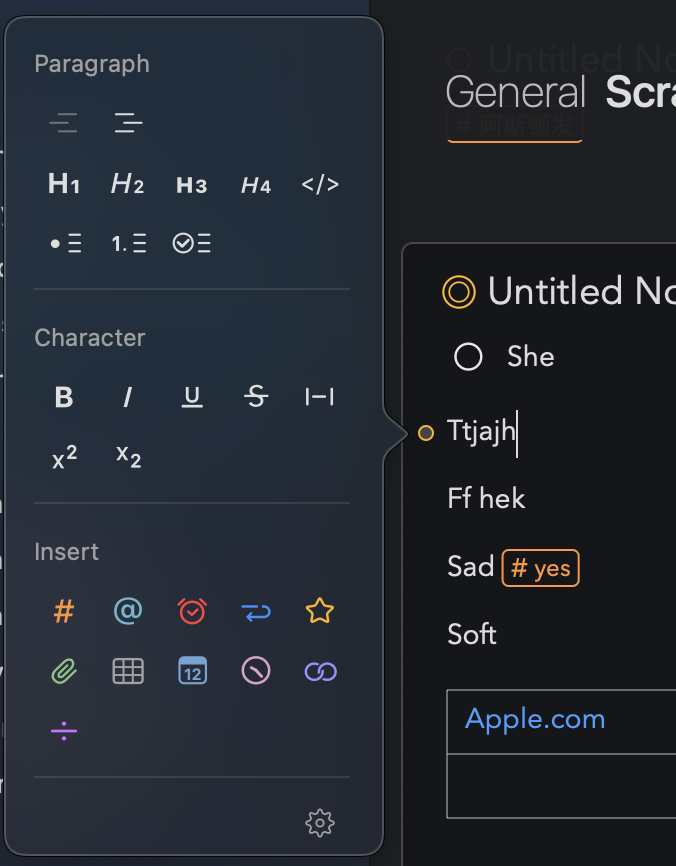
On the Mac we feel a format bar doesn’t make much sense, if you need a visual way to change formatting we have the popover you mention, but much faster than either that and a formatting bar is to simply use keyboard shortcuts (or right/control-click contextual menu as an intermediate between the two).
Thanks for your reply. But why doesn’t the dot appear on the next empty line? Should I first type and then format?
Yes, this is indeed a shortcoming. You would need to add some text first.
We have plans to change this aspect of the app.
Kind regards,
Drew
Great. And what about formatting multiple lines at the same time. If I select 5 lines and choose the check list option, I would expect all 5 lines to become separate items in the list. Now, only the first line becomes a check list item.
That would speed things up. And it would be a logical way to go about it.
The current control is for a particular paragraph, not the selection. It is unrelated to the selection at all. You don’t even need a selection for it to work.
You can you use the menus at the top to apply check list to a multiple line selection.
In future we may move away from the paragraph control and to a selection based one, but that is a more major project.
Kind regards,
Drew
Hi. I have used the app for a while and have decided to jettison all other note takers in favour of it. So, I’m a fan. However, this OP isn’t the only one who has requested a formatting bar - and it’s a good enough idea that you have included it in the IOS version. Not everyone is comfortable with shortcuts - partially because there’s a lot to remember as to what shortcut does what. Remember, you are dedicated to this app and intimately acquainted with it - to the rest of us, who might use multiple apps with multiple keyword shortcuts, it is one of a number of tools we use to get through our day. The right-click thing is awkward and going back and formatting after you’ve typed the line equally so. I really feel like we need that bar… Anyway, I have no expectation or a fix or a response, I just wanted to make this point in case it hadn’t occurred to you. Thanks for a great app.
We’ll certainly take your feedback along.
Note that iOS and macOS are different. On iOS it is standard to put formatting controls above the soft keyboard. It’s in fact the only place they can go. On Mac, that isn’t standard, because we have no on-screen keyboard. We have opted for menus, which is a pretty standard approach.
Note there is a popover bar. It doesn’t stay active, but maybe that is helpful. It appears when you click the little dot to the left of your text selection.
Note also that this isn’t a case of being stubborn. It is actually quite tricky to figure out where such a bar could go in Agenda. In other note taking apps, the whole window is one note. You put the bar at the top or bottom. In agenda, the notes scroll in a timeline. The bar would probably have to float. Perhaps like the popover we have, but something that can stay permanently visible.
What would you think to something like that? Perhaps we could consider an option to “break off” the popover from the window.
I would do it like on this website where the format bar is part of the form. Fixed on the top of the form so it scrolls with the timeline. And make it only appear when you edit a note.