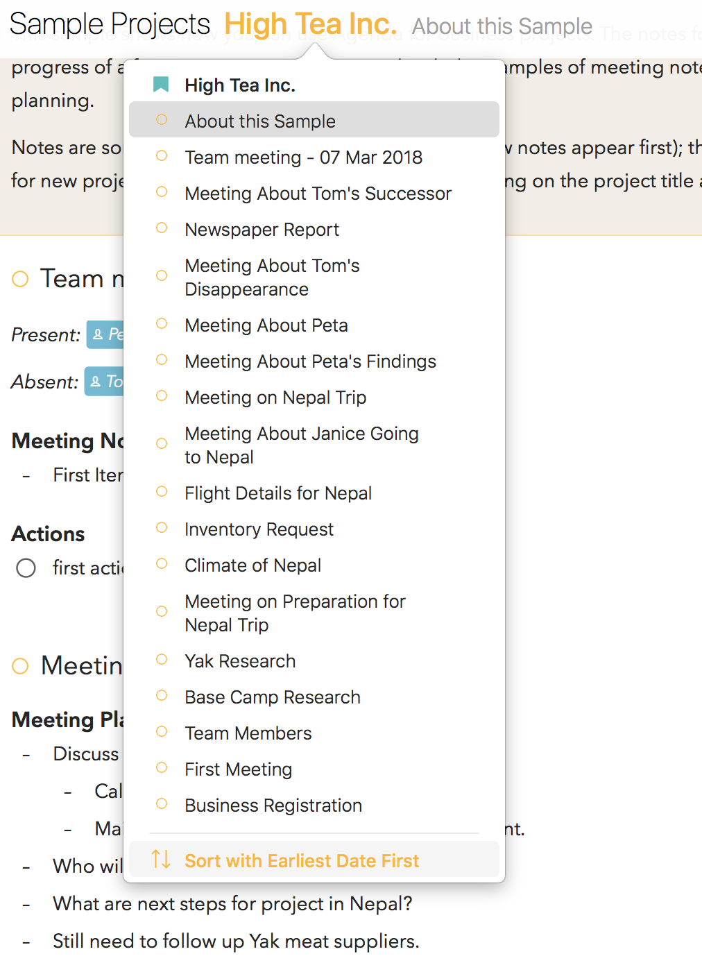
Feature request to add an optional 3-pane view similar to an email app or Wunderlist (technically, a 4-pane view if we’re counting the Related panel.)
Collapsing notes is a great start but it would be so much faster to navigate the UI if the middle pane was a list of note titles, and the right pane was the actual notes. The icing on the cake would be keyboard / arrow navigation.
The goal would be:
- Less clicking
- Fewer animations
- Quicker access to the data that’s always up front
I’m afraid that this is very unlikely as we went in the current direction, sorry.
That’s really disappointing as most note-taking apps from Apple to Bear to countless others provide this default step down view from left to right:
- Sidebar with folders
- List panel
- Edit body panel
2-pane inline editing is just way too much clicking in and clicking out and animated collapsing and expanding… when it could just be flying through note titles with arrow keys to navigate…
Adding 1 more vertical panel = a lot less friction.
I’ll keep a hopeful eye out for this wish in the future as all of the other user requested features have been delivered in spades.
We understand this is indeed what most note-taking apps do, but that’s also what makes Agenda unique: it’s timeline of notes in a single scrollable list. It’s unlikely we’ll change this concept given it’s the core of Agenda’s philosophy.
Having said all this, did you discover you can get to the view you are kind of suggesting by tapping the project title?
1 Like
Thank you for the suggested workaround but that’s not really the idea: to see all panes at the same times and navigate them with arrow keys.
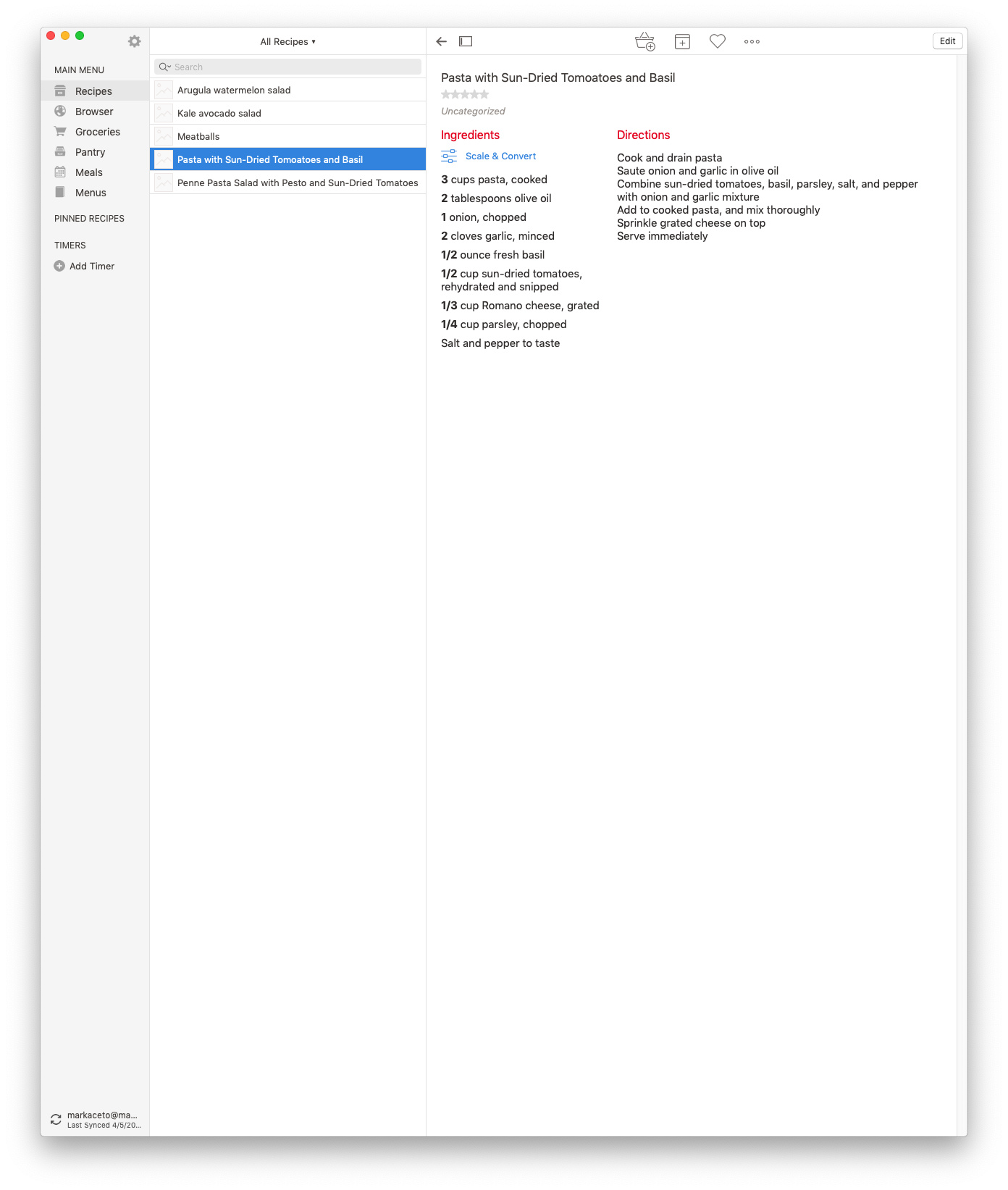
2 panes works great and makes sense on mobile but it’s not taking advantage of valuable real estate on a desktop app. Even my recipe app uses it (screenshot attached).
2017-2020 has been exhausting to hear one precious developer after another use the excuse "we know that’s what you want, and it’s the de facto way of doing it but this is what makes our app unique… " What makes Agenda unique is the unrivaled attention to detail, clever integrations, and beautiful design but please don’t reinvent the wheel when it comes to the basics: layout / UX.
You guys rock–keep up the great work!
Someone wrote a hack for Bare Bones’ Yojimbo back in 2009 that’s pretty analogous to the 3 panel + Related panel view (albeit the notes title panel is ridiculously wide, and Agenda would look so much slicker):


Alas, I’m afraid it’s very unlikely to happen, I just want to set the right expectations. If you really like this layout much better you are probably better of with an app that takes this approach.


