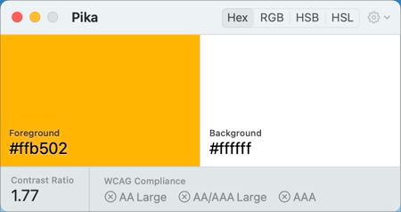
Please note that the default color combination has a contrast of 1.77, which is far to low for many, many people. To meet accessibility standards, a 4.5 contrast ratio is the minimum for text, and 3 is a minimum for other graphical elements.
I understand that you want to use your color, but it might be good to provide higher contrast colors for the users who need it (and not hide it behind a terminal command).