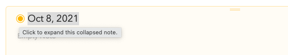
Minor feedback (nitpicking?) - I use the button in the screenshot a lot to collapse or expand notes (as well as other note actions such as ‘Pin to Top’, ‘Mark as Done’, etc.) as opposed to using keyboard shortcuts. One thing I’ve noticed is that the Text Cursor shows up when I try to click the button next to the text field for the ‘Note’ title. It is a little annoying to constantly use the text cursor to click on the button everytime rather than an arrow cursor. The same issue exists for the ‘settings’ icon on the bottom right corner of every note. For both these buttons, an arrow cursor would make for a better UX.