Simple Search

I find searching in Agenda so confusing that I rarely use it. I think there’s a vicious circle here: I find it confusing, so I avoid using it, so I don’t learn how it works, etc.

I appreciate that the search function can be powerful for power users - especially people who are programmers, and are good at logic etc. I’m neither. I good with words, but I struggle with more than basic calculations in spreadsheets.

One of Agenda’s overall strengths is the care with which it’s designed, the avoidance of multiple options etc, and generally keeping things simple. However, it seems to me that with search, this design principle has been lost - complex searches are possible if you understand logic and the syntax, but there’s no simple search.

Of course, one person’s simple search will be different from someone else’s. But here are some things which feel to me like they should be simple, but aren’t:

I want to find something I wrote about Magnetism. I search for Magnetism. A list of found notes drops down. I want to scan all of them for the correct reference. I hit ‘filter notes’.

And then, having been presented with a long list of notes seconds earlier, I’m just shown one note. WT??. I realise that the filter is only acting on the project I happened to be working in when I made the search. I click on other projects to see the notes in each of them by turn - but I have no recollection of what projects my various notes on Magnetism might be. Any way, if I knew where the notes were I would be seaching! I try selecting multiple projects - and I start feeling this is all too complicated.

But say I preserve, I’ve selected the projects I think will have by notes, and I’m presented with lots of of notes, each one of which should include the word Magnetism. So I start scrolling down. Some of them or long notes. I’m trying to scan for one word, and it feels like searching for needles in a haystack. I give up.

I realise everyone’s idea of simple search will be different, but to me, the results window of searching for a word should make it easy to find the word and see it’s context. Eg:

===

Project 1

Note A

  • line of text with search term highlighted

Note B

  • line of text with search term highlighted

==etc==

Then when I see that Note B is probably the one of looking for, I can click the line of text with the serch term to open the note and see it in context.

It’s likely that I could set up a search that works like this - but I’d need a more logical brain and to know the syntax, and to remember it for next time.

Could the first results of a Simple Search also offer some simple ‘buttons’ to edit the search - without typing any syntax?

Fundamentally I think what I’m asking for is user friendly interface for search.

Sorry, this has turned into a bit of rant!
I think I can relate to your frustration.
I don’t use the search feature that often, but sometimes I run into similar problems, and the results aren’t displayed clearly enough.
The search process also differs slightly between Mac, iPad, and iPhone. There are hidden features that are meant to be self-explanatory, but when you’re just doing a quick search, you tend to overlook them. Some aren’t even documented.

Here’s an example:
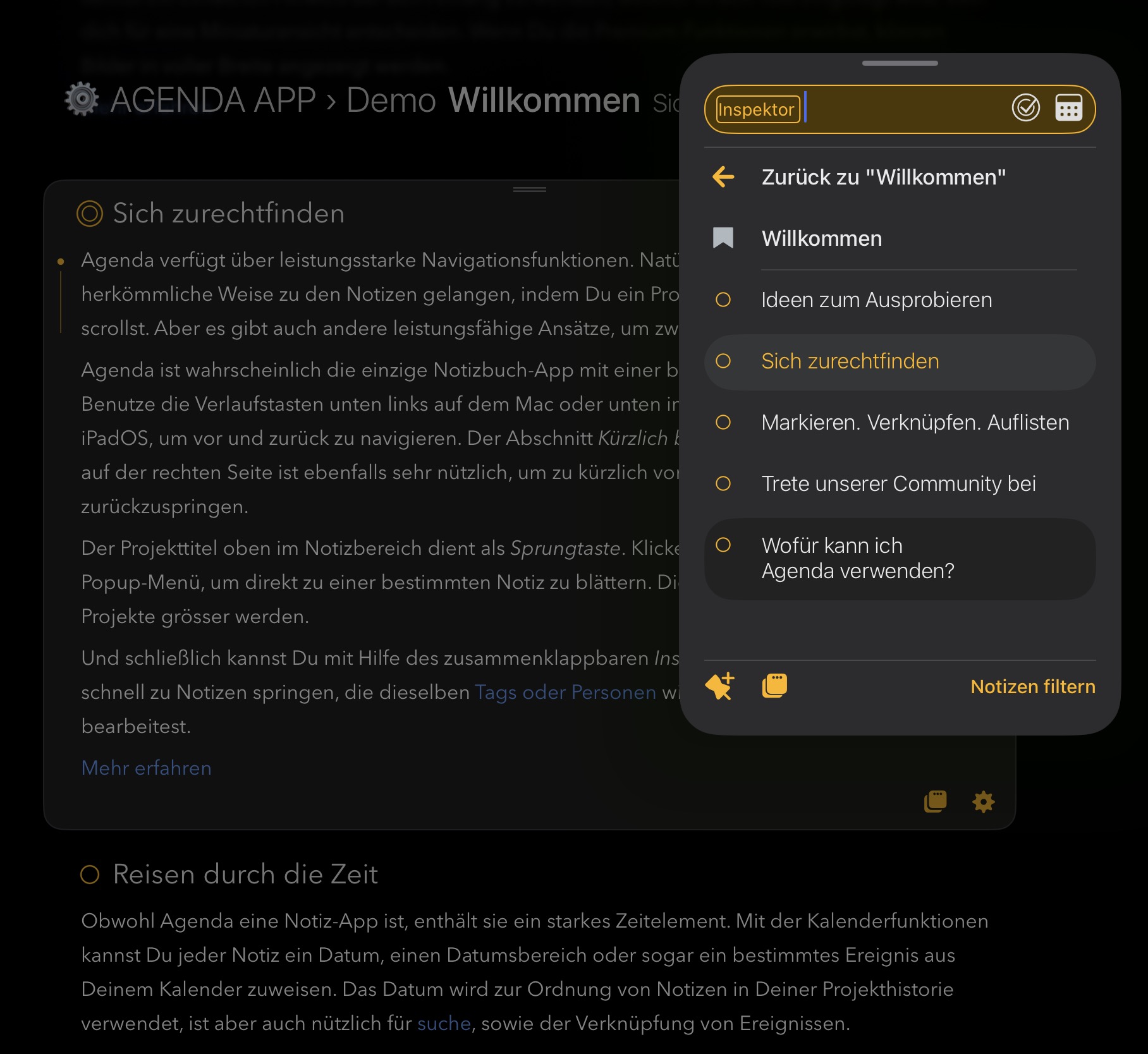
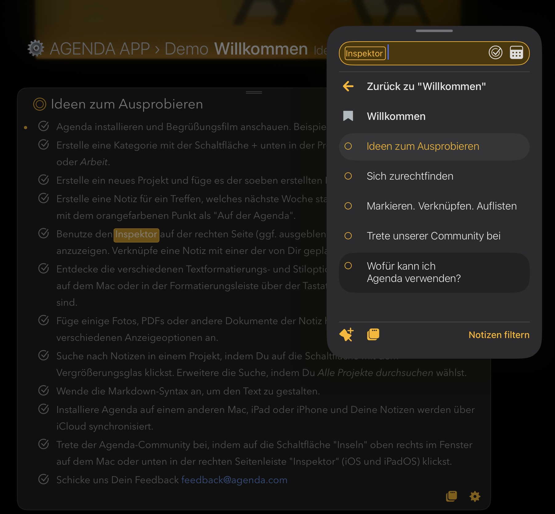
I’m currently on my iPad and searching for “Inspektor” in the demo project (german version).

Search result 1

There are two hits here, but how am I supposed to tell?
To see the other hits, I have to tap again on the note title in the list that’s already selected and highlighted in color.
I didn’t know this and overlooked the other results. I’m missing visible cues—such as the number of results (e.g., 1 of 2) or some other clear indication.

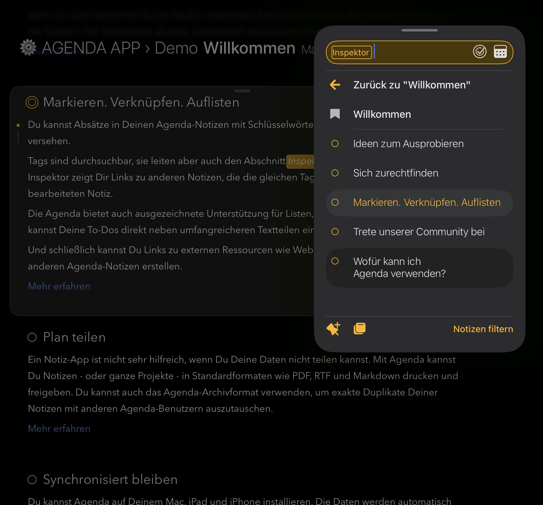
Search result 2

Here’s the next hurdle. The window covers the note and possibly the search results as well. If you don’t give up, you keep trying your luck and move the search window to see the background. That’s not a solution!

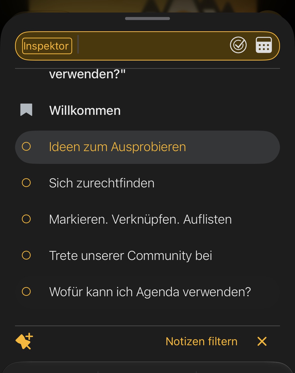
Search result 3

Here I finally understood why no results were displayed before :slight_smile:

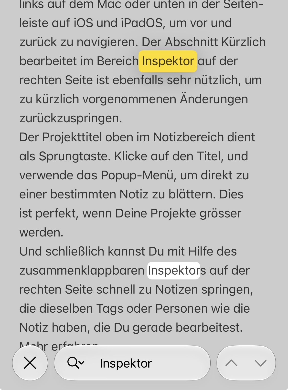
Search result 4

I was sure about this one. It’s hidden somewhere.

The bottom note in the results list has a darker border. I don’t understand why, and it’s confusing me now, at the very least, because I haven’t selected it yet.

Sorry, this ended up being more text than I intended.
But it’s good that we’re writing about this.

Thanks for the in-depth analysis. We’ll take it along.

We have to balance the fact that search is global, with the desire to see in-note matches. It is tricky. No other notes app I know of has this issue, because they only load one note at a time.

Please also note the search function on the iPhone. There are a few minor issues there as well.

  1. The keyboard sometimes gets in the way.

  2. The number of results per note is unknown here.

I then have to check the same note over and over again and return to the list each time. Only one result is highlighted at a time. Honestly, with longer texts and multiple results, I quickly lose track of things because switching between windows disrupts my focus on the content.

  1. The highlighting of search results is lost if I accidentally tap the screen briefly with my finger while scrolling on the iPhone. It’s my own clumsiness, but the margin for error seems to be very generous.

Thanks Roms, good points. A count of the matches in each note, and a highlight that doesn’t disappear so easily, would help on iPhone as much as on iPad. We’ll look at those along with the rest.

Hi Drew

I appreciate it’s not easy. I really just wanted to make the point that Search feels very un-Agenda to me!

There are so many feature requests in this forum where you’ve said something along the lines of, “no, that would introduce too much complexity, we’re want to keep Agenda simple”. In most areas of functionality there’s the simple way, and for those who want to dig into the guts, there’s a powerful way - like shortcuts, or all the \ codes for special actions. It’s what makes Agenda a brilliant app.

Search feels like the exception, there’s only the power users’ version.

I look forward to seeing how search evolves and hopefully becomes more accessible for non-powerusers.

That’s a fair point, and well put. Search should have a simple way in, like the rest of Agenda. We’ll keep that in mind as we work on it.

I am wondering a bit why you think it is difficult. We actually completely revamped it a few years back to make it simpler. Now you see all the results in the search field, and you click one to go to the note. That’s pretty much all you need as a basic user.

Is your problem with the searching within a note, for multiple matches? It’s true that is not as good. You click repeatedly to cycle, or hit return.

Let me know the crux of the problem. I’m interested to get to the bottom of it.

I have looked into this a bit further, and I think some of the design is worth explaining.

The search results are already grouped by project. You see each project with its category, and the matching notes under it. We deliberately stop at the note level. Listing every hit would make the list a lot longer, and for most people finding the note is enough. That is the simple path: type a word, click the note.

Once you are in the note, clicking the result again (or hitting return) takes you to the next hit. That is a bit hidden, I agree, but it keeps the basic case simple. Hit counts would be useful to some, but they add complexity too, so it is a balance.

@Roms, on iPadOS 27 search is now a sheet that you can drag around, which is better than the old popover. I’m not sure if we can move it out of the way automatically to uncover the hits in the note, but we will investigate that.

On iPhone, being able to hide the keyboard while you look through the results is a good idea. That should be doable.

Drew

Let’s say I’m searching for the first time and intuitively use the down arrow and Enter keys to see all the results.

This is what happens on the iPad..

(Sorry for the poor video quality. The 3MB limit is really annoying.)

…and this is what happens on the MacBook.

Hmm, that’s not what you’re describing, or maybe my version of Agenda doesn’t support that!

I can’t fully see what the issue is. It looks like you are hitting return, and it is just showing the one match, probably because there is only one match in that note. Is that right? Or is it missing another match?

What it was designed to do is move within the one note from match to match, and then wrap around to the top of the note and do it again. If it is not doing that, let me know. It would be a bug.

@Roms, you were right, and thanks for the videos. Return on a search result always goes back to the first match, so a second Return does nothing. That is a bug. We have a fix, and it will be in an update.

Until then, click the note in the search results again to go to the next match. On the Mac, Cmd-G does the same.

I’m afraid that’s nowhere near enough. As I mentioned earlier, switching windows just to continue searching is, in my opinion, too cumbersome.

Even Apple Notes makes it easier.

I like the simple concept.

  • I can easily see all the matches and still focus on the one that’s clearly highlighted.

  • A “Forward/Back” button in the lower-right corner lets me quickly access all matches without leaving the text and losing my place.

    I think a button like that in that spot is more important than the “+” button in the upper-right corner. Why would I want to create a new note while I’m searching?

I’m just realizing that the more I look into the search feature, the more inconsistencies I find. I’m not saying that Agenda Search is bad, but rather that there might still be some room for improvement.
Ultimately, everyone experiences it differently.

Thanks, the Apple Notes comparison helps. Highlighting all the matches in the note, with buttons to step forward and back through them, is a good suggestion. We’ll take it along.

YES! You asked earlier above what the problem is, and I think this is a big part of it.

I search for a term, and I’m shown a list of notes. But unless the search term is highlighted and easily visible, I might have no idea whether each note is what I’m looking for.

I think search as it is at moment works better for finding a specific note you know exists and that you’ll recognise when you see it. Much less well when looking for notes that include certain information that is probably in many notes and you want to review all those notes.

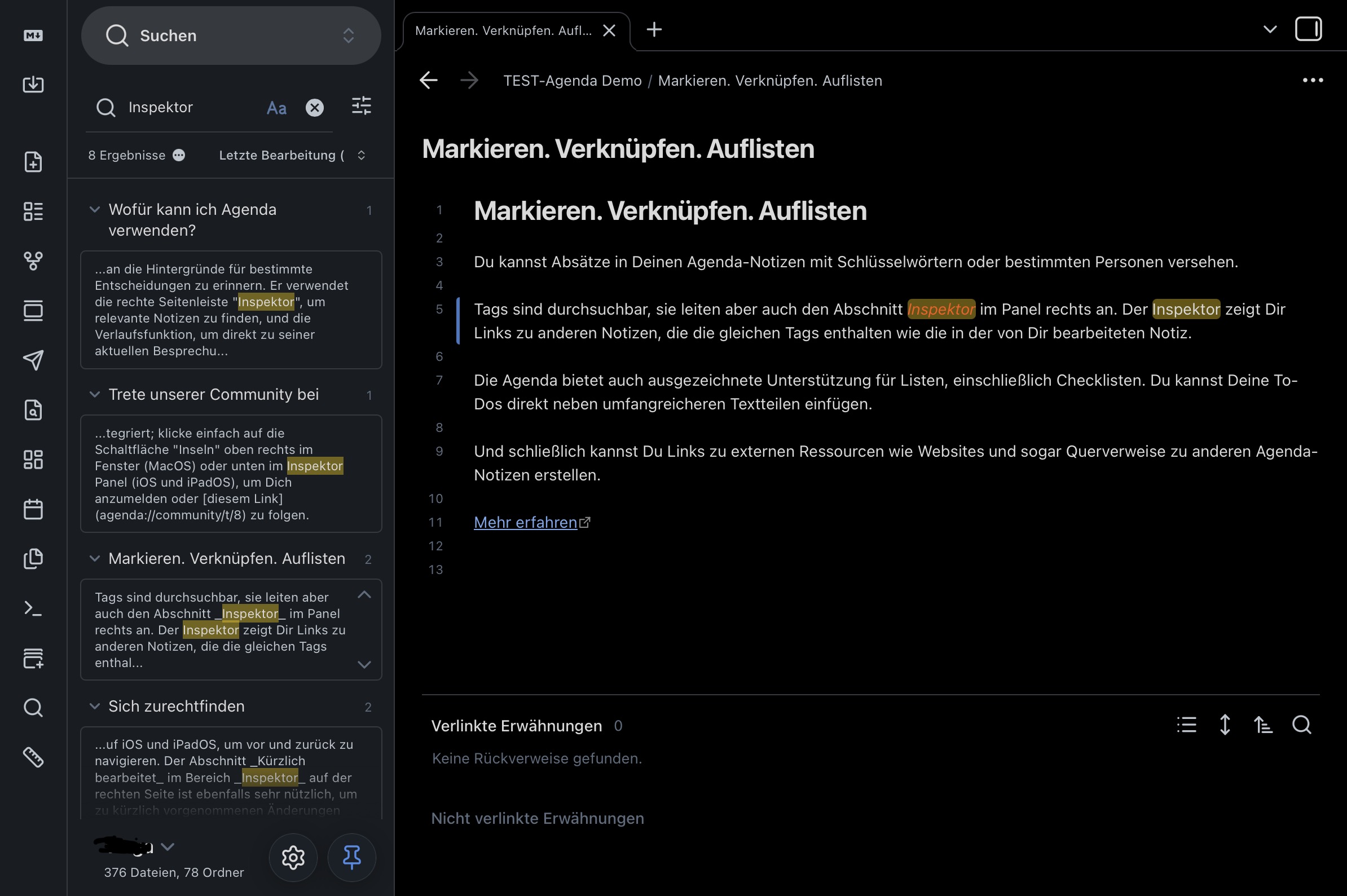
I think this screenshot shows that pretty clearly, right?


Obsidian (and other apps as well) takes this approach.
The left-hand pane with search results contains all the information you need for your search. All I have to do here is scroll down to see more results.

The goal is to immediately show the reader the context in which a term is used, without requiring them to read the entire text.

Our decision not to do this was quite deliberate. We actually had a search a bit like this. It would take over the whole window like you are showing.

We moved away from it, because we didn’t want you to lose context as you searched. That is why the results appear in a popover, and do not replace where you are in your notes or what you are looking at until you click a search result. And when you do click a search result, you see the note exactly in context, unlike the other apps, where it is just a search result. You see the other notes above and below it exactly as if you navigated to it yourself.

There are a few ways we can improve the experience, including fixing some bugs, but we find this approach of maintaining as much context as we can, the best way to do search in Agenda.

I’d be interested to hear from others what they prefer. Ie a search that completely takes over the UI and takes you away from what you are doing (like we had a few years ago), or this less invasive version. It’s a good discussion.

First time poster here, but I agree with everything that has been said above. For what it’s worth, I’d prefer a search UI like Obsidian and the like.

I find the search in Agenda is the main thing that keeps me from using it full time (the other being that I notice lagging often, which slows me down). Logging notes and linking them to events and projects is great, and along with tags and contacts, all of this makes Agenda an excellent and beautiful app to use. However, when I want to go put in a quick search to find the needle in the notes-haystack, the current UI is very hard / cumbersome to use.

I can’t imagine how difficult it is to manage this app and make changes, and ultimately it’s what you owners think works best. I just wanted to throw my thoughts in along with everyone else. Thanks for all you do!

Can you go into a bit of detail about what feels cumbersome? Just trying to understand it.

You hit CMD-F, type a word, hit return, and see a list of notes. Where is the friction you feel?

We changed this a few years ago precisely because the old way, where we showed full notes, felt heavy and slow, because it had to load all those notes. It also took over the whole window to show the notes, meaning you were taken out of the context where you were working.

What part of the current system annoys you? The popover? Previewing the matches?

Just trying to get down to the essence of the problem.

I see two operations here, “Search” and “Find”. To me it’s as I view “todo and task”, similar but nuanced. Search has matured into a good tool at identifying a collection of items on a macro level having similar specified criteria. “Find” is quite good but doesn’t maintain hi-lights which is due to no actions allowed in the search results, which is totally needed. Using (Search+Find) in the same operation is a great combo . I searched using a word I knew would scale multiple cats/projs/notes. When the search finished I selected the first note, opened find ⌘F﹥entered ⌘G> (find next) until end of note and continue to the next. However, without the highlights being persistent this becomes a nightmarishly repetitive process.

Why at end of search, couldn’t one select and copy all desirable projects to a dedicated location, similar to Inbox where they could be fully editable and cleared when finished?